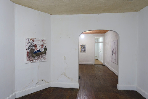
Trevor Shimizu is the third artist to show at Rowhouse Project, a curatorial project located at 2640 Huntingdon Avenue, Baltimore, MD. The duration of this project spans three years and features the work of a different artist each season. With each season, the formerly unoccupied and decrepit row home is revealed further along in the process of its renovation, leading towards the property’s eventual realization as a livable space. Evan Roche and Harrison Tyler (two members of the group Jimmi~Research) discuss Trevor Shimizu’s recent show “Trying To Be A Good Person” here.
-Editor

EVAN ROCHE: Trevor’s show featured one of the most visible changes in the house thus far in the project, this was the hasty whitewashing of all of the interior’s (deteriorating) plaster walls, which were previously wallpapered, orange or green. This definitely led to a far clearer boundary between art work and house decor than in the shows previous.
HARRISON TYLER: Yeah, having only seen Trevor’s past work online, this seems like one of the first presentations of his work outside of the strictly gallery environment. I think the installation is a good opportunity for Trevor’s work to be explored in a more challenging way, but I think this also turned out to be a strange and unforeseen turn in the three year renovation project of this rowhouse property. The sloppy whitewashing of the walls is clearly not a long term renovation effort…
ER: And also kind of an oddly ordinary move to make in such a distinct space, no?
HT: Yeah, it is funny that while this appears to be a first step out of the gallery for Trevor’s work, the row house has been pushed as far back into gallery territory as possible, at least in comparison to the previous two shows in this space that really responded to the existing qualities of the architecture and domestic detritus.
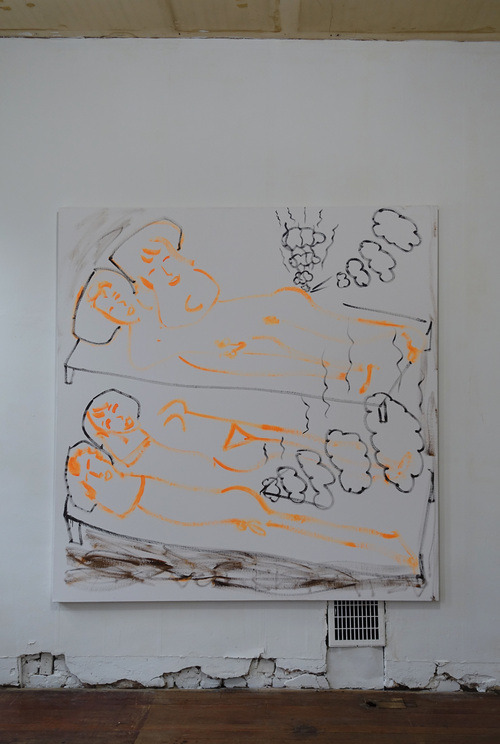
ER: It is a little confusing to me as a curatorial decision, why not bring in work that is more challenging to the space that is provided? This being said, I think that Trevor’s paintings, generally depicting sadly mundane and introspective household activities, really do work very well in this setting. The paintings are placed throughout the house so that the situations depicted in the paintings reflect the rooms they are displayed in (a painting that depicts a couple farting in bed is placed in the bedroom) and they also suggest tragic psychologies of the characters inhabiting these spaces.
HT: One distinct stylistic element lingers throughout the show also: a scarcely dry brushed, even economical, image with a figurative subject, blurred and dryly smudged, within elements of some vague environment. These nebulous images lacking specificity and detail introduce an eerie mystery surrounding the character of the painter; at times introspective, at others voyeuristic.

ER: The house itself is old and decrepit and has some real bad juju. I think the eeriness of the house brings out a darker and subtler side of Shimizu’s humor that I am really fond of, one that is so subtle that it might disappear in a different environment. The painting of the man blowing the cat comes to mind here. It has a quieter, darker, underlying metaphor: that the man has lost himself and his individual willpower in the effort to maintain equilibrium in his household.
HT: In a different setting that humor might just become more slapstick.
ER: Yeah, maybe become more slapstick. Many of the works are right on the edge here–coming close to being a slapstick, even raunchy, a sort of shock-comedy. I think this is also really tempered by how vague the images are. This has a lot to do with the stylistic elements that you described previously: the dry and smudged brushwork that lacks specificity. The images are often so vague that they do not present enough information to commit to the punchline of a slapstick joke, and instead they remain naïve. This is a delicate balance that I really enjoy in these works.
HT: Maintaining equilibrium is a recurring theme… I really liked the painting of the couple smiling and farting in bed, each content with each other and sweetly entertained by their own bodies. This isnt a bored acceptance or a compromise for the sake of others, but an example of equilibrium, a dreamlike contentedness with reality in this house. This was a point in the show where the lite humor and vagueness started to grow into a more developed narrative for me.
One piece that I liked for setting up some logic in the show was the painting of a person washing dishes hung in the kitchen towards the back of the first floor.
ER: Out of all paintings in the show, the placement of this one was the most literal – a painting of dirty dishes hung above a pile of dirty dishes.
HT: Right, the painting is hung in-the-mix directly on the cabinets in the kitchen. The dish washer scarcely dry brushed and smudged together with his own dishes is also smudged, overlapping into this IRL kitchen-gallery scene with our empty beer cans. This begins to outline the relationship of Trevor’s work to this new and lived-in space, and while maybe a moment of clarity, its simplicity and literal placement is far less engaging than some rooms upstairs that are more thematically challenging.

ER: The sea otters were thematically challenging. How did you feel about those?
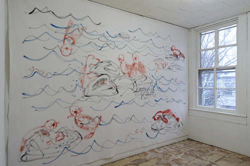
HT: Ok, yeah, the back end of the second floor started to get really strange as it diverged from the more explicit thematic foundations set up in the kitchen and bedroom. The last room in the very back of the second floor contained a wall sized mural of a river scene with otters–this room was very surreal compared to the other rooms, and even darker for me as I had to fit it in within the format set up by previous works. I thought, “Is this the nursery? Or the kids room?” This non-domestic otter scene was a very strange and complex format for content from previous work to come and rest. However, while this room was powerful to me, this complexity and poetry was severely dampened by a smaller, sketchy drawing hung on the wall across from the mural depicting a masturbating man watching porn on a TV. A lonely and dreamlike space with naïve, guilty pleasures was naturally implied in this room and didn’t need an explicit and obviously kinky cartoon to hint at any content.
ER: (There were guilty pleasures implied in the room with the otters?) I think that’s a really accurate way of describing that room. The image of the man watching porn lost all of the vagueness that was what made the other works more complex. I think a big part of this was the line quality. The image you speak of was drawn with a thick marker line–every element was clear and legible–as if a cartoon, compared to the vague dry brush of the other pieces. This work kind of threw off the rest of the show for me–it was like a foil to the vagueness that was established so strongly elsewhere–confirming a more slapstick read of all works.
HT: How would you sum up?
ER: The vague brushwork alone created a pretty fresh naïvety in Trevor’s works and I found this far more compelling than when the works seemed self aware or clearly intentional in their joke. I think they could stand on the naïvety alone – there is skill in this naivety and in the vagueness of depiction. The naïvety in these images is difficult to come to terms with and I like that–the intentional joke I can understand too easily.
HT: Overall, this show left me with an impression of uncertainty at the fault of some unclear directions, that some works being too explicitly slapstick brought down the complex and dark humor found in other works. The exhibition had the opportunity to defy my expectations of the whitewashed walls and create a complex psychological space, but that experience was muddled by works that seemed too jokey and of a cynical humor.
—