Works (Events? Shows? Exhibitions?) like Something Crossed My Mind are difficult to quantify; to address it as a singular entity would be doing a disservice to the complexities of each individual artist’s work, and to treat each component as separate would be to ignore the intent that goes into curating something of this kind. This is made even more complicated by the fact that, while at its heart, Something Crossed My Mind is a fashion show, things like the room’s design and the soundtrack have been treated with as much intentionality and care as the collections themselves. It could be argued that the actual work is the interaction between these components, and between these components and their audience.
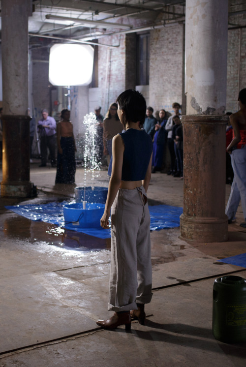
The show is set in the garage of the Copycat Building, a cavernous, windowless space with large pillars running down the center of the room. Colin Foster has constructed a series of fountains out of ultramarine plastic barrels and PVC pipe that are scattered between the pillars. The barrels rest on rectangular plastic mats of a similar color which catch the splashes of water while the fountains are running. These assemblages have a flatness that gives them a quality not unlike a rudimentary, untextured form in a computer graphics software. They are the schematic of a fountain; reduced, yet recognizable. The starkness of these objects contrast them sharply against their weathered surroundings, and they seem to float above the ground rather than rest on it. The space is lit with large cinema lights on tall stands placed in the corners, which tower above the crowd, casting elongated, dramatic shadows.
In one corner, Co La sits in the driver’s seat of a parked car with a PA system set up in the trunk. It is from here that he performs the soundtrack for the show, a seamless set of psuedo-club tracks which transform and evolve throughout the night. The audience gravitates to the perimeter of the room, clinging to the wall, meaning that no matter where one stands, they’ll be directly facing someone across from them. The din of Foster’s fountains creates an aural screen that intersects the room, assuring that while you can see who’s standing opposite you, you cannot hear them. This dynamic sets the tone for the night, where one feels more like a voyeur than a viewer. Perhaps the greatest feat of this show’s design, is that by the time the procession of models begins to move through the space, the audience is already well inundated in the show’s atmosphere, blurring the lines between viewer and participant, show and prelude, runway and room.
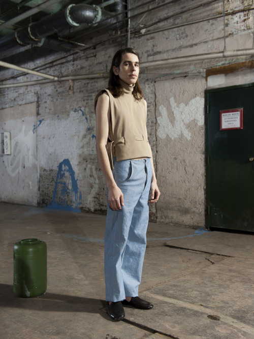
The four collections presented make up a cohesive whole, without any two designers’ work feeling overly similar. Lucia Maher-Tatar’s collection is shown first, which is constructed largely from dark denim and pale neutral fabrics, with a few pieces in a reddish pink hue. Upon first glance, her garments seem fairly conservative (and relatively speaking, they are). They are recognizable as clothing, and point to pieces of clothing that came before them (a coat, a dress, a blouse, jeans, etc.), yet these categories simply serve as a point of departure from which the pieces take shape. Certain motifs such as exposed seams, tied closures, and raw edges unify the garments and suggest a sort of amorphousness or adaptability. This is emphasized by the actions of the models, who remove and reconfigure their ensembles as they move about the space. The collection’s use of denim is unique in that it avoids the trap of seeming nostalgic, a difficult feat when using a material so imbued with cultural significance.
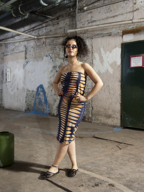
The second collection, designed by Marines Montalvo, is a jarring shift. It relies heavily on printed fabrics, ranging from plaid, to camouflage, to a striped fabric adorned with the designer’s first name. The allusions to luxury brands are evident, and many of the outfits consist of matching tops and bottoms, establishing them as a sort of uniform. Montalvo’s play on patterns are subtle; a black and white camouflage pattern that is doubled over, similar to a printing error, or a knockoff of the iconic burberry fabric with areas that have been digitally altered and distorted. The most extreme example of this is a light purple textile that is printed to depict distressed denim, and then actually torn and tattered in places. It’s effective tromp l’oeil which cleverly highlights the absurdity present in this sort of commodification of damage. This collection seems most focused on apparel’s role as a signifier of status, and is choreographed to call attention to interpersonal interactions, as the models stop in the space and share eye contact before moving on.
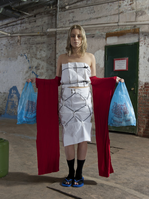
Where Montalvo addressed luxury, Audrey Gair’s collection seemed to instead draw from necessity and thrift, featuring garments that are rough edged, patched, and tied together, and props like plastic bags and styrofoam cups. It is also the only collection of the four that includes footwear, such as bulbous assemblies of athletic socks worn over sneakers, or sandal soles lashed on with cord. Although aesthetic choices such as these run the risk of coming off as a gimmick, here they are tastefully executed, suggesting resilience as opposed to a fetishization of poverty. The prevailing trend of the collection is baggy, sacklike garments adorned with eyelets and belt loops, that suggest an adaptability to a wide range of body types, and perhaps a practical usage as well (à la cargo netting). Other garments feature clever details like panels of terrycloth, or a two part coat that slides off the shoulders to become a set of dangling sleeves, almost resembling those of a kimono.
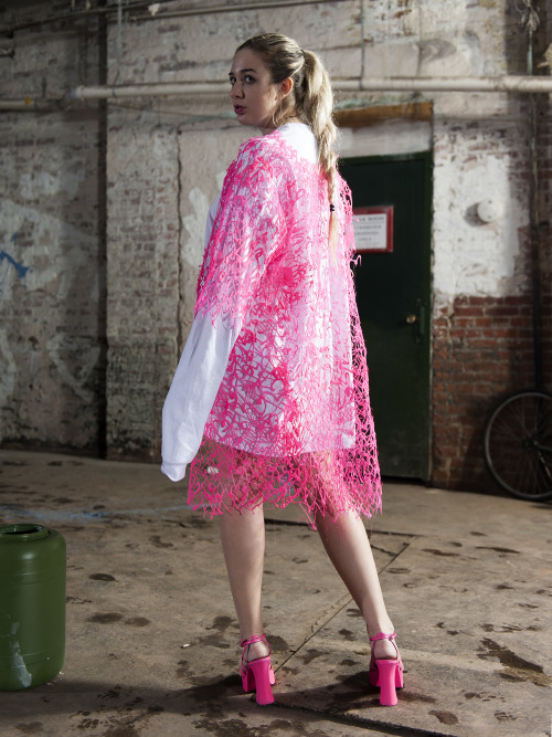
The final collection, designed by Sonja Solvang, assumes a childlike playfulness. Some of it’s outfits execute this quite literally, with oversized sleeves that hang long past the hands of the models, or ruffled tulle skirts that are reminiscent of a tutu. Other pieces are a nod to arts and crafts, such as a paper chain crafted out of leather, or a series of garments fashioned out of a neon plastic mesh that resembles strings of dried glue. Solvang’s work draws parallels between youthful experimentation and garishness in high-fashion which, similarly to Montalvo’s collection, serves to point to the arbitrary lines between class and crass. Of the four designers, Solvang’s garments are some of the most alien, with cartoonish silhouettes that render the models as caricatures.
Something Crossed My Mind is an exercise in juxtapositions, and is successful due to the skill of its players. Maher-Tatar, Montalvo, Gair, and Solvang have each executed collections that are both aesthetically strong and thought provoking, Foster has constructed a fitting environment for the audience to engage with these collections (in addition to creating objects that would function just as well in a different setting), and Co La has composed a score which complements each collection individually without sounding unfocused. If there is a weakness to this show, it’s that ultimately, it still adheres to the established format of a runway show, which can feel linear and reductive (an alternative could be seen in the structure utilized by conceptual fashion label Bless, in which the models are positioned naturally throughout a room, rather than walking through it.) That’s a minor criticism however, and while the show’s basic structure didn’t match the ingenuity of its other components, it doesn’t detract from them either. Overall,Something Crossed My Mind is a show whose sum is greater than its parts, and it succeeds in uniting the work of six artists as a cohesive whole.
(First photo, credit: Nate Grossman, all others, credit: Tim Mahoney)