Post-Office Arts Journal, Baltimore

Deuteranope @ Gallery CA/ICA Baltimore (Angela Conant)

Joseph Shaikewitz


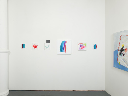
In her recently closed show with ICA Baltimore at Gallery CA, Angela Conant investigates a curious relationship with color. As the exhibition title “Deuteranope” clinically asserts, the presentation of paintings, sculptures, video, and installation peruses the condition of colorblindness through visual and performative manifestations. In this theoretical starting point alone, the writing of Clement Greenberg, the grandfather of formalism, immediately swarms my mind: is this a formalist exploration of color’s relationship to human vision? I resist this notion and, at times, Conant does too; in fact, it is in these sparse moments of rebellion that the exhibition stands out with a vibrant and inspired potential.
image


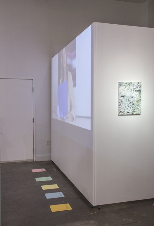
“Deuteranope” is unabashedly ambitious in its thorough approach to the sensory reception of color. A large-scale video projection (Color Cast, 2015) offers an ongoing soundtrack of the exhibition’s thematic linchpin as four actors, including the artist herself, define the visual phenomenon of color and feebly attempt to explain various hues through spoken language. Seated as newscasters, the performers parody the feigned objectivity of the media when confronted with a complex and subjective headline such as color. While the work at times nears too literal an approach to the overarching subject at hand, its saving grace comes in the uncanny and dry delivery of dialogue, sporadically reminding viewers of the intricacies of visual perception as they explore neighboring works.

A scattered series of paintings chiefly paired in diptychs (Human Gesture Paintings 1-5, 2015) is alive with formal interest but, when taken at face value, remains conceptually underwhelming. Each work treats a simple, gestural mark with careful dabs of pigment and consequently reads as sculptural and tactile rather than a hackneyed expressionist swath of oil paint. Conant conceives of the works in sets: one in bright pinks and purples over a field of flat green, the other in muted earth tones over a deep black ground. Through the latter, the artist intends to replicate the range of colors perceptible by those with red-green colorblindness. While I appreciate that Conant appears to ‘get to the point’ through these images, once again I remain unconvinced by the namesake premise of the exhibition. In other words, why are we supposed to be thinking about colorblindness now?

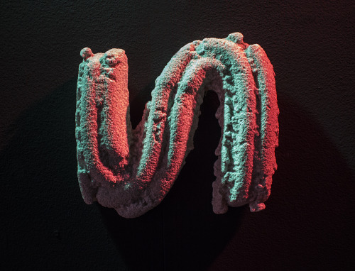
This is not to say that the exhibition completely misses the mark. Where Conant stands out and ultimately excels is in her conception of a transmedia practice that situates painting and sculpture in a refreshingly dynamic relationship; emblematic traits of painting inform the creation of the sculptures, and vice versa. The image of each Human Gesture Painting, for instance, finds a three-dimensional, wall-mounted analog rendered in a coarse mass of plaster and sand (Human Gesture Series, 2015). Three sweeping forms appear tucked away beneath an imposingly low window while others fully occupy a dark gallery-within-the-gallery and receive intoxicating washes of red and green light. The simple starting point of the gestural brushstroke not only motivates the shape of each sculpture, but is itself disrupted as the paintings resolutely and attentively render the contours of a carefree flick of the wrist.  The sheer muddling of the processes behind each artistic format revives what might otherwise be a conceptually wanting show and leaves me yearning for more of this rich transmedia experimentation.
image


The current state of medium or—to re-insert Greenberg—medium specificity is a tricky one. Mixed-media approaches have assumed an established and respected place in the history of art, most notably with the Neo-Dada craze of the 1950s championing a persistent and ever-present crossover between traditionally separate media. On the other hand, following painting’s rise from its illusory ‘grave’ over the past two decades, a recent glorification of the specific capacities of the isolated medium has renewed and energized how we think about pigment on a flat surface. Conant’s transmedia approach feels markedly different and critically needed—the development of a mediumunspecific practice. As she translates not only forms but characteristic elements between the acts of painting and sculpture—simultaneously adhering to and augmenting the specific attributes of the two—Conant proposes a vision of medium that complicates its prevailing treatments. What might a variety of different artistic media look like in a detached yet nevertheless mutually reflexive relationship? While this question may not fully emerge through the thematic fog of Conant’s exhibition, its budding suggestion promises a captivating viewpoint from the artist to come.
College Ruled @ Lil’ Gallery (Angela Arrigo)

Joseph Shaikewitz

image


The double entendre behind the title of Angela Arrigo’s current show “College Ruled” at Lil’ Gallery is enough to spark my interest. Taken as a declaration, the phrase affirms the exhausted adage that college “could be the best four years of your life.” (Looking through the artist’s past work, a series titled “What Loans?” dares to suggest otherwise.) At the same time, the exhibition title recalls the college ruled notebook paper that one eventually acquires for note taking or mindless doodles. In that reading, the narrower spaces for scrawling text might insinuate maturity and seriousness—an academic coming-of-age.

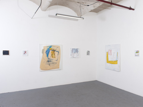
Whether an homage or an affront, Arrigo’s newest series of work confronts the nearly countless days spent in the confines of the classroom in the oftentimes imposed pursuit of an education. The one-room gallery features a suite of paintings that function as vignettes of a homogenous school system, strewn with motifs of graded assignments, manila folders, impasto scribbles, and a folded love note. Throughout the exhibition, the artist demonstrates an impressive ability to translate her subtle forms across dimensions; pockets of 5×7” surfaces hold their own among the smattering of large-scale paintings.

A recent MICA graduate, Arrigo approaches her college years and those that preceded them with an ounce of nostalgia. Scenes of elementary school prompts, wide-open journals, and a blank blackboard actively recall the image of docile students seated behind desks. In the corner furthest from the entrance, a grouping of six small paintings intimate a childlike point of departure for this body of work. The saturated palette simulates a fresh pack of Crayola markers while the swift brushstrokes reinforce the innocent spontaneity of youthful, naïve mark-making.

image


At times, the literal depiction of iconic school supplies falls short in communicating the actual complexities of navigating an education. Such is the case with three small canvases that initiate the exhibition. Each portrays a quiet stack of lined and plain loose-leaf paper that establish the picture plane as a quasi-desktop. However, the depictions of these unmarked pages and circular reinforcement labels verge on banal in the context of the expressive character and narrative imagination that animate the works alongside them.

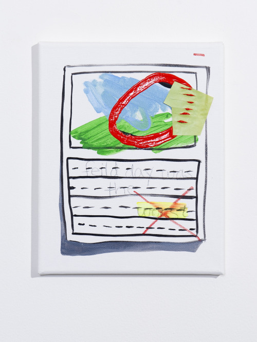
“field day was the worst” is one such highlight—a particularly endearing image that puts forth a rebellious, albeit anodyne renouncement to which I find myself silently agreeing. The canvas is separated into two smaller tableaus. The top half reveals a simplified landscape—juvenile swaths of pale blue and green—overlaid with a brazen red circle and a small, incised cut-out. The title of the work is scrawled in pencil in the lower register within the lined format of a handwriting worksheet. If we take this to be a graded assignment as several markings suggest, then the instructor takes offense with the quiet protest of the word “worst”—highlighting and crossing it out with a definitive ‘X’–rather than the flagrant misspelling of the word “feild.” The work appears to poke fun at a system where freethinking and defiance are stifled more quickly than legitimate errors. The subtle rebellion of the composition contributes to the overarching wit of the exhibition where similarly tacit marks encourage close looking and careful reflection.

image

Perhaps even more compelling than Arrigo’s caricature of the classroom setting is her inspired handling of medium. Her pieces incorporate thick, at times calligraphic impasto lines atop expressive painterly forms. In many of the larger compositions, the textured brushstrokes and now-muted colors of previous paintings bleed through the gessoed surface, alluding to the material lifetime of each object. If painting functions as a record of memory, then Arrigo’s applications of protruding acrylic paint and collage over multilayered and somewhat concealed surfaces metaphorize that very process. The temporal layering of images and viscosities underscores the act of looking back, the polemics of memory, and the allure of nostalgia. The memorializing brushstrokes bring to mind a range of fellow painters ranging from Philip Guston to Liat Yossifor, while the question of painting’s materiality and its relevance to a contemporary moment seems inspired by artists like Trudy Benson, Laura Owens, and Eric Sall. Amid such comparisons, Arrigo’s work emerges as a reflection on the past with a gloss of its material excavation.

If college did indeed rule, then its presence continues to linger in the present. For Arrigo, the act of parsing out this moment creates a likely thematic commonality between artist and viewer and hosts a keen exploration into the essence of painting. While in rare instances this plays out in conceptually sophomoric terms, Arrigo’s new series of work demonstrates a clear painterly perseverance that is anything but elementary.

Photos courtesy of Lil’ Gallery