Post-Office Arts Journal, Baltimore

Rigor Raging Rigger @ Freddy (Thornton and Foster)

C. Klockner

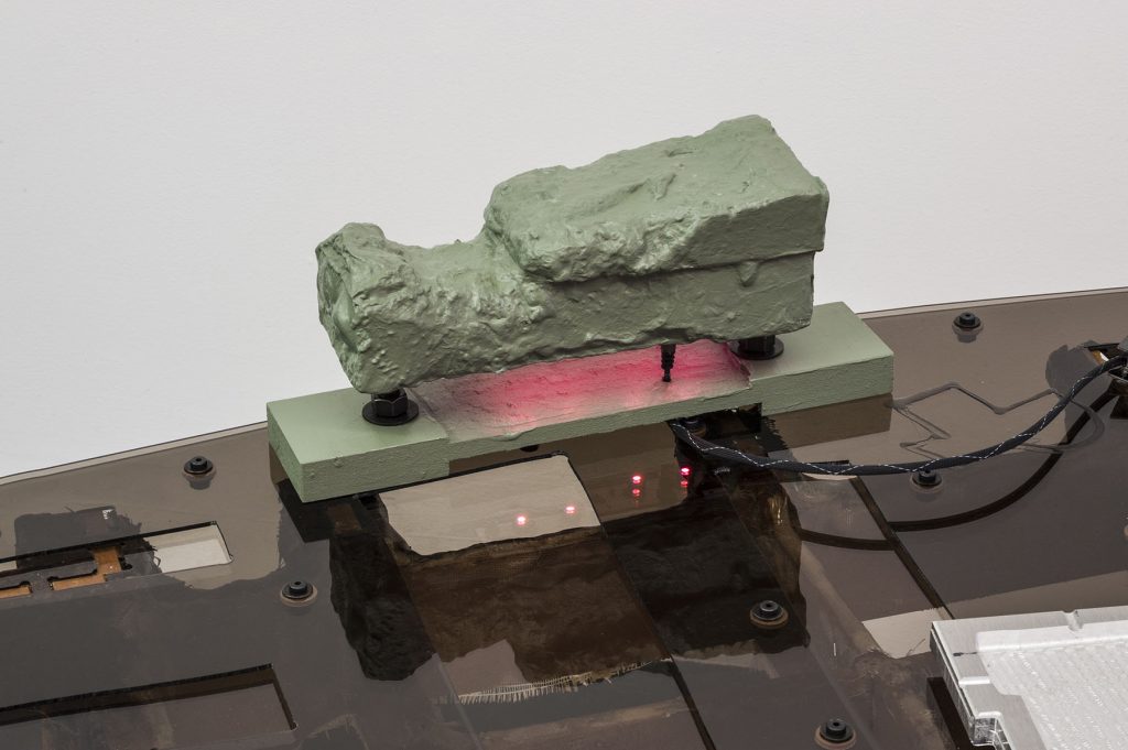
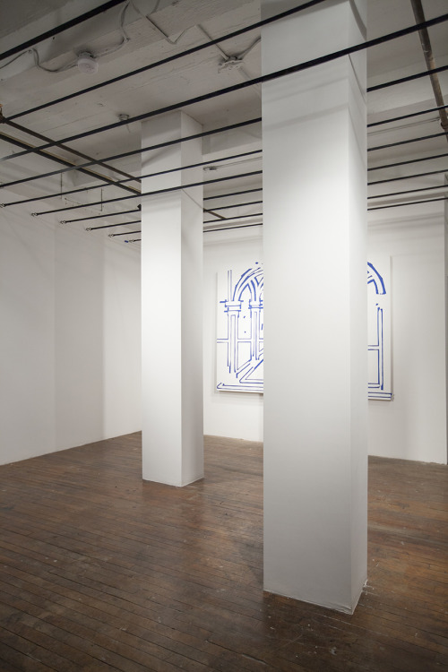
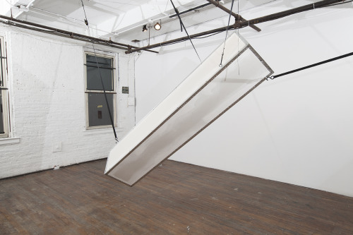
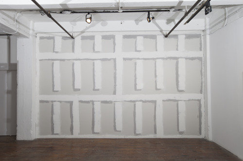
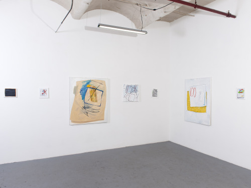
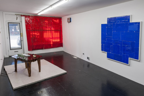
Colin Foster and Torey Thornton show collaborative work as well as individual work in the current exhibition at Freddy Gallery, Rigor Raging Rigger. On entering, the compact space is crowded by a large floor pedestal that supports a sci-fi acrylic and wood table. On the table, a variety of objects sample one substance for this, another substance for that, forming an array of shapes that seem to have neither history nor future. To the left, a large red transparent vinyl covers the front window.

A few wall pieces by Thornton experiment with the context of OLD WOOD (which, in the context of particle board and depicted gum in one piece, I can’t help but think of as a sign increasingly owned by yuppie food establishments). A blue, “+” shaped cardboard collage is forgettable/unnervingly tidy in the mad (material) scientist atmosphere that everything else works to establish. Foster’s pieces each seem to embed some sort of overwhelmingly human narrative within their otherwise industrial/analog electronic Hobby Hell aesthetic.

image

The link between these practices seems to stem from a material dissonance — an ambivalence towards just how comfortable both might be with the found and manipulated material vernacular available. I see a sort of flattened timeline of cutting edge and antique materials, of natural and unnatural qualities forced to interact outside of their themes. Where Thornton’s work remains relatively sober, Foster’s work feels erratic and difficult to parse.

Though Top Ribbon (Disturbed Mono) by Thornton and Selling Shoes on the Beach by Foster are both non-collaborative, they mark where the artists most closely brush shoulders in practice. They seem to be the strongest pieces in the show in their ability to point to that link (a squished material timeline) and employ the separate strengths of each artist’s practice.


That the gallery text and title offer a roll of possible labels that function more as phonetic textures (pick your poison: beatnik poetic, summer camp icebreaker, dada, hashtag list?) than as specific descriptors is a nice coupling for work that relies so heavily on the physicality of objects.

As a collaboration, Rigor Raging Riggeris a treat to explore even with the few pieces that seem engaged in a different conversation. Thornton’s blue “+” still seems unfitting here, but the formal effort to match it (or to be matched by?) Foster’s large red vinyl window highlights the conscious efforts of the two to commit to the sort of material choreography that ultimately holds the show together. Perhaps a second collaboration is the stage for further grace in that dance—I’d be curious to see it.

(photos courtesy of Freddy Gallery)

breathe in gold light @ New Door Creative

Chris Williford

breathe in gold light is a current exhibition at New Door Creative gallery in the Station North neighborhood. Curated by MICA Curatorial Practice MFA student Kelly Johnson, breathe in gold light creates a comfortable, dream-like oasis in which women’s bodies are observed as sacred temples: “sites” rather than objective destinations. For her thesis exhibition, the culmination of two years of rigorous collaborative work, Kelly was concerned with commenting on the gender-based hierarchies that still rigidly define the discourse of contemporary art as we know it. A light in itself, this timely exhibition—spanning painted, sculptural and performative works by exclusively local female artists—sheds new (gold) light upon spirituality’s role in a woman’s process of creating.

image


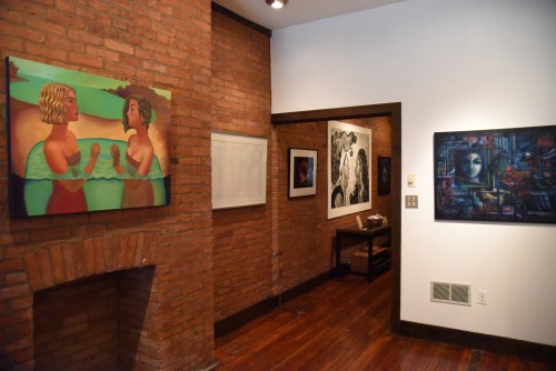
Walking into the space, I am instantly soothed by the dimly lit entryway that smells of decades earlier, when it was built. Red brick walls line a majority of the exhibition space, a gorgeous historic feature that supports Kelly’s interests as a curator concerned with re-contextualizing the gallery as a livable, breathable, space through which to view works. As Kelly explained, there are three visual motifs that can be interpreted from the exhibition: portraits, scenes of partnerships and scenes of group exchange, all equally powerful manifestations of female autonomy.

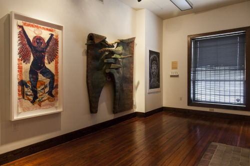
Looking around the first gallery, my eyes wander from Mequitta Ahuja’s Dream Sequence: Winged II to the tarnished surfaces of Rachel Rotenberg’s large wooden sculpture. On vellum, a painted composition reads as an ancient scroll on which Ahuja depicts a woman towering over a pastoral village. In the image, the figure exists not just as fearless woman but also as goddess; feathered wings extend out from underneath this protagonist, whose gesture already embodies a feeling of empowerment. Across the way, Rotenberg’s poetically rendered forms in Elizabeth echo the holistic sensibility of Johnson’s exhibition: a sum of parts that reference a larger whole. The twelve Mid-Atlantic artists in the exhibition demonstrate the criticality of representation within their given mediums, all or most of which have been commercially dominated by white, male artists throughout history. Evidently, there is strength in numbers as breathe in gold light surveys a vast landscape of cultural traditions and personal histories.

As I spoke with Johnson, I gained more insight about the mechanics of the exhibition. She displays a layered consideration for museum and gallery conventions in her minimal use of signage. For breathe in gold light, she feels, the signage and otherwise curatorial jargon had the potential to be too intrusive to the overall inclusionary nature of the exhibition. As a curator, she is more concerned with staging the variety of messages inside these works rather than musing further on their material components. By encouraging us to look beyond an artwork’s physical makeup, Johnson subverts the Modernist impulse to obsess over craft in favor of a more accessible conversation of imagery. Hourglasses were placed throughout the exhibition so that the viewer could meditate alongside artworks to gain perhaps deeper understandings of them. Another critical position on homogenized gallery culture, these signs explained that the average gallery viewer spends an average of six seconds looking at an individual artwork. Here, Johnson takes a political stance on the immediacy of contemporary artworks, giving works with allegorical or narrative structure time to shine in breathe in gold light.

Outside the gallery space is a painted labyrinth by Sandra Wasko-Flood. Visible from the St. Paul Street entrance, Goddess of the Universe Labyrinth was commissioned specifically for the exhibition. For thousands of years, these ornately designed mazes have been used to promote peace through wandering and meditation. Furthermore, non-profit organization Living Labyrinths for Peace says that walking a labyrinth can help balance the creative and analytical polarities of your brain. As I traversed through the golden labyrinth with a group of others, I became more aware of my body and also of the bodies sweeping past me, our individual energies fusing into a collaborative activation of the site-specific piece. The mission of the labyrinth echoes that of breathe in gold light in that it simultaneously suggests a venue for individual reflection in the context of a larger community.

image


This depiction of individual reflection is most thoughtfully articulated in the work of Cynthu Muthusamy, the single performative work in the exhibition. In her 2014 piece Soil, Soul, Society, the artist ritualistically creates patterns known as kolam, Hindu symbols that altogether represent creation, destruction and the wavering obstacles one must overcome in life. Muthusamy’s background in printmaking at MICA directly informs the graphic marks she imposes on the street outside her home in Baltimore. As the sun rises in the video, we are again reminded of gold light – and more importantly of the time we are given to breathe it all in.

breathe in gold light will continue its programming at New Door Creative, located at 1601 St. Paul Street, through May 19, 2015, with several workshops scheduled before closing.

(images courtesy of Kelly Johnson)

Something Crossed My Mind (Fashion Event @ The Copycat)

Nate Grossman

image


Works (Events? Shows? Exhibitions?) like Something Crossed My Mind are difficult to quantify; to address it as a singular entity would be doing a disservice to the complexities of each individual artist’s work, and to treat each component as separate would be to ignore the intent that goes into curating something of this kind. This is made even more complicated by the fact that, while at its heart, Something Crossed My Mind is a fashion show, things like the room’s design and the soundtrack have been treated with as much intentionality and care as the collections themselves. It could be argued that the actual work is the interaction between these components, and between these components and their audience.

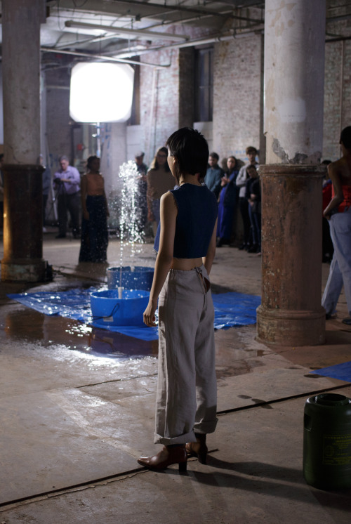
The show is set in the garage of the Copycat Building, a cavernous, windowless space with large pillars running down the center of the room. Colin Foster has constructed a series of fountains out of ultramarine plastic barrels and PVC pipe that are scattered between the pillars. The barrels rest on rectangular plastic mats of a similar color which catch the splashes of water while the fountains are running. These assemblages have a flatness that gives them a quality not unlike a rudimentary, untextured form in a computer graphics software. They are the schematic of a fountain; reduced, yet recognizable. The starkness of these objects contrast them sharply against their weathered surroundings, and they seem to float above the ground rather than rest on it. The space is lit with large cinema lights on tall stands placed in the corners, which tower above the crowd, casting elongated, dramatic shadows.

In one corner, Co La sits in the driver’s seat of a parked car with a PA system set up in the trunk. It is from here that he performs the soundtrack for the show, a seamless set of psuedo-club tracks which transform and evolve throughout the night. The audience gravitates to the perimeter of the room, clinging to the wall, meaning that no matter where one stands, they’ll be directly facing someone across from them. The din of Foster’s fountains creates an aural screen that intersects the room, assuring that while you can see who’s standing opposite you, you cannot hear them. This dynamic sets the tone for the night, where one feels more like a voyeur than a viewer. Perhaps the greatest feat of this show’s design, is that by the time the procession of models begins to move through the space, the audience is already well inundated in the show’s atmosphere, blurring the lines between viewer and participant, show and prelude, runway and room.

image


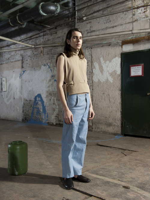
The four collections presented make up a cohesive whole, without any two designers’ work feeling overly similar. Lucia Maher-Tatar’s collection is shown first, which is constructed largely from dark denim and pale neutral fabrics, with a few pieces in a reddish pink hue. Upon first glance, her garments seem fairly conservative (and relatively speaking, they are). They are recognizable as clothing, and point to pieces of clothing that came before them (a coat, a dress, a blouse, jeans, etc.), yet these categories simply serve as a point of departure from which the pieces take shape. Certain motifs such as exposed seams, tied closures, and raw edges unify the garments and suggest a sort of amorphousness or adaptability. This is emphasized by the actions of the models, who remove and reconfigure their ensembles as they move about the space. The collection’s use of denim is unique in that it avoids the trap of seeming nostalgic, a difficult feat when using a material so imbued with cultural significance.

image


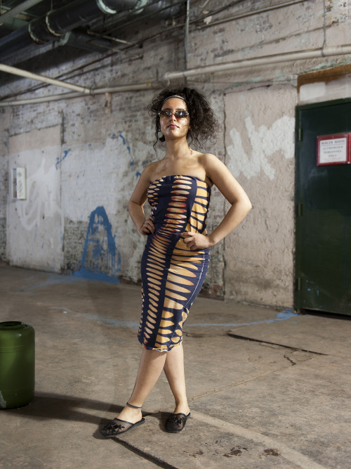
The second collection, designed by Marines Montalvo, is a jarring shift. It relies heavily on printed fabrics, ranging from plaid, to camouflage, to a striped fabric adorned with the designer’s first name. The allusions to luxury brands are evident, and many of the outfits consist of matching tops and bottoms, establishing them as a sort of uniform. Montalvo’s play on patterns are subtle; a black and white camouflage pattern that is doubled over, similar to a printing error, or a knockoff of the iconic burberry fabric with areas that have been digitally altered and distorted. The most extreme example of this is a light purple textile that is printed to depict distressed denim, and then actually torn and tattered in places. It’s effective tromp l’oeil which cleverly highlights the absurdity present in this sort of commodification of damage. This collection seems most focused on apparel’s role as a signifier of status, and is choreographed to call attention to interpersonal interactions, as the models stop in the space and share eye contact before moving on.

image


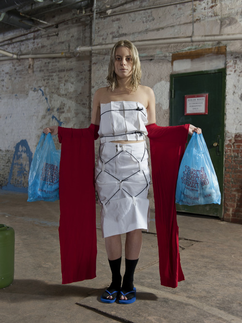
Where Montalvo addressed luxury, Audrey Gair’s collection seemed to instead draw from necessity and thrift, featuring garments that are rough edged, patched, and tied together, and props like plastic bags and styrofoam cups. It is also the only collection of the four that includes footwear, such as bulbous assemblies of athletic socks worn over sneakers, or sandal soles lashed on with cord. Although aesthetic choices such as these run the risk of coming off as a gimmick, here they are tastefully executed, suggesting resilience as opposed to a fetishization of poverty. The prevailing trend of the collection is baggy, sacklike garments adorned with eyelets and belt loops, that suggest an adaptability to a wide range of body types, and perhaps a practical usage as well (à la cargo netting). Other garments feature clever details like panels of terrycloth, or a two part coat that slides off the shoulders to become a set of dangling sleeves, almost resembling those of a kimono.

image


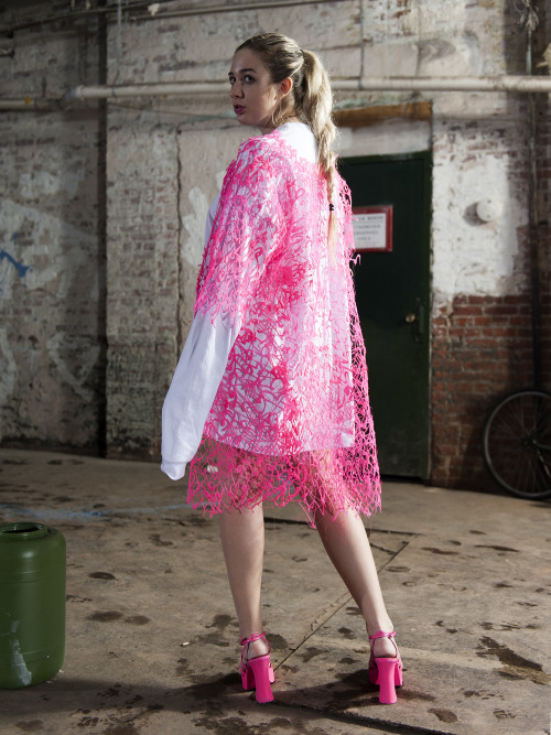
The final collection, designed by Sonja Solvang, assumes a childlike playfulness. Some of it’s outfits execute this quite literally, with oversized sleeves that hang long past the hands of the models, or ruffled tulle skirts that are reminiscent of a tutu. Other pieces are a nod to arts and crafts, such as a paper chain crafted out of leather, or a series of garments fashioned out of a neon plastic mesh that resembles strings of dried glue. Solvang’s work draws parallels between youthful experimentation and garishness in high-fashion which, similarly to Montalvo’s collection, serves to point to the arbitrary lines between class and crass. Of the four designers, Solvang’s garments are some of the most alien, with cartoonish silhouettes that render the models as caricatures.

Something Crossed My Mind is an exercise in juxtapositions, and is successful due to the skill of its players. Maher-Tatar, Montalvo, Gair, and Solvang have each executed collections that are both aesthetically strong and thought provoking, Foster has constructed a fitting environment for the audience to engage with these collections (in addition to creating objects that would function just as well in a different setting), and Co La has composed a score which complements each collection individually without sounding unfocused. If there is a weakness to this show, it’s that ultimately, it still adheres to the established format of a runway show, which can feel linear and reductive (an alternative could be seen in the structure utilized by conceptual fashion label Bless, in which the models are positioned naturally throughout a room, rather than walking through it.) That’s a minor criticism however, and while the show’s basic structure didn’t match the ingenuity of its other components, it doesn’t detract from them either. Overall,Something Crossed My Mind is a show whose sum is greater than its parts, and it succeeds in uniting the work of six artists as a cohesive whole.

(First photo, credit: Nate Grossman, all others, credit: Tim Mahoney)

Real Rocks Are Heavy and Hard to Find @ Gallery Four (Bouché/Syrell)

April Camlin

Real Rocks Are Heavy and Hard to Find, on view at Gallery Four, is a collaboration between James Bouché and Ryan Syrell. The show translates familiar materials through a grammar of signifiers that Bouché and Syrell have developed to address ideas of time, illusion, reflection, and process.

image


From the moment the elevator doors open directly into the space, I lose all sense of the typical feelings of anxiety that permeate most of my art-opening experiences. So much consideration has been given to the arrangement of the space that it becomes impossible to focus on anything but the work. This is a strong, ambitious show. Syrell and Bouché address the ubiquitous material object in a way that both highlights and obscures its materiality, showing us works that become more than themselves, or the ghost image of themselves. This can be seen in a series of five pedestals that are arranged in a linear alignment throughout the course of the show, moving in gradient from light blue to black. Displayed on each pedestal is a grouping of bricks and rope that have been subtly transformed from conventional materials into a new object that feels simultaneously familiar and unknown.

I laughed when, while studying the obliterated homage to Maso di Banco’s St. Sylvester (a 14th century fresco), a fellow visitor leaned over and asked me if the work was part of the show. I could only assume that he was confounded by the presence of a Renaissance painting amongst domestic building materials. By the way, the only information yielded from my research of this painting was that St. Sylvester slew a dragon that was killing a lot of people with its toxic odor. I appreciate these hidden jokes within the works.

Here and there, little remnants of blue tape are left behind, feigning intentionality within the context of the expertly installed works they accompany. In the final room of the show, pieces of sandpaper are treated with a sawdust flocking that form caricature-like references to Bouche and Syrell’s collaborative works. These are also available in a folio as a take-home set.

image


The work is technically and structurally on point while still retaining the feeling of an intuitive process. Forms are placed in orientations of constant activation by the preexisting architecture of the space. And the space itself is one of the most brilliantly present aspects of this show – every element is considered, engaged, and negotiated. Implications of structural elements are placed centrally in every room, giving the feeling of potentials – objects caught in the act of fulfilling their latent capabilities. By repeated use of columns and arches (and the literal or probable acts of obliteration connected to these objects), Syrell and Bouché subvert an architectural canon that is buried deep in our subconscious.

image


It surprises me that I’ve gotten this far without talking about my favorite work in the show: a piece simply titledDrywall. On a large wall, tinted joint compound creates a three-dimensional grid that is so optically deceiving that my eyes would not believe it was flat even as I stood inches away. Full disclosure: I’ve spent the better part of a year obsessing over the binary relationship between the eyes and the brain created by optical illusions. Drywall interprets these complex principals using the most basic materials; this juxtaposition of conceptuality and universality perfectly exemplifies the statement written by the artists for this show. Bouché and Syrell refer to the “threshold of art” as the resting place for the work, speaking of an intuitive making process that is dictated by materials. Their quest for de-individualization is a noble one, although it’s impossible not to pick up on various cues that reference each artist’s personal practice. But I think that’s ok – their two voices are never dissonant together.

(photos courtesy of Gallery Four)

College Ruled @ Lil’ Gallery (Angela Arrigo)

Joseph Shaikewitz

image


The double entendre behind the title of Angela Arrigo’s current show “College Ruled” at Lil’ Gallery is enough to spark my interest. Taken as a declaration, the phrase affirms the exhausted adage that college “could be the best four years of your life.” (Looking through the artist’s past work, a series titled “What Loans?” dares to suggest otherwise.) At the same time, the exhibition title recalls the college ruled notebook paper that one eventually acquires for note taking or mindless doodles. In that reading, the narrower spaces for scrawling text might insinuate maturity and seriousness—an academic coming-of-age.

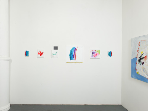
Whether an homage or an affront, Arrigo’s newest series of work confronts the nearly countless days spent in the confines of the classroom in the oftentimes imposed pursuit of an education. The one-room gallery features a suite of paintings that function as vignettes of a homogenous school system, strewn with motifs of graded assignments, manila folders, impasto scribbles, and a folded love note. Throughout the exhibition, the artist demonstrates an impressive ability to translate her subtle forms across dimensions; pockets of 5×7” surfaces hold their own among the smattering of large-scale paintings.

A recent MICA graduate, Arrigo approaches her college years and those that preceded them with an ounce of nostalgia. Scenes of elementary school prompts, wide-open journals, and a blank blackboard actively recall the image of docile students seated behind desks. In the corner furthest from the entrance, a grouping of six small paintings intimate a childlike point of departure for this body of work. The saturated palette simulates a fresh pack of Crayola markers while the swift brushstrokes reinforce the innocent spontaneity of youthful, naïve mark-making.

image


At times, the literal depiction of iconic school supplies falls short in communicating the actual complexities of navigating an education. Such is the case with three small canvases that initiate the exhibition. Each portrays a quiet stack of lined and plain loose-leaf paper that establish the picture plane as a quasi-desktop. However, the depictions of these unmarked pages and circular reinforcement labels verge on banal in the context of the expressive character and narrative imagination that animate the works alongside them.

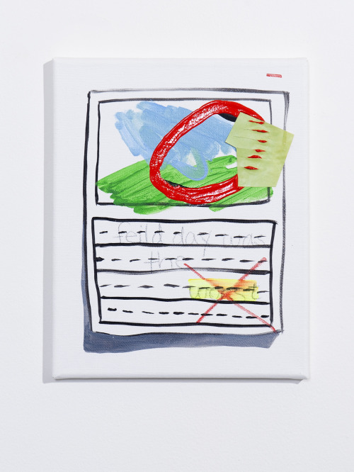
“field day was the worst” is one such highlight—a particularly endearing image that puts forth a rebellious, albeit anodyne renouncement to which I find myself silently agreeing. The canvas is separated into two smaller tableaus. The top half reveals a simplified landscape—juvenile swaths of pale blue and green—overlaid with a brazen red circle and a small, incised cut-out. The title of the work is scrawled in pencil in the lower register within the lined format of a handwriting worksheet. If we take this to be a graded assignment as several markings suggest, then the instructor takes offense with the quiet protest of the word “worst”—highlighting and crossing it out with a definitive ‘X’–rather than the flagrant misspelling of the word “feild.” The work appears to poke fun at a system where freethinking and defiance are stifled more quickly than legitimate errors. The subtle rebellion of the composition contributes to the overarching wit of the exhibition where similarly tacit marks encourage close looking and careful reflection.

image

Perhaps even more compelling than Arrigo’s caricature of the classroom setting is her inspired handling of medium. Her pieces incorporate thick, at times calligraphic impasto lines atop expressive painterly forms. In many of the larger compositions, the textured brushstrokes and now-muted colors of previous paintings bleed through the gessoed surface, alluding to the material lifetime of each object. If painting functions as a record of memory, then Arrigo’s applications of protruding acrylic paint and collage over multilayered and somewhat concealed surfaces metaphorize that very process. The temporal layering of images and viscosities underscores the act of looking back, the polemics of memory, and the allure of nostalgia. The memorializing brushstrokes bring to mind a range of fellow painters ranging from Philip Guston to Liat Yossifor, while the question of painting’s materiality and its relevance to a contemporary moment seems inspired by artists like Trudy Benson, Laura Owens, and Eric Sall. Amid such comparisons, Arrigo’s work emerges as a reflection on the past with a gloss of its material excavation.

If college did indeed rule, then its presence continues to linger in the present. For Arrigo, the act of parsing out this moment creates a likely thematic commonality between artist and viewer and hosts a keen exploration into the essence of painting. While in rare instances this plays out in conceptually sophomoric terms, Arrigo’s new series of work demonstrates a clear painterly perseverance that is anything but elementary.

Photos courtesy of Lil’ Gallery

Girth Proof Vol. 2 (Wickerham/Lomax) @ Springsteen

C. Klockner

image

The trouble with talking about decentralized cultures is semi-obvious; the moment you point to any one aspect of the network, the network becomes immaterial. It’s the source of their power. In that inevitable failure, the first thing to be revealed is the myth of objective observation, of the invisible eye. That is moot to anyone invested in identity politics, but while viewing the Wickerham/Lomax Baltimore reboot of Girth Proof (Dem Passwords, Los Angeles, 2015), I find the constant reminder of both notes comforting.

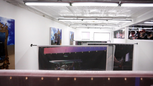
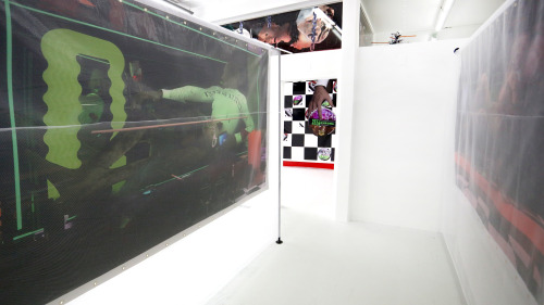
A dense, winding installation inaugurates Springsteen Gallery’s new space, a storefront located across town from their former location in the Copycat Building. Installations in 502 W. Franklin Street’s three connected rooms are multiplied by a labyrinth of four large, mesh covered billboard printouts of CGI male odalisque imagery, dark illuminations of club culture pre and post. The imagery-turned-architecture fragments the gallery into a variety of encounters between TV screens displaying slowly rotating CGI ass purses, framed club paraphernalia references, and a series of Craigslist casted portraits. I navigated the space clumsily while trying to keep track of what I had seen and what I glimpsed around corners.

image

The accompanying gallery text points to exterior components of the show, including BOY’Dega, the entity that Wickerham and Lomax gave birth to as gay dads (using their own description); clues about the sprawling narrative between depicted scenes; and cooperation with the LED Art Billboard towering over North Charles and Lanvale in an eight day display series of the CGI portraits.

Only in researching these supplements later do I truly feel enveloped by the referenced narrative as name drops lead to dead ends. The embossed name plates of unlabeled phone numbers tease (and remind me of a note found in my backyard: “PUSSY EATER: 410-[XXX]-[XXXX]”) and searches for “non-supplemental” content of BOY’Dega prove to be fruitless. The large body of interviews the duo have participated in seems to outnumber critical discussions around the seemingly endless web they have manufactured. Why criticize when you’re not sure you can even point to anything? It does follow that all you can do is ask more questions.

The work is intimidatingly seductive in the way that decentralized cultures often are to those that, out of necessity, carve out cultural spaces as havens from the still standing, but wavering, monoliths of “mainstream culture.” The references towards club culture and web featurettes point to the shift in methods of both cultural organization and media production, using Craigslist as a signifier for the myth of the unregulated forum.

image

While considering the depiction here, I’m compelled by a note from Terry Smith’s book “Thinking Contemporary Curating” (2012); “The task facing art critics and art historians is to unmask uncritical, unhistorical, art market ideas such as ‘the contemporary’ and ‘Contemporary Art’ and replace them with ideas that speak from our actual contemporaneity” (246). Even with the buzzword-style abuse of that word “contemporary,” the passage holds real usefulness in its emphasis on avoiding reductionist tendencies in art production. Girth Proof Vol. II’s embodiment of, rather than illustration of, the sort of “world creation” that Wickerham and Lomax point to here is where the show exhibits great value. In doing so, it avoids the traps of riding on net aesthetics to vaguely gesture towards a kind of contemporary analysis, and instead creates a relationship between physical space, digital space, and implied narrative that forces that analysis.

I am perhaps most interested when the insistence on having a conversation about the pervasive, decentralized characteristics of digital networks and entities returns to the history of networking IRL – where analog methods of organization in club culture, in handkerchief code, and in ride hacking act as only a small selection of examples of cultural organization in decentralized models. In this conversation, as well as in the many conversations that orbit the BOY’Dega narrative, the combination of elements helps to get past a simple reference to the presence of the screen and into the more complex question of how people use that screen.

Images courtesy of Wickerham and Lomax/Springsteen Gallery.

Conflict Unknown @ Open Space (Lale Westvind)

Kyle Tata


image


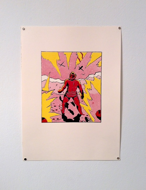
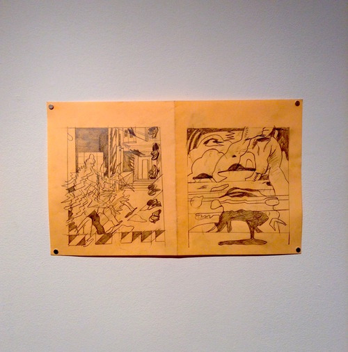
Conflict Unknown: Drawings, Prints and Paintings by Lale Westvind is the latest exhibition at Open Space’s new location at 512 W. Franklin street. The exhibition reflects Westvind’s prolific artistic output by containing an immense amount of work in a variety of mediums. The works on display are taken from, or inspired by, Trial One, Westvind’s third and final book in her comic series Now & Here. A majority of the work in Conflict Unknown are graphite drawings done on approximately 11″x17” paper hung in single rows on the two opposite walls entering the space with larger paintings and screenprints hung on the the far wall. In addition to the works on the wall, there are copies of Trial One and Westvind’s previous comic books on for viewers to look through. This is the second exhibition of Conflict Unknown which was shown in a different format at the Booklyn Art Gallery last November.

Open Space’s poster for the exhibition is conceived in a similar typeface as the original posters for Ridley Scott’s 1982 classic movie Blade Runner. The two share similarities both formally and theoretically in their view of an dystopian, authoritarian environment, but personally, I can’t help but think of this superficial relationship due to the coincidence that Blade Runner happened to be showing the same week in the revival series at the Charles Theater. Both have imagery based around futuristic realms where cold steel machinery and human flesh are simply interchangeable materials that collide into each other in countless ways.

image


The strength of Westvind’s work is how she takes these recognizable and almost clichéd science fiction motifs and perverts them to elicit an original guttural reaction from the viewer. Throughout the exhibition, there are references to different forms of futuristic transportation. The combination of intergalactic travel and the automobile is a familiar one that has been around since the inception of science fiction. However, Westvind reimagines this old trope by rendering the cars and planes in the paintings “Hax 1 & 2” with surfaces that exist metallic and fluid simultaneously. These vehicles appear more like living organisms than the actual human characters in Trial One which sometimes look cold and synthetic. In “Shields”, Westvind mounted three vintage hubcaps to the wall of the gallery, as if to create a realm where automobiles concurrently present themselves as antiquated artefacts and futuristic vessels.

Throughout the different mediums, Westvind’s characters are presented in constant motion, being blurred and abstracted. Her aggressive use of graphite portrays them to be uncontrollably hurdling through space, barely being contained in the two dimensional format. They are almost inseparable from the motion of the environment they occupy and become one with the exploding machinery around them.

Halfway through the opening of Conflict Unknown, Westvind did a reading from the series of Here and Now. As her voice echoed through a guitar amp a seethingly loud ambulance siren could be heard passing by on Franklin Street. This coincidental noise added to the cacophony of Westvind stream of consciousness writing. The siren accompanied the poetic urgency that was felt through the reading and created a synesthetic effect with the visual work on display, instilling an overall feeling of abjection.

image


While Westvind’s Paintings and Prints in Conflict Unknown seemed to challenge the layout structure of the comic in an intriguing manner, the graphite drawings in comparison had a hard time visually existing outside the context of Trial One. The sheer amount of different types of work on display may have been a strength and weakness. While it did reinforce Westvind’s idea of multiple realms existing at once in Trial One, it also felt too much to visually digest for one exhibition. It is hard to have these graphite drawings exist alongside the more developed work and not have them not appear simply as working sketches. Likewise, while both the screenprints and and paintings were compelling pieces on their own, I found it hard to view them together due to their differences in how Westvind handled each medium. The screenprints utilized the flat, hard edged vernacular of both screenprinting and comic books, compared to the paintings which were realized in a more viscous manner accentuating the constantly melting and exploding flesh of the characters in Trial One.

There is an inherent difficulty in creating a new exhibition based around an artist’s pre-existing work. Especially when that work occupies a completely different format such as a book. In this case, Trial One becomes a text with all the work on display nearly becoming secondary information. Conflict Unknown definitely had it’s beguiling moments, but at times felt as if it was too invested in sharing Westvind’s career as a whole instead of focusing on the singular exhibition context of Open Space.

(photos courtesy of Open Space)

Corrupt Images at Terrault Contemporary (Andrew Laumann)

Val Karuskevich

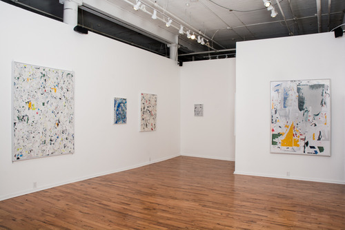
Although closed for a couple of weeks now, Andrew Laumann’s second solo show Corrupt Images ran from 1/2/15 – 1/22/15 at Terrault Contemporary in Baltimore’s Copycat building.

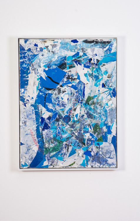
Laumann’s recent paintings replicate phenomena that are often found on city streets along the walls of bridges, buildings, tunnels, and various structures of transportation where advertisers put up posters and graffiti is written. The exhibition consists of nine works, all framed, ranging in sizes from approximately 12″x16” to 3’x4’.

The paintings are made by layering pasted sheets of colored paper with an adhesive and then tearing parts off in order to collapse those layers into textured compositions. These textures are difficult to capture with a camera, and straight-on installation images don’t quite do them justice. A few of the works are completely painted over with a semi-reflective silver wash, alluding to when city anti-graffiti efforts cover spray paint with rectangles of paint. Similar imagery is found not far from the front door of the gallery along the Guilford Ave bridge, just half a block away.

It’s a good looking show; it’s hard not to like aesthetically. The texture, composition, and colors are all well-considered and controlled. The spacing of the paintings, the variation in sizes, and the arrangement create a pleasant experience when navigating the gallery space.

Although the materials and the subtractive process of peeling away paper fall into the category of Painting, the work is almost photographic. For one, each surface seems flat until you get up close and see the texture. But also, the steps to production seem to be Witness, Absorb, and Recreate. Laumann is recreating, instead of photographing, an effect one would find on a walk through the city.

But, why remake these rather than photograph it? The most obvious answer might be that re-creation offers control. Yet, there’s something incredibly unsettling about commodifying a phenomenon that accidentally happens on a city street. The spirit of the desired effect seems to get lost somewhere in the shift from street – to studio – to gallery.

The fragments of text, objects, or figures that might typically emerge (in the street setting) are nowhere to be found. Additionally, there is no supplemental press release that reinforces the process or the conceptual foundation of the work. The combination creates a veil of inaccessability and sterility. All that exists is a promotional poster that reads, “All Natural, 100%, Organic, Grass Fed, Fair Trade, Cage Free, Pure, White, Fucking, Heat” along with a one-page CV and bio that says the artist is self-taught, he’s been Baltimore-based for ten years, this is his second solo show, and that he is represented by a Parisian gallery. I wanted to know more, but when I read that bio it was as if someone confidently whispered into my ear, “Trust me, this is Art. And it’s made by a REAL Artist.”

It’s not that every art show needs a press release, the problem here is that the work doesn’t stand strongly enough on its own. And even if there was a statement, I doubt it would add much. The work is straightforward and there doesn’t seem to be much to chew on. All that the work suggests is that Laumann is a product of his environment.

By making and exhibiting abstract painting, you enter an entire history of Abstraction along with a history of artists making work that points to and is inspired by the street. Looking at the work in this show its hard to not think of the work of Franz Kline, Jean-Michel Basquiat, Jacqueline Humphries, Laura Owens, or countless others.

As a side note, I find this work a bit disappointing as a follow up to his 2012 exhibition, Hallowed Ground, at Penthouse Gallery. It’s important to note here that Laumann’s creative output is divided in two; he’s been the frontman and lead vocals of Dope Body, a punk noise band, since 2008. In Hallowed Ground, he had figured out how to harness the energy of a punk show into an art show. There was a painting made by slamming a skull-shaped object into a metal door, stacks of half-melted milk crates, an elegant photograph of a twisted chain-link fence and more in a multipurpose industrial gallery space that was four times the size of Terrault Contemporary. The work writhed in bravado and paralleled Laumann’s stage presence in Dope Body. There wasn’t a statement then, and there isn’t one now. The difference is that Hallowed Ground left an impression, a ringing in your ears.

I can’t say the same for Corrupt Images. It is safer, cleaner, more put together but ultimately contained in the way that commercialism has learned to co-opt punk aesthetics and gestures. In the past, Laumann has shown he can maneuver around various mediums and artistic movements with machismo. Let’s hope he can combine his recent refinement with the energy of prior work as he builds his practice.

Exhibition Images by Kyle Tata, courtesy of Terrault Contemporary.

Iconscapes @ Freddy, Year of Flowers @ Franklin Street

Allie Linn

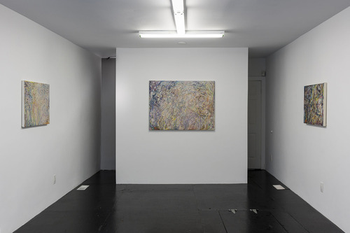
The term “latent image” is generally reserved for the dialogue of photography, but the notion of a hidden or delayed image, either literally concealed or evasive from one’s memory, can apply to the experience of reading any work. In the case of Iconscapes and Year of Flowers, neighboring exhibitions that opened earlier this month at Freddy Gallery and Franklin Street, respectively, that delayed recognition becomes a connecting link between each artist’s practice. While Keith Mayerson’s Iconscapes focus on dreams and the subconscious as the starting point of the painting process, allowing symbols to automatically emerge through the guise of abstraction, the familiar, though contextually cryptic, symbols comprising David Armacost’s Year in Flowers next door force the viewer to work backwards, reading the images lining the walls to understand the artist’s personal mythology. There is a notion of anonymity within both shows; Mayerson becomes a passive liaison between subconscious and canvas, although it ultimately results in autobiographical work, while Armacost uses a visual lexicon of symbols in place of any kind of signature or statement (it’s no secret that these works are his, but nothing inside Year of Flowers says so). As the images within both shows come into focus, the sincerity of the works emerges as well.
image

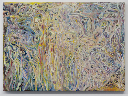
Iconscapes at Freddy Gallery presents six works by New York-based painter, and recent Whitney Biennial contributor, Keith Mayerson. Known primarily for his portraits of historical, personal, and cultural icons, Mayerson veers away from a strict adherence to linear narrative and illustrative scenes in favor of abstracted and vaguely psychedelic fields of color for the show. These works contribute to a larger series of Iconscapes that Mayerson has been exploring since the eighties as on-going attempts to “realize iconic images from [his] subconscious.” Covered in meandering, melting stews of vibrant paint strokes, the paintings fall somewhere between the works of Arshile Gorky, Joan Mitchell, and James Franklin Snodgrass, merging early abstraction and figurative abstraction with obsessive painting techniques evocative of outsider art. 

On first view, the works in Iconscapesdon’t feel particularly new or innovative; they suggest a slew of references and feel vaguely familiar. The intrigue in these works, however, occurs in the crevices between strokes of paint, where the artist has inserted cartoonish eyes and ears and mouths. As these stylized body parts begin to emerge and the space beyond the surface expands, it becomes increasingly unclear which figures Mayerson has intentionally included and which ones have been imagined from the chaos of the marks. 
image

Further clarity arises from Mayerson’s earlier writing from his 2013 exhibition “My American Dream” at Derek Eller Gallery in New York. Showcasing the same six Iconscapescurrently on view at Freddy, this exhibition was accompanied by a catalogue containing twenty-five pages of hand-written musings by the artist titled simply “Letter written on a plane to and fro Columbus.” Excerpts from this essay, perhaps the most automatic work of all by the artist, reappear in Freddy’s press release, but the passages that Mayerson has left out provide a much more direct explanation of the source of these works:

“In my thesis show back in 1988 I hung abstract works – created in part to purposely sublimate my then still ‘hidden’ (at least beyond my circle of friends) desires for other men (by breaking down forms of me and certain individuals I had secret longings for) into eyes, mouths, etc. converging over and through each other in ways I couldn’t do in real life.”

This brief insight into the origin of the Iconscapes – not a dull interest in the figurative possibilities of abstract works or a heavy-handed attempt at overly mystifying the painting process, but a poignant depiction of a young artist navigating his sexuality during the early peak of the AIDS epidemic and a subsequently extremely homophobic culture – completely changed my outlook on these works, several days after seeing them in person. As this catalogue was unaffiliated with Freddy’s exhibition, and the press release for Iconscapes references only Mayerson’s interests in the canvas as a tool for psychological navigation, it might not be fair to place Mayerson’s reflections in the context of his Freddy show, but the stakes seem so much higher, and the results so much richer, when the works’ origins are revealed. 

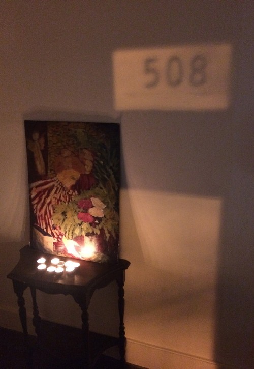
Next door at Franklin Street, David Armacost’s Year of Flowers, presented as a one-night-only event, plays with elusive imagery in a very different way, referencing symbols that feel familiar but have an undefined history. The front room of the gallery is lit only by a cluster of tea candles in front of a painted replica of Edouard Vuillard’s 1895 piece, Woman in a Striped Dress. As the first and only image visible from the street through the storefront window, Armacost’s reproduction on a cheap, cardboard-like material feels like a hand-painted sign or some a kind of DIY icon for a memorial. The reference to a recognizable painting calls into question the origin of the other pieces comprising YOF, and the nod to Vuillard informs the rest of the show: a certain softness pervades the imagery, and Vuillard’s embrace of the painting as decorative object is reconsidered in the context of the contemporary souvenir.
image

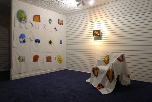
The back room of the gallery alludes to a funeral home, or maybe a caricature of one. The walls are draped with white cotton fabric, the floor is covered with a navy blue carpet, and the subtle fragrance of the candles from the front room lingers in the air. There is, however, a humor that pervades the space, making it seem more like a movie set for a funeral home rather than a real one: in the corner, a chair draped in white fabric painted with outstretched hands is positioned beneath a beaded picture of a bouquet of flowers, seemingly purchased from a second hand store. On the adjacent wall, a dozen small paintings centered on white pieces of cotton are casually tacked up. Resembling t-shirts or another similar souvenir object in their scale, composition and imagery, these paintings depict quick notations of quiet landscapes, more handprints, a red curtain touching the wooden stage beneath, and multiple pink lilies. These small vignettes function as brief windows into unintelligible narratives, gesturing towards the unseen landscapes that reside beyond the boundaries of the images. The repetition of the overly romantic, nostalgic symbol of the flower makes all of the scenes resonate with a certain degree of yearning while still pointing to the language of the memorial. 
image

These paintings are really lovely, soft and immediate in their application and appearing soaked into the cotton. It is unclear, however, what the source of these moments is: Have these scenes been borrowed from postcards or other novelty items, as the Vuillard replica and framed bouquet imply? Or are they the invention of the artist, acquiring importance and history only in their repetition? It might not make a difference, but these works are appealing because of the sentiment of the marks and the mystery they exude, and in lieu of Mayerson’s writing, the absence of any kind of accompanying text to provide any clues is somewhat disappointing. The images remain fairly clouded by an unrealized articulation of their purpose. Perhaps, however, the focus is more on the performance and its conclusion – the sliver of the red curtain in one of the paintings, the bouquet of flowers that is typically presented at the end of the show, the ambiguous gesture of the hand that looks like a wave. Existing only as a one-night event, it feels appropriate that YOF reads as both a “welcome” and a “goodnight,” allowing the images within to exist as lingering, fragmented memories. 

If Mayerson’s paintings become clearer and more accessible alongside the narration of the artist, Armacost’s works seem to prefer to remain somewhat ambiguous. Presented as neighboring exhibitions, Iconscapes and Year of Flowers complement one another in their varying degrees of esotericism. Armacost’s works, alluring in their form and the mystery they convey, don’t allow complete entrance by the audience, while Mayerson’s paintings, initially not very compelling, acquire interest with time. The search for the hidden image – its form, its context, its history – directs the way each artist’s work is experienced and allows for a satisfying exploration within both spaces.  

(Photos courtesy of Freddy and Franklin St.)
xXx @ Current Space (Bouché/Schappi/Judkis)

C. Klockner

The proposal of a BDSM themed group exhibition sounds gimmicky off the bat, like something that might exist as a for-profit museum venture in a Euro tourism zone, but the local buzz that preceded the group show xXx at Current Space Gallery this November indicated more serious expectations. Obviously, the conversations regarding sex practices that rely on a certain level of theatre have a lot of ground to cover when the issues at hand cover power relationships, consensual violence, trust agreements, and so on. These topics resonate with the deeper frequencies in any social sphere since a binary between an inside, theatrical world and an outside, encompassing world relies on the general vibrations that are felt in whichever is deemed to be “real,” be that inside or outside.

image

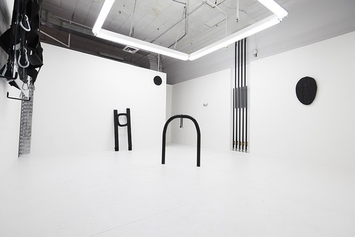
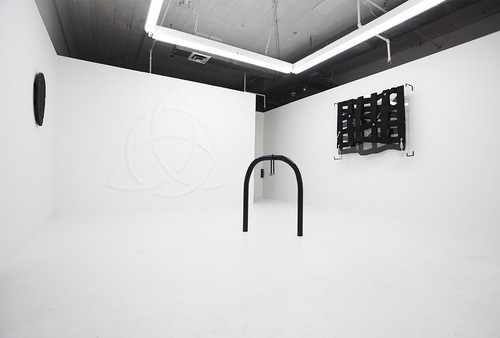
James Bouché, Colin Schappi, and Laura Judkis certainly express this complexity in the space. There is nothing in the show that would primarily lend itself to the realm of the sexual (whatever that may be), but this proves to be no barrier for each object’s recontextualization. The fluorescent glow and a strictly black/white/chrome monochrome palette shared between the artists’ works reflects a gesture towards the surgically sterile. Schappi focuses on surface in a way that attempts to remove his hand from the equation: two of his pieces focus on metal links, one a perfectly chrome plated four ring chain-link (made of cock rings), the other a single bike lock fastened to and balanced on a simply designed bike port. His third piece uses the gallery wall to emboss an old, esoteric symbol (a triquetra) on the dry wall plaster. Bouché uses glass planes, stainless steel, and black straps to work in a related language, while Judkis balances the feel of the space with her black, tar-beaten forms that stand in contrast to the cleanliness of Schappi and Bouché.

The all-business, no frills statement included by the artists focuses on an ambiguity in potential between objects, pointing to an ability for repossessing tools in both directions, the “dark potential” in the everyday as well as the controllable in the violent. Between the artists, Bouché’s pieces are the most attention grabbing. On one wall, uniform black ratchet straps alternatingly attached to floor and ceiling (each with industrial strength tension) support a large plane of glass by matching downward with upward pull. The delicate, wavering stasis and minimal form hypnotizes while, in a corner across the room, another piece by Bouché uses hundreds (or thereabouts) of basic, chrome wall hooks to form a column replicating some gesture of an iron maiden, a sadistic cradle of sorts. Unlike the rest of the works in xXx, this piece relies on a gestalt relationship more frequently seen in painting, seen here with a sort of flickering between the recognized consumer object and the unfamiliar threatening object.

image

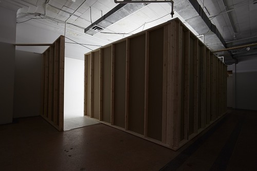
Surprisingly, the most dramatic move in the show is the space itself. I’m not familiar with any instance of erecting a gallery within a gallery, but it was done here with an incredible attention to detail. (Maybe the more surprising bit is that such an ambitious undertaking was made viewable for only two weeks.) The gesture on one hand is domineering, showing the artists could imagine a space better for their work than what Current could offer, but I’m maybe more interested in the way I’m forced to read the gallery walls as theatre veneers marking inside from outside. Walking past exposed lumber and drywall work makes the space have a definite stage left, stage right, entrance and exit. In the conversation about the latent darkness in the everyday, this move has more impact on that discussion and my own meditations on whether the theatrical inside or the encompassing outside has more weight as “truth” than the individual pieces of the show. In the back and forth between the everyday and the violent, what makes one more real from the other?

In a space made as sterile as this one, Schappi’s metal link pieces leave me a little cold with their industrial design references. I’m more attracted to his drywall embossment with its softness and subtleties of craft. In Judkis’ work, the relationship between wood, fibers, and heavy, sticky, blackness is deeply satisfying, but I wonder if that feeling would remain if these pieces weren’t working to balance out the stuffy cleanliness found in every other aspect of the show. That being said, I enjoy each artist’s success in cultivating a heightened awareness for the sensual in the industrial.

image

I spent some time enjoying what the cartoon opposite of this show might look like–low lit, red satin, deeply warm tones all around, that’s what sexuality and romance is, right? Susan Sontag comes to mind here, “There hardly seems to be anything that’s purely sexual: it’s overloaded with other forms of affirmation and destruction that you are declaring when you engage in a sexual act. We’ve been instructed that it’s the central or only natural activity of our lives. I mean, it’s very hard to imagine what natural sexuality could be.” 

The heavy mediation between work and content in this show could be its key to success, since it helped to avoid the quirky, kinky, oops-did-i-say? “shocking” sexual references as often is done in work that edges near these topics. Instead, the artists navigate it in a sophisticated way that resonates outward by tip toeing on the political without seeming didactic. If the focus of this show is on power relationships before sexual practices, maybe that makes sense. It’s always a good sign when nobody needs to rely on getting naked to show that their work on this topic is “seriously edgy.”

(All photo credit to Maxime La)