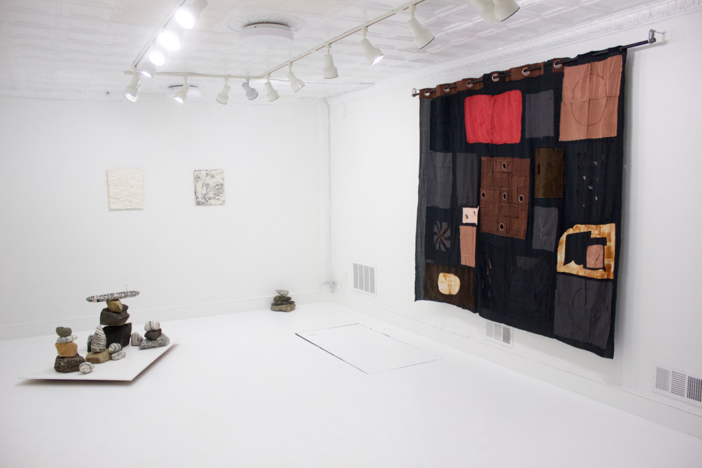
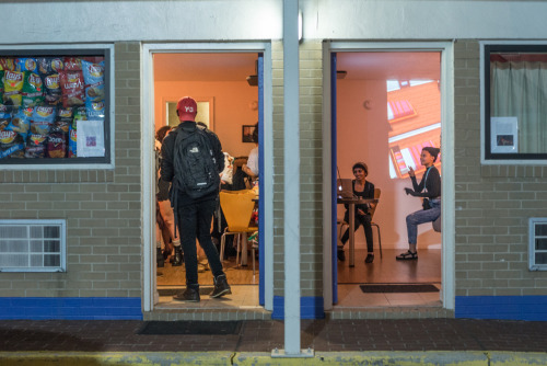
In Open Space, work populates the wall and the floor. Lucia Maher-Tatar and Christina Haines use language of simplistic measure in the recent show Half Past, Two Rocks Back, denoting time through the physical and, in this case, the rudimentary and sometimes the rudimentary domestic.
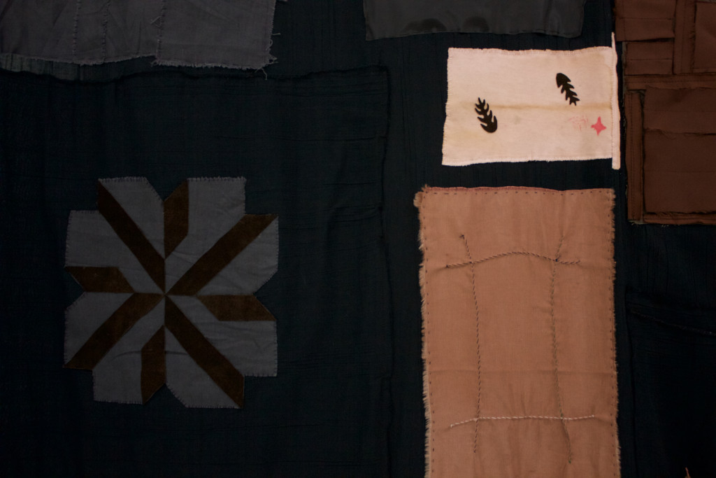
Lucia Maher-Tatar’s piece A Rook, A Rock, A Crooked Café is hung on the wall from a rod. It talks like a curtain, but acts more like a tapestry. A conspicuous but complex composition creates a space where time is imprinted into symbolic anecdotes, spilled out, nonlinear and landscape-like. What lay obstructive were moments where the craftsmanship felt filled in, such as a shimmery swatch of black hastily stitched rather than carefully placed, leaving disjunction from the beautiful and the strange— little waves puckering in a brown rectangle, like they would delicately make the sound of a mouth rising out of the water.
A ROOK, A ROCK, A CROOKED CAFÉ (MAHER-TATAR)
A ladle made of links/a scythe? Forceps near a vessel. Stitches to the left, some careful, some not. Leaving some strips vacant, for rear access, or for economy. Grommets large and in numbers, that allow dedicated access to the inside of the piece. Just a big pocket.
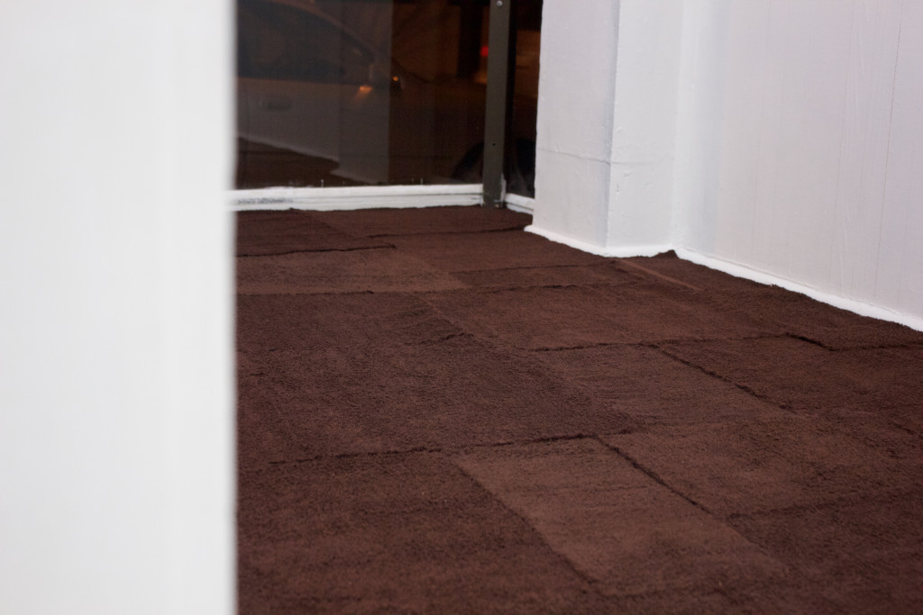
The cutting, stitching, and displaying of personal symbols allows the artist’s mind to come through their hand. The work combines the liminal as object and as function. The same could be said about the other Maher-Tatar piece, Untitled, involving brown patchwork terrycloth on the floor of the windowed display areas.
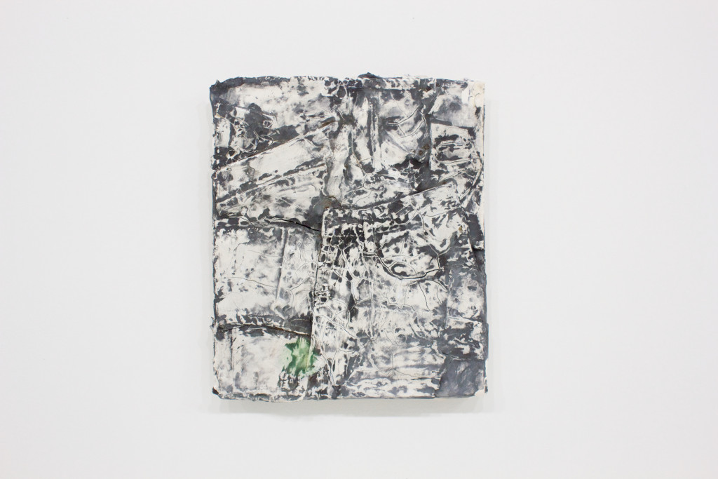
BURNOUT 3 (HAINES)
Christina Haines’ work includes six rectangular pieces on the wall all titled Burnout 1 through Burnout 6 and a glazed ceramic and rock assemblage titled A Tree. A Rock. A Cloud. The Burnout pieces have a luring quality; for me, it could be an attraction to the texture of destruction. These pieces are cracking and reveal sediment, washed over and dried, showing the waistline of a pair of jeans or sweatpants—starting and stopping at the edges of the rectangle, as if I were looking at a thumbnail of a body, buried in the river.
They became landscapes. Belt loop is a bridge. A cracked, then peeled opening (the only one) leads to an underbelly. Some pieces have little green dots. A man has a small green tattoo behind his right ear. The pieces themselves have goose bumps.
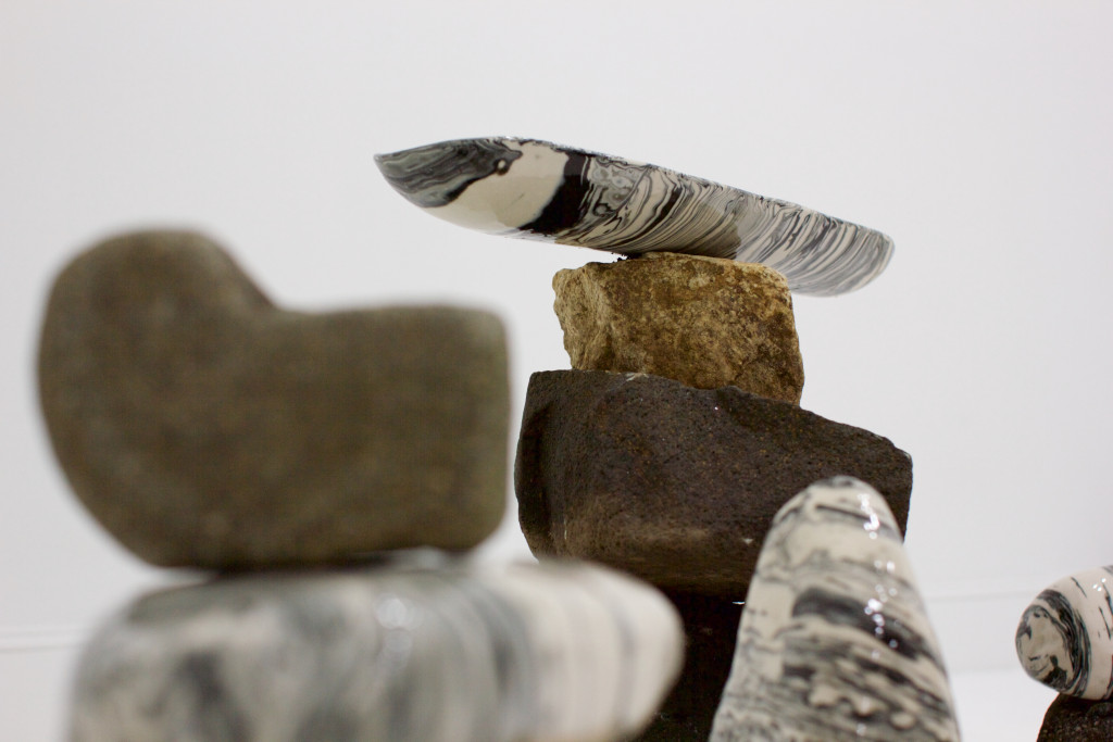
A TREE. A ROCK. A CLOUD. (HAINES)
I found them almost too laconic. The nature of the material blocked off into rectangular shapes was very tidy. Without matching directness in the imagery, they almost meander into dullness.
In the piece A Tree. A Rock. A Cloud., the ceramics look like polished stones, perfect objects, revealing layers from formation but with sensually smooth and unassailing surfaces. These ceramics felt texturally uncomfortable stacked, sandwiched between their pre-manicured cousins, as if they might scratch. I have to remind myself I am talking about ceramics and not actual polished stone.
UNTITLED (MAHER-TATAR)
The artists as a coupling: Haines let the material speak unhindered, and Maher-Tatar intrudes on the fabric’s material quality, neither insincere, and both intelligent observers of their respective material.
A friend says, “I keep looking for the rest of the stuff.” and I must agree. There is a craving for more to grasp onto. And I think it has less to do with “stuff” and more to do with striking the senses of the viewer. Give me something to grab, or put me in your place. The style is LARPing, conspicuously mimetic, though there should be a push towards an embedding, which I know they are capable of. My hope is for them to wield their sensibility with a stronger conviction.
Half Past, Two Rocks Back is open on Saturdays through March 26, 2016 at 512 W. Franklin Street, Baltimore, MD 21201.
With McLuhan as the de facto point of reference when talking about the current shift in dominant medium, it is easy to forget that much of his work specifically hinges on analyses of print, rather than film and television. His book The Gutenberg Galaxy was the 1962 goldmine of technological determinism and medium dissection that framed modern society as a product of the cold objectivity and linear qualities of the printed word.
Even at the time of writing, the rise of more participatory media signaled a shift from that once central form – so how is it that 50 years on even the worst forms of puff-periodical still manage to hold on? Despite a stumbling gallery text, Jeremy Cimafonte’s current installation at First Continent manages to point towards a frustration with this long announced “death of print.”
“Print is a dead man walking, perpetually revived by the institutions in need of it most. Pragmatic and necessary at its advent, the path towards its irrelevance would not be seen without the extensive development of entire industries around itself.”
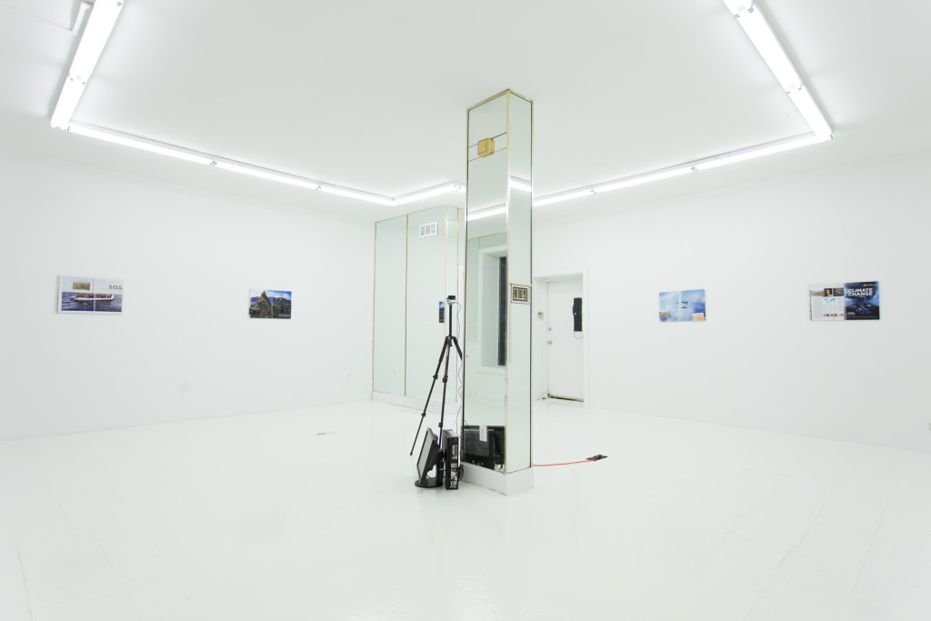
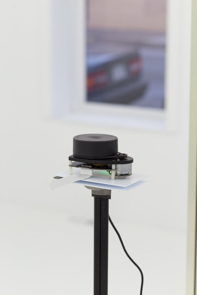
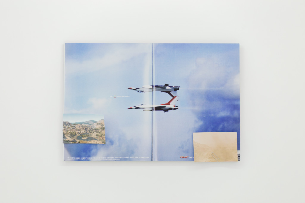
First Continent’s mirrored, fluorescent and gold space reflects four aluminum mounted prints, “slightly larger than life” reproductions of magazine periodical spreads. Each employs a casual use of magnets and paper clips to attach small, digitally rendered prints of empty (though not barren) landscapes to its surface. Adjacent to the gallery’s central mirror column stands a steadily spinning, tripod-mounted mechanism introduced as LIDAR (simple enough: “light radar”).
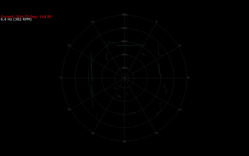
The LIDAR functions to gather an array of simple data points; the machine measures the distance of its laser from the first object its light hits, so while the laser spins and makes dozens of measurements per second, a monitor is able to display a primitive visualization of the space that it is in. Sort of a wobbly 2D drawing of a room.
My experience with interactive objects in galleries is pretty consistent; their attempts to grab my attention usually backfire – it is the passive objects that end up pulling me in. That said, the very presence of the machine goes beyond the role of gallery plaything by referencing a tradition of work by Harun Farocki (arguably the most important politically driven artist/filmmaker leading into the 21st century), Hito Steyerl (in her work such as How Not to be Seen: A Fucking Didactic Educational .MOV File), and the high stakes conversation surrounding non-human observation.
That work reliably orbits the real questions in ethics of the military industrial complex. Here, there’s something perhaps less sincerely concerned, i.e. less a sense that the subject has something at stake. The LIDAR’s presence gestures towards a self-proliferating industry, one that doesn’t actually require the support, the gaze, or even the presence of a human audience. Perhaps the only sensitive reading of this arrangement is the LIDAR’s placement next to a mirror, revealing its inability to properly “see” itself in reflective objects. That said, this reading seems anthropocentrically defensive – a position that I’m not sure Cimafonte believes in.
The magazine spreads depict the most exploitative and manipulative methods of image production in advertisement, so it is easy there to follow his critique. An ad for Skecher’s shoes announces its new moisture wicking technology by cutely proclaiming “CLIMATE CHANGE” while a GMC ad shows military jet planes frozen in the midst of a flashy flight maneuver with the text “PRECISION MATTERS,” playfully sidestepping the destructive purposes for these machines. However, perhaps the real depth to Cimafonte’s arrangement of reproduced objects is that the formal language of these images is uniform. Any difference between the image selling jets (“advertisement”) and the image of a single man hiking through the woods akin to Caspar David Friedrich’s Wanderer (“content”) is purely situational.
The cover of nihilism that shrouds this work is similar to an attitude of apathetic critique that is easily recognizable these days, one that seems to stem from a feeling of disillusioned disempowerment. Because of that, any simple satisfaction from this display mimics the feeling of opening a new, untouched product: sweet but short-lived. Ultimately, the presence of the LIDAR is what brings this work into value by opening a conversation around complicity and finally brings up the question, “What actually perpetuates such a zombie industry?” – before (hopefully) recognizing the patterns and paradigms that obviously don’t end on the printed page.
Jeremy Cimafonte is currently on view at First Continent in Baltimore until February 20, 2016. Images courtesy of First Continent.
My memory of “The Serial Garden,” a short story I read when I was ten or eleven years old, is foggy, but the plot revolves around a boy who assembles a paper model garden from the back of a tasteless cereal called Brekkfast Brikks. After discovering that singing the Brekkfast Brikks ode written on the box allows him to enter the garden, the boy begins to withdraw more and more into the partially real, partially fabricated landscape that he has constructed both physically and, possibly, mentally. Inside of the model garden, large portions of the idyllic flora and fauna fade into a dreamy fog where the neighboring models have not yet been attached. Until the adjacent models are linked, the garden exists as an unfinished world.
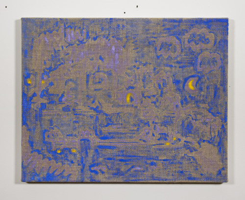
August Moonlight. Oil on linen. 2015.
I was reminded of “The Serial Garden” for the first time in many years, while viewing the simultaneous flatness and hazy depth of the mostly blue and lilac August Moonlight, one of ten paintings by Ryan Nord Kitchen recently on view in “Summer Paintings” at Terrault Contemporary. The reliance on signifiers of the landscape (moon, tree, cloud) hinders August Moonlight from falling into total abstraction, but the ample use of blue and exposed linen accentuate the painting’s surface. Loose outlines of clouds and bushes in the foreground trail off into a collapsed, blurry backdrop in the center, drawing on traditional elements of perspective to create a deep space while concurrently acting as a wall, obstructing the landscape behind. The distortion of the dryly applied brush marks does somehow translate into a muggy and heat-shimmered atmosphere, and there is something inherently magical about a garden bathed in blue when the familiar urban landscape so frequently glows a noxious orange.
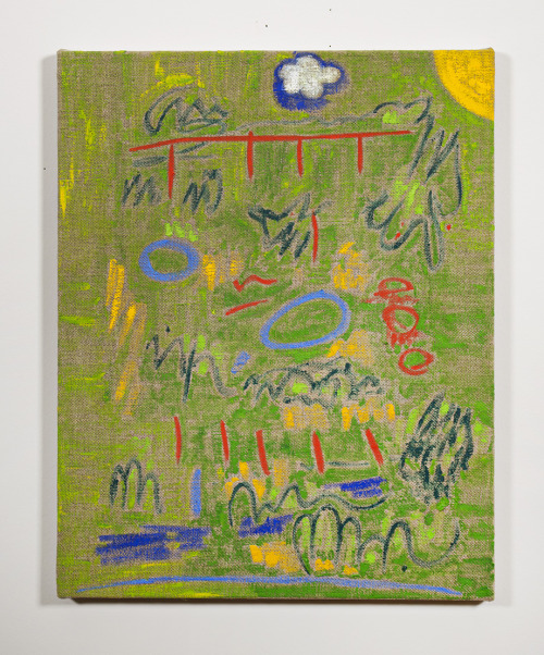
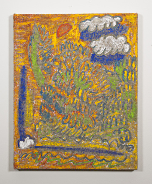
The palette for most of Kitchen’s paintings relies on one dominant color straight from the tube, interspersed with other primaries. The childlike color and mark making is most effective in works like Ponds 2, a field of green speckled with an archetypal corner sun, a puffy cloud with a perfect drop shadow, and a series of red tick marks making up a bridge or jungle gym. The pure yellow of Summer Painting, too, functions as a warm ground for a landscape of bushes and clouds, emanating heat and feelings of mirage and distortion. In some cases, the deliberate wiggle of a line even closely resembles a word, almost spelling out “wind” or “pond,” but ultimately these lines dissolve into indecipherable loops.
Ponds 2. Oil on linen. 2015.
Some of Kitchen’s compositions seem to borrow elements from Chinese shan shui (aptly, “mountain water”) scroll painting, stacking mountains and skies and suns from multiple points of view, especially in the more graceful linework of Garden and Fountain. Fittingly, many of these Chinese landscapes, primarily from the Tang, Song, and Yuan dynasties, depict nature as a place of retreat or sanctuary in times of political instability. Perhaps Kitchen’s paintings do the same, relying on the garden as a space for escape and blissful daydreaming amidst a grim political climate. The only accompanying text for the show, “Some are cloudy days and others are sunny days,” mimics the childlike mark making of these paintings. What does it mean to equate the unending atrocities of recent current events (a texas grand jury declined to indict anyone in the death of sandra bland, boko haram, now ranked as the world’s deadliest terror group, continues terrorizing nigeria, recent mass attacks by isis in beirut and paris) with cloudy days? The depicted gardens here provide, as so many before have in the canon of landscape painting, a temporary retreat to a saturated wonderland that feels very pleasant, if slightly naive.
Summer Painting. Oil on linen. 2015.
Even after all of the Brekkfast Brikks models have been assembled in “The Serial Garden” to form a complete garden, the boy returns home one afternoon only to find that in the midst of spring cleaning, his mother has burned the paper model in the furnace. There is no trace of any other Brekkfast Brikks boxes or means of returning to the utopian garden again. Maybe it is a reminder that these moments of escape can only be short-lived. Kitchen’s depictions of perfect, summer days likewise can only momentarily provide a distraction, but for that moment, they do emanate a certain tangible warmth.
I especially appreciate when an idea is courageous enough to venture into the “real world,” its “real problems” and “real communities” exponentially more apparent than in the temporally frozen space of an institution.
Six @ Six was held in the Unpretentious Motor Inn with free Wi-Fi that is Motel 6. The rooms that were rented/parceled out were the six rooms closest to the entrance of the Motel itself. The show spaces were ground floor and all in succession to one another. I did not find much to engage with in a large percentage of the work exhibited in this show, which is not to be considered a demerit to the work itself. I believe regardless of what the work may have been about, I found myself put at an incredible distance from any of that prospective meaning by the mechanics of the works’ handling of the site.
Some of the inconsistencies I find with the show become more apparent when it is compared to a haunted house (which the show could have been easily mistaken for). People were led in groups into highly thematized spaces where we witnessed various amounts of acting/performing. There was lots of laughter and an undeniable giddiness in the air. This is not successful in that most people go to haunted houses so that they may be entertained by being scared. In an endeavour to be entertained, most people pay for a modular experience and, with that awareness, the experience turns from one of being scared, saddened, or surprised to one of being entertained, which might be analogous to the modularity experienced when viewing art.
It may have been this expected modularity that caused the motel rooms to feel more like sets rather than real spaces being responded to. If it was too scary, one could, at any moment, stop or remind themselves of the simulation’s presence. It is a form of spectacle that is especially apparent within performance; it either works or it doesn’t (it seems).
What I found to be especially frightening was the light emanating from the second floor rooms atop the exhibition. It was suggestive of another presence outside of the work/the group of mostly young people. It would be wrong to assume that whoever was in those rooms was using them for the motel’s intended purpose; it may have in fact been for equally bizarre reasons as the show (though those reasons were hidden from the public eye). I believe the foreignness of the work being presented at the ground level led me to feel as though everything else was just: everything else. This is an imposition that I don’t think the show was interested in enacting. The art becomes the art and its spectacular showing is so loud that it groups everything else together as “other.” Motel goers become thematized into being exactly what we think of “them” to be.
Despite some of those shortcomings, I found the sixth room of the show to be incredibly successful. The room, directed by Marcelline Mandeng, Keenon Brice and Emilia Pennanen was most striking in its avoidance of giving the viewer anything they would immediately expect or want, things they probably received in the rooms preceding. Viewers were denied the assumption that they, too, would have the same metaphysical implication of modularity, or distance, that we usually expect to have while looking at an artwork.
The door was locked shut (though this was not the only room to do so) and the viewer waited to be allowed in. All three performers were wearing masks and rarely spoke. The door would fly open and Marcelline would quickly pull out a gun and hold it to viewers who were otherwise expecting to be allowed in (they were not). If they were lucky enough to be let in, they would be pushed to do things that some believed were pushing the boundaries of their own personal limitations. A woman was made to leave the room after having her hand dunked in what appeared to be a lube-like substance. A friend of mine was escorted out after having a pomegranate smooshed against his face and shirt while being told to call his mother and count to one hundred. Another friend of mine never got the opportunity to go inside the room because they never let her in. I even heard that someone was thrown in the shower and soaked.
People want equity, people don’t want to get their clothes dirtied or to be treated in a way that might discomfort them in a nonconsensual way. That said, what could have been a better embodiment of the atmosphere exuding from Motel 6 for the two hours that the show took place? Emilia’s, Kenan’s, and Marcelline’s room remained in avoidance of becoming a spectacle because it remained true to the individual’s experience rather than focusing on the politics of curation or performance, politics that don’t register with importance given the site’s context.
Six @ Six was a one night only group show at the Motel 6 on North Avenue, featuring six site-specific installations and performances. Work by: Forced Into Femininity, Julie Libersat, Sashenka López & Miguel Mendías, Marcelline Mandeng & Keenon Brice & Emilia Pennanen, Adam Void, and Laura Weiner. Curated by Miguel Mendías.
The Motel 6, 110 W. North Ave, Baltimore, MD 21201 (November 6, 2015)
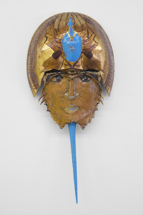
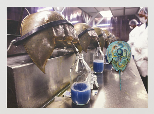
The fate of the horseshoe crab seems to be dismal and worth the attention of an experienced artist’s touch, one that many would believe New Mexico artist Puppies Puppies to have. One might catch themselves thinking: this seems like an important project, I’m surprised more people do not know about this, as they leave the Freddy Gallery on West Franklin. But are we to believe that Puppies Puppies solely purposed this show to raise awareness of a ‘forgettable sea creature with a hidden chemical superpower?’ I feel there is more to discuss here.
The most recent exhibition at Freddy Gallery features painted horseshoe crabs and vinyl works in addition to a live performance. The work is seemingly focused on giving a visual explanation of the LAL test, which involves the use of a chemical found only in the amoebocytes of the horseshoe crab’s blood cells. “Pharmaceutical companies burst the cells that contain the chemical, called coagulogen. Then, they can use the coagulogen to detect contamination in any solution that might come into contact with blood. If there are dangerous bacterial endotoxins in the liquid- even at a concentration of one part per trillion- the horseshoe crab blood extract will go to work”- by turning the solution into a ‘gel’ substance. Nonetheless, to paraphrase the press release, virtually every American who has ever received an injection has been protected because we harvest the blood of the horseshoe crab.
I believe the most critical part of the exhibition lies on the back of the press release itself.
Hi this is Puppies speaking on behalf of HorseshoeCrabs:
The horseshoe crab… It has evolved onnnnly so much as to further its existence & existence it has achieveddd…. 445 million years worth….. horseshoe crabs and paintings seem to relate in my mind. They are expressions that have survived the test of time. By linking the two I’m expressing my need as an artist (not by me being the actual artist that painted the paintings) but my need to present the paintings in this context. Maybe these expressions are addressing my need to survive and to hide under many layers in order to do so. To understand my fleeting existence but know that humans like me will continue to paint. To breed on the shoreline in shallow water only to propel the existence of my expressions and the expressions to come later on, I feel very deeply for these creatures.
It is very tempting to digest this direct statement from Puppies in a binary sense (them commenting on a relationship between a human and external [natural] world). This would be a very stale modern take on an issue that, for the most part, a large percentage of us have gone our whole lives not caring about. Though Puppies only mentions man and horseshoe crab, I believe him/her to be outlining a more overarching network of thoughts. I believe it would also be very tempting to spout a thematic ecological discussion that would leave us all feeling very sorry for these poor, poor creatures. If we do choose to take thatroute, how are we then supposed to feel about painting? How are we then supposed to feel about our own reproductions through the everyday (facebook, snapchat, everyday performative gestures, etc.).
Puppies speaks about the need, obligation and instinct to procreate in both the production of paintings and within the horseshoe crab population itself. The relationship that Puppies finds between the two owes itself to many more things than just the initial similarities one may find. I begin to think of all the other happenings required for the two processes of production discussed earlier to take place. I do not want to view this relationship being described as one that temporarily floats above the mechanics of the everyday. I think of the full moons and high tides necessary for a typical horseshoe crab mating season, or even the worms and clams that form the horseshoe crab’s regular diet.
The average contemporary painter steps outside their mating process as they journey to the local art store to pick up the necessary paints, stretchers and canvas. As one starts to form a list of every thing related to the process of duplication, mating or ‘creating’ (as the romantic painter would believe) and then a respective list of all the things related to that long list of things first handedly related to the original act, it changes the way we speak about things commonly idealized as being autonomous such as painting or horseshoe crab mating. I think now we are drifting towards a more Latourian approach to dissecting just what this show is trying to dance around. If we take, for instance, French Sociologist Bruno Latour’s actor-network theory (which treatsobjects as part of social networks) not only does it do the job of removing humans from a metaphysical top-tier in any analysis we try to mount, it also mobilizes horseshoe crabs as a driving force in that same relationship (able to act or participate in that same list of networks). If we instill within the horseshoe crab, an ability to act or participate actively in a system of networks (not through animism or our imagination, but rather through a pseudo flattened ontological mindset) we begin to tred into a conversation that is more entertaining and definitely a lot less lonely. We become less lonely in a sense that we may begin to realize we share the stage (as both humans and artists) with a lot more actors who have just as much if not more experience as us, that population no longer swept to stage left and labeled as other, everything else, or even people(as some ecological discussions tend to drift towards). To be perfectly honest, a hyperobject such as a horseshoe crab is a great stage partner to have.
The instinct to reproduce (whether painting or horseshoecrab mating) may not be one that is mythical or something that we humans or artists should find unbelievable and/or beautiful. The horseshoe crab may in fact be acting within its networks and among its set of alliances (which give justification for its existence not in a sense of purpose but in a pure empirical sense). As the horseshoe crab continues to breed on the shoreline in shallow water only to propel its constant ability to act, to change and grow (not so that on one far off day it may be free to live peacefully on its own, but rather for the sole purpose of expression, of acting), painting continues along a parallel trajectory. Painting can so often be a dreamy, mystical process of magic that happens when an artist is in their studio. Here, Puppies suggests that the initiative to paint is the same as a horseshoe crab’s performative act of reproduction. The fewer alliances an actor forms or has, the weaker their grip becomes on existence, therefore, painting (and, to a greater extent, art) survives (and is beautiful) through its alliances with other networks and its opaque malleability.
I feel that both the painter and the painting should not colonize their way through the everyday. It may be because of this notion that makes it a perfectly appropriate move for Puppies to have not painted or even fabricated any of the visual components of the show. The fabulous myth of the painter lives on. Their ‘shared stage’ allows the perpetual act of recreation and duplication of painting to continue unfettered (even more so than the typical show we have become used to seeing). Puppies truly connects to this sea creature not in an animistic-type sense but in a sense that they are comfortable enough to share the stage. To say (in this instance) that it does not in any way really matter who painted or fabricated each piece (be it a professional artist or a more visionary-type painter), that would not be so bizarre would it?
Perhaps in remembering the artist’s various trips to the art store, high tides and pb&j’s we may begin to derail the magic of the artist and of ‘nature’ and understand our own initiatives as well as those around us as we begin to share Puppies’ feelings towards this forgettable sea creature.
HorseshoecrabsHorseshoecrabs is on view through September 26 at 510 W. Franklin Street, Baltimore, MD. All images courtesy Freddy Gallery.
Joint published with Temporary Art Review. Find this review in short form at their site.
It is fitting that Ajay Kurian’s show at Rowhouse Projects uses the word “work” in its title: Work Harder Under Water. The mega exhibition, consisting of three floors (several rooms to a floor) indeed shows a lot of work. The install utilized a multitude of media including the aroma of freshly fried fish prepared by Kurian’s mother, and served, at times by the artist himself throughout the opening. The home cooking and inclusion of family nicely complimented the ever-present domestic atmosphere of Rowhouse Project’s interior on its opening night.
The home cooking was not the only reference to consumption or childhood in the show. Upon entering the foyer of the house, you were greeted by a sculpture of a black frog serving a speaker on a platter garnished with an assortment of faux leaves. Adding to the prankish absurdity, the frog’s pants were pulled down revealing heart patterned boxers. Catching the waiter in this goofy yet humiliating state of undress was erksome and there was a sadness underneath the lightheartedness of this sculpture. The encounter with the humiliated frog waiter as an entry to the show is emblematic of the title of the exhibition, “Work Harder Under Water.” The waiter’s work is undermined by his appearance of ineptitude. The voyeuristic quality of this moment was just a taste of what more was to come further on into the exhibition.
In the same room, a caricature of a high school aged Kurian was silkscreened on the maroon red wall in butter. The cartoonish portrait depicted the artist as a hairy ape with a human face. The greasy substance made the image only faintly visible and suggested certain racial slurs like grease monkey etc. The ape-man caricature is particularly poignant considering the press release for the exhibition, which details the artist’s experiences growing up as a person of color around the time of 9/11. “The membership into a white world that I had so assiduously earned was then called into question,” (speaking of the post 9/11 political climate). “The jokes and playful fears manifested in suggesting I better not grow a beard when I go to New York were meant to show that I wasn’t a terrorist, but that I’m one facial hair mishap away from fitting the description,” reads the press release.
Continuing through the house, you came to a beer-pong sized folding table supporting a ten gallon Igloo water cooler in bright orange (a humorous decoy to the beverages typically provided at openings).
Within the belly of the cooler was a silver ironman looking mask submerged in a lemon-lime colored liquid. The way the mask glimmered under water (another tie in to the title of the show) resembled shiny change in a fountain, tossed in for good luck. The liquid softened the exaggerated masculine features of the mask making it appear more as an illusion of masculinity rather than a symbol of it.
Just past this room, Kurian’s mother fried the fish in the house’s kitchen. The staging of this scene reads like a snapshot made to be viewed in real time. To quote Gaston Bachelard in The Poetics of Space, “We realize that the calendars of our lives can only be established in its imagery.” Through this scene, the theatre of memory is revisited and the physiological reverberations of the act are absorbed in the walls of the house along with the aroma.
Positioned there on a wooden shelf was a derelict sculpture presenting a much less edible food; two Styrofoam containers from Cup Noodles were placed several inches apart. In one of the containers was body hair from Kurian soaked in about two inches of Neem oil. The adjacent soup container held the recently extracted molars from the painter Jamian Julliano-Villani, also soaked oil. These abject cast offs can signify our mortality while also provoking disgust at the fate of our ultimate decay and the messiness that goes along with it. The primal body is treated in pieces and sorted as a doctor might while performing an autopsy. In this tableau, the fragility of the body is gently contrasted with the stark materiality of the synthetic soup containers.
The oil has Old Testament significance as well. Oil as a magical material, one that can mysteriously extend its own life, etc., offers a trace of hope.
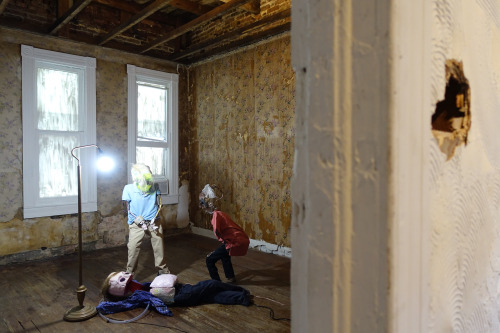
Up the stairs and to the right is a large room in which three child-sized figures engage in a homoerotic display of pre-prepubescent debauchery. One of the boys (he had a clear piece of vinyl tubing in place of a phallus indicating that he was male) was urinating into the mouth of another figure positioned directly beneath the first while another one of the figures watched in giddy anticipation. Or was it horror? These figures looked like skeletons from hell dressed in Old Navy mimicking a frat house hazing session. Physically the “boys” were in different stages of decomposition or deconstruction. Parts of their armatures were left exposed. Their wigs hastily positioned atop uneven skulls. The voyeur of the group, the child who was not peeing or being peed on, had black skin while the other two characters skin could be described as white. I am having a hard time deciphering what the significance is for the black kid to bear witness to the sadomasochistic performance of the white children but to say that it was a hellish scene and the figures all appeared to be demons in it.
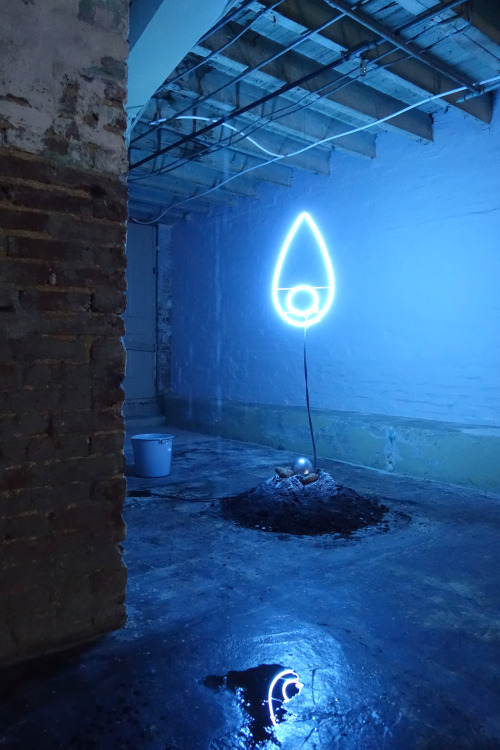
The fluids from this perverse vignette trickle down the house, unseen, literally soaking the foundation of the institution in the depravity. The “urine” eventually reaches the intimate space of the basement where it is caught in strategically placed cookware (pots and bowls). The basement or cellar of a house signifies the irrational. According to Bachelard who wrote; “In the cellar, “rationalization” is less rapid and less clear; also it is never definitive.” If the structure of the house mimics the human psyche the subterranean space of the basement, inherently dark and damp, is where secrets are kept. “The cellar dreamer,” states Bachelard, “knows that the walls of the cellar are buried walls, that they are walls with a single casing, walls that have the entire earth behind them. And so the situation grows more dramatic, and fear becomes exaggerated.” It is where one might give in to temptations, or regress to the primitive.
Perhaps this is why, in this same space Kurian hung electric neon light in the shape of the neighborhood watcheye pointing out the relationship between light and vision. But in this case vision is also a stand in for power. The neighborhood watcheye, a symbol for vigilantes, disrupts the nature of the cellar. The cellar cannot be a space to stowaway childhood fears because it is under surveillance. “But the unconscious mind cannot be civilized,” Bachelard writes.
Back upstairs, themes of race, power and consumption are subtly carried through in a video of a black police officer puppet attempting to eat his arm. Using the body and a nonsensical gesture, the piece looks like Sesame Street appropriating Vito Acconci’s early video work.
The show utilized every corner of the space with objects both deeply rooted in personal narrative and universal concepts; race, coming of age, consumption, violence. Children’s toys were used in several sculptures tracing the subtle significance of those objects on the psyche of the adult they help to shape. An oversized Jacob’s Ladder hanging in the stairwell of the house was particularly metaphorical. Climbing a Jacob’s Ladder does nothing to bring you forward while climbing the stairs in the house is what one must do to see the piece. The Jacobs Ladder, like a stationary bike, contradicts itself. It is the children’s equivalent to the myth of Sisyphus summed up in one elegant object.
The installation also made exciting correlations to Bachelard’s theory that the structure of the house parodies the human psyche. The functions of rooms of the house correlated poetically to the sculptures they harbored. In several pieces the artist used water or, “being under water” as the title phrases it to symbolize how one might struggle with the themes presented in this show. Like trying to run in a dream, working harder under water is futile and all efforts at it are ultimately doomed to fail.
Work Harder Under Water is on view by appointment only from September 26, 2015 through November 14, 2015. All images courtesy of Rowhouse Project.
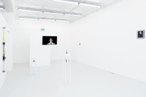
To safely light one’s hand on fire, first apply a sodium polyacrylate polymer. While water would run right off one’s hand, the polymer holds large amounts of water in gel form, protecting the skin from the flame. The promotional image for Watching Things Burndepicts a hand lit on fire using this method. The show’s poster, coupled with the title, tells me much about what I should expect to see: controlled chaos, staged fire, and the intensity of heat both with and without the burn.
Izabelle New’s candle and wax works are the most immediate reference to the show’s title. New’s cast apple and asparagus candles are scattered throughout the exhibition and were burned during the opening reception. No longer lit, the wax is frozen in action as it puddles, drips, and spills out onto the floor. Most noticeably, at the entrance, a wax candle is melted down to an indistinguishable mound of goo, while its handsome counterpart—a candle asparagus, titled for Julian—stands upright across the room. The potential of the candle is to melt away.
Unlike the candles, New’s work near the gallery entrance is concerned with preservation, rather than entropy. Fully bloomed chives covered in wax rest on a windowsill. Tension is placed on a single flower that has fallen off its bloom. The title of the work, your laughter comforts the dead, is a line from the poem A Tree Within by Octavio Paz. Paz uses the tree as a metaphor for the mind and spirit, which both grow and die—“born in the memory of an old women/ and you turn it into a flaming carnation.”
Jason Benson’s Untitled works share (but complicate) this notion of preservation. Clear tubes mounted with plumbing hardware contain paper with printed notes, moss, plant debris, and piss-yellow resin. The notes on paper are preserved in a staged temporality with resin bubbled in faux movement and plant debris that suggest rather then show natural growth from the enclosed notes.
With the tubes mounted flat against the wall, only sections of the printed notes are legible. One note reads, “Natural_Born_Killers Directors_Cut_ [1994].” The referenced film is a dark comedy about two murderers and lovers who are glorified by the mass media. Predating the popularity of reality tv, Gale, a tabloid journalist follows the couple for a show called American Maniacs. Gale gives a live television report as Mickey confessed to his crimes followed by a prison break in which people are beaten and killed. Now it is common for mass murders to use social media to confess and elaborate on their crimes. Take for instance Randy Janzen, who posted on facebook after killing his wife, sister, and daughter, “Rest in piece my little family. Love Daddio.”
Another piece of visible text in Jason Benson’s tubes, “You: fruit / flesh combination” points me back to New’s candles, reinforcing bodily connotations. Though these two works are formally disparate, they couple nicely.
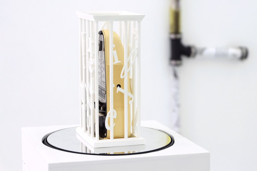
If Izabelle New’s work embodies the show’s reacurring motif—the potential to burn, melt away, and unbecome—Sydney Shen’s and COBRA’s works sets the tone. Placed adjacent from each other they sing in disharmony. Sydney Shen’s three works titled Lament Config. consist of metronomes inside of 3d printed boxes rotating on a mirrored platform. Each metronome beats at its own pace, displayed at three different heights. The work points to theatricality, performance, and musicality. The titleLament Config., comes from a fictional puzzle box popularized by the Hellraiser movie series. In the film, solving the puzzle box transports you to a demonic dimension, a place of endless pain and suffering. This is precisely where I am transported viewing COBRA’s video The Future is Wild – CRY CRY CRY -. In the video, a clown whimpers, ranging from a light sobbing to a theatrical hyperventilating cry. Equally exaggerated are the clown’s features, including overdrawn lips, eyebrows, and a prosthetic nose. The two works sing together. The metronomes keep time, and the clown cries eternally.
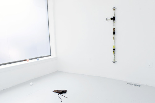
The most intense piece in the exhibition is Zachary Susskind’sMalcolm X Blvd, a flattened shoe that sits in the middle of the second room in the gallery space. The shoe is as flat as the floor with its shoelaces sprawled out like limbs from a chalk outline in a crime scene. The work is poetic and requires little explanation.
Alex Perweiler and Chloe Maratta’s works are the most disjointed of the show, but relate to the blurb released by Springsteen, which addressed the show as addressing “the modes of measuring performance through varying media.” Both works imply a performance.
Alex Perweiler’s work Role, an 8 x 10 headshot of the artist, feels too close to David Robbins’ work Talent to be a mere coincidence. Talent consists of eighteen 8 by 10 headshots of (now) well-known artists including Jenny Holzer, Cindy Sherman, and Jeff Koons. In an interview with Susan Morgan, David Robbins stated he chose talent as the title because, “Artists [… are] people involved with difficult intellectual, political, and moral stances, and on the other hand, they are public figures who function as entertainers.” Perweiler’s piece, made nearly thirty years after the original, asserts that the role of entertainer now overshadows any other artistic purpose.
Chloe Maratta’s D.I. dress is an artifact of a character and performance that is never seen. The dress is white, hand sewn, screen-printed, and smudged with a grey residue. A badge with the numbers “88” is sewn to the back of the dress. The work is too cryptic for me to understand or to relate to other works in the show.
Watching Things Burn is open through July 25 at 502 W. Franklin Street, Baltimore, MD. Images courtesy of the gallery.
In her recently closed show with ICA Baltimore at Gallery CA, Angela Conant investigates a curious relationship with color. As the exhibition title “Deuteranope” clinically asserts, the presentation of paintings, sculptures, video, and installation peruses the condition of colorblindness through visual and performative manifestations. In this theoretical starting point alone, the writing of Clement Greenberg, the grandfather of formalism, immediately swarms my mind: is this a formalist exploration of color’s relationship to human vision? I resist this notion and, at times, Conant does too; in fact, it is in these sparse moments of rebellion that the exhibition stands out with a vibrant and inspired potential.
“Deuteranope” is unabashedly ambitious in its thorough approach to the sensory reception of color. A large-scale video projection (Color Cast, 2015) offers an ongoing soundtrack of the exhibition’s thematic linchpin as four actors, including the artist herself, define the visual phenomenon of color and feebly attempt to explain various hues through spoken language. Seated as newscasters, the performers parody the feigned objectivity of the media when confronted with a complex and subjective headline such as color. While the work at times nears too literal an approach to the overarching subject at hand, its saving grace comes in the uncanny and dry delivery of dialogue, sporadically reminding viewers of the intricacies of visual perception as they explore neighboring works.
A scattered series of paintings chiefly paired in diptychs (Human Gesture Paintings 1-5, 2015) is alive with formal interest but, when taken at face value, remains conceptually underwhelming. Each work treats a simple, gestural mark with careful dabs of pigment and consequently reads as sculptural and tactile rather than a hackneyed expressionist swath of oil paint. Conant conceives of the works in sets: one in bright pinks and purples over a field of flat green, the other in muted earth tones over a deep black ground. Through the latter, the artist intends to replicate the range of colors perceptible by those with red-green colorblindness. While I appreciate that Conant appears to ‘get to the point’ through these images, once again I remain unconvinced by the namesake premise of the exhibition. In other words, why are we supposed to be thinking about colorblindness now?
This is not to say that the exhibition completely misses the mark. Where Conant stands out and ultimately excels is in her conception of a transmedia practice that situates painting and sculpture in a refreshingly dynamic relationship; emblematic traits of painting inform the creation of the sculptures, and vice versa. The image of each Human Gesture Painting, for instance, finds a three-dimensional, wall-mounted analog rendered in a coarse mass of plaster and sand (Human Gesture Series, 2015). Three sweeping forms appear tucked away beneath an imposingly low window while others fully occupy a dark gallery-within-the-gallery and receive intoxicating washes of red and green light. The simple starting point of the gestural brushstroke not only motivates the shape of each sculpture, but is itself disrupted as the paintings resolutely and attentively render the contours of a carefree flick of the wrist. The sheer muddling of the processes behind each artistic format revives what might otherwise be a conceptually wanting show and leaves me yearning for more of this rich transmedia experimentation.
The current state of medium or—to re-insert Greenberg—medium specificity is a tricky one. Mixed-media approaches have assumed an established and respected place in the history of art, most notably with the Neo-Dada craze of the 1950s championing a persistent and ever-present crossover between traditionally separate media. On the other hand, following painting’s rise from its illusory ‘grave’ over the past two decades, a recent glorification of the specific capacities of the isolated medium has renewed and energized how we think about pigment on a flat surface. Conant’s transmedia approach feels markedly different and critically needed—the development of a mediumunspecific practice. As she translates not only forms but characteristic elements between the acts of painting and sculpture—simultaneously adhering to and augmenting the specific attributes of the two—Conant proposes a vision of medium that complicates its prevailing treatments. What might a variety of different artistic media look like in a detached yet nevertheless mutually reflexive relationship? While this question may not fully emerge through the thematic fog of Conant’s exhibition, its budding suggestion promises a captivating viewpoint from the artist to come.
Leisure-longing is an endeavor known by little, as it is rarely intersected with an art viewing encounter. Phenomenology, being of awareness, could be perceived as boring (possibly even more boring through its acknowledgment) though whoever it was that said that boring is counter-effective should, in this instance, reconsider. Painting is as useful as is standing in a shower until the water runs cold or stirring pasta until the water comes to a boil on its own (I mean this in the best of ways). A realization has to be made at some point down the road. Leisure as a tool for non-literal thought posits an intuitive breakthrough that these four artists have laid their collective finger on.
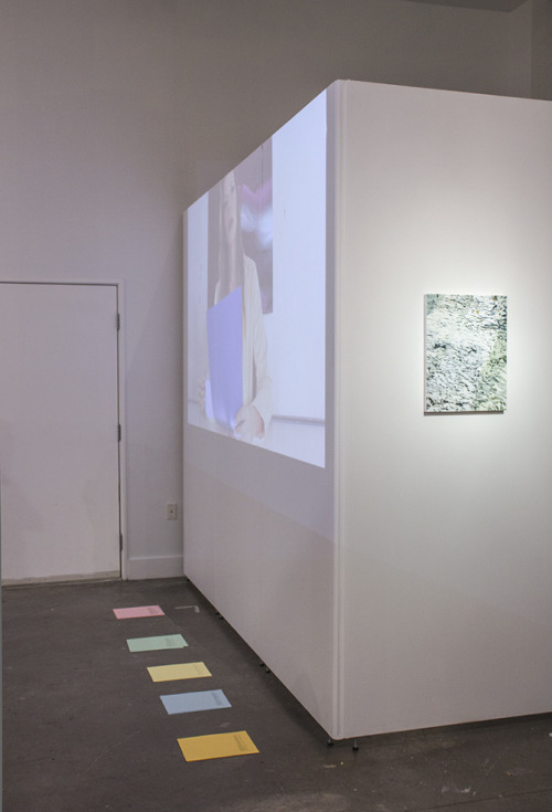
Upon entering Longing for Leisure, it is easy to find yourself dissatisfied with the lack of imagery with which you are presented. One sees a few larger-scale (around 4×5’) paintings to the left and back-left, a smaller-scaled work and a few vinyl prints next to and in the front two window displays. Leaving the gallery, what I can remember most of the show is that much of the work was spaghetti themed and that there was a large painting of a man who is also a ship, smoking a cigarette. In the center of the space sits an enlarged, navy coffee lid with stirrers (all produced with a CNC mill). Lastly, one is to pick up a poetic gallery text accompanied with a list of the artists and their respective works.
This poetic preface to the exhibition is important in its failure to spark any ‘interest’ on the readers’ part. One observes the space and then, confused, turns to the text to attempt to put a name to an image. We read the preface and finish, perhaps maybe even more unaided in answering the question ‘what is this about?’
Maybe we knew the answer to that question and then we forgot it, and now, at this exhibition, we are trying to remember it. In considering ‘remembrance’ and ‘awareness’, we have lost touch just as the person (who is described in the short story in the gallery text) could not remember the note inscribed on the ripped piece of paper they lost between pants transfers (even though it was of most importance to them).
A risk is being taken in that this show walks a very fine line between being ‘interesting because it is seemingly boring’, or just being ‘boring in and of itself.’ I am trying to remember what exactly it was that I saw in the show and why I found it so fascinating, but it is escaping me. This isn’t necessarily detrimental to the show as much as it is a merit to its execution; its comfort in being forgettable. The show allows itself to become a backdrop and reemerges when I’m in the shower, or cooking pasta. I think that is especially beautiful.
When trying to remember some thing, the more effort one exerts in remembering, the more the Thing escapes them. The inversion of this would be: the thing is most likely to present itself when we are not trying to remember or put our finger on it.
The moment we enter Longing for Leisure, we experience neither side of this coin but perhaps something between. We enter expecting to realize the thing that we have not yet realized. This prospective realization is unable to actualize itself through our concurrent attempts to grasp this thing. e.g. By attempting to remember the name of an actor, the further the name seems to drift to the back of your head; you realize that you need to not think of the search for the name in order for the name to naturally re-emerge.
At Longing, for Leisure, we have been assigned the task of the I can’t remember, which posits as much of a question as it does an answer (throughit being the answer to a different question than the original one (what is this show all about?), and that same answer owing its Aha!-moment from the original question itself). To jump off the diving board harder is to only be drawn further into the enigma to which this show is presenting to us. Perhaps one would have to sit around and drink beer until one remembers.
(Longing For Leisure is installed through June 20 at Open Space, 512 W. Franklin Street)
Though it is unusual to see Springsteen’s lights dimmed during open hours, the current exhibition by Flannery Silva opts for a muted darkness and curtained-off front window to house its collection of digitally collaged posters, ceramic figures and ballet barres, and embroidered banners. Moving away from the net-ready, pristine shows Springsteen has consistently curated,Youth Dew offers a selection of carefully crafted and often times peculiar artifacts that feel like a secret or whisper offered by the artist and necessitate being explored in-person to fully resonate.
That said, navigating the space is much like navigating Silva’s diaristically structured website: a labyrinth of images and links fusing fragments of Little House on the Prairie,Little Women, and The Glass Menagerie among others. The characters from these stories seem to act as surrogates for the artist, and Silva shape-shifts between roles in Youth Dew, merging her own hand with the likeness of Laura Ingalls, ballerinas, and Precious Moments dolls. Silva’s interest in these childhood depictions of girlhood surpass nostalgia and border on obsession/fixation, making it difficult to distinguish the boundary between fact and fiction, performance and reality. Simultaneously imbued with tenderness and threat, Youth Dew blends young naiveté of melancholic reminiscence with something more sinister.
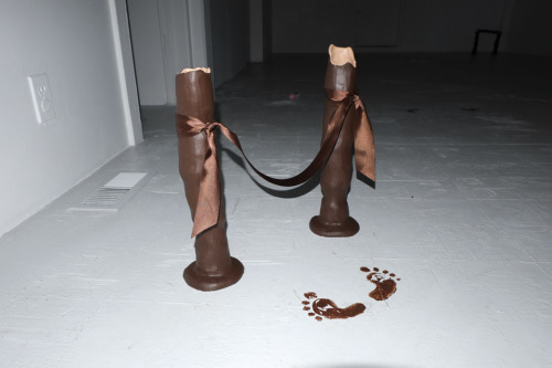
Akin to a crime scene, or perhaps the opening montage of a crime television drama, small vignettes of fabricated ballet barres, footprints indicating ballet positions, and spilled baby bottles lay on the ground untouched, softly lit in the otherwise darkened room. In one corner, a grey and black wooden cutout of a simplified, featureless figure in a bonnet hangs from white rope. It is unclear whether her hands are bound or she is innocently swinging. On the opposite wall, a triangle of fabric machine-embroidered with a poem hangs by two oversized hair clips. Splotches of juice or dye allow the white-on-white text to emerge more clearly, revealing collections of phrases both light-hearted (“a feeling i only want to poke with a stick”; “qUiLt TiL u WiLt”) and more threatening (“Drawers Hiked, Ode To Bloomers/ milk-teeth missing, lips bee-stung, nipples swell/nothingness for baby”). Throughout the gallery, hands are bound, faces are obscured, and shapes reminiscent of tears and flower petals litter the ground.
The exaggerated sadness of Silva’s arrangements references the performance work of Laurel Nakadate, while ties to artists Bunny Rogers and collaborative partner Filip Olszewski emerge in the imagery and content on display as well. Recently highlighted in Joanna Fateman’s article “Women on the Verge: Art, Feminism and Social Media” (Artforum, April 2015), Rogers employs a similar language as Silva, combining found text, crafted objects and websites, and appropriated imagery to explore cybermythology and child sexuality. Probably the most disturbing yet all-encompassing phrase cited in Fateman’s article is lifted from a poem of Rogers’: “Adorability is fuckability / because children are adorable/ and men want to fuck children/ Acknowledge or die wow/ You are dead to me.”
And there is something mildly disturbing about encountering so many characters and figurines intended for a young audience in Silva’s show, although this exploration of the uncomfortable intersection between trauma and innocence remains intriguing in its taboo without ever becoming overly didactic. Moments where these two subjects merge, as in the image of a young toddler crawling on all fours, cradled by the words, “This little country girl is all ready to be hung from your tree,” become the keystones for Youth Dew. Not explicitly erotic or violent, but certainly interpretive as such, these works provide only murmurs of their histories. Even the show’s title offers liberal interpretation, simultaneously referencing infancy, spring, freshness, perfume, perspiration, a water drop emoji, and a tear.
Youth Dew is on view through June 6that Springsteen Gallery, 502 W. Franklin St. (Photos courtesy of Springsteen, view video walkthrough here.)