Post-Office Arts Journal, Baltimore

Architecture tends to be haunted

Allie Linn/C. Klockner

Key: Allie Linn C. Klockner Collaborative

Ajay Kurian

Two haunted house stories: in Agatha Christie’s 1976 work Sleeping Murder, a recently purchased English countryside estate quickly generates chilling déjà vu for its new tenant, newlywed Gwenda Reed, as she begins to initiate renovations throughout the home. Gwenda finds that the estate seems to respond to her own thoughts: upon beginning the addition of a new doorway between two rooms, she discovers that one has already existed there, and as she strips the wallpaper in the future nursery, she finds the new paper that she has in mind already installed beneath. Before Gwenda can logically remember the truth, she viscerally feels it: that she has already spent time in this home as a small child, that she is the only one haunting the house.

In 1977, one year after Christie’s novel, director Nobuhiko Obayashi released the horror-comedy film Hausu in a similar vein of home architecture exerting a life of its own. In contrast to Christie’s text, where this agency is revealed as the repressed history of intimate knowledge, the film’s protagonist Gorgeous finds that the murderous objects in the house are violently haunted by her aunt’s grief over a husband that never returned from war. The portrayal of home as antagonist is at odds with more common, inviting depictions of domestic space and in this subversion of trope, Hausu and Sleeping Murder underscore the affectual potential of built architecture: inhabitants influence space and space influences its inhabitants.

Josh Tonsfeldt

Houses are familiar territory for art in Baltimore. In 2013, Max Guy wrote the article “The Baltimore House Gallery Phenomenon.”1 He paints a picture of an art community defined through a variety of lenses: in its use of domestic space as gallery space, in its logics of camaraderie as curatorial impulse, and in its shared isolation not only from art capitals but from a broader network of other small art communities. Despite the casually domestic conditions, “The walls are white and dedicated to the presentation of art”—a cursory gesture to how these spaces should be understood.

Five years on, it’s refreshing to look back on writing that sidesteps stale accolades regarding alternative spaces. Instead: “an all-of-my-friends approach to curating can make bland exhibitions.” Incorporating the history of apartment galleries in places like Chicago into one of many canons, we move beyond novelty and get more specific about the effect of and the intention of using these spaces. A question regarding criticality stayed in flux here for Guy when the distinction between these spaces as galleries or as house parties remained blurry, but this also didn’t diminish the value of this community’s amateurish ambition.

Cynthia Daignault

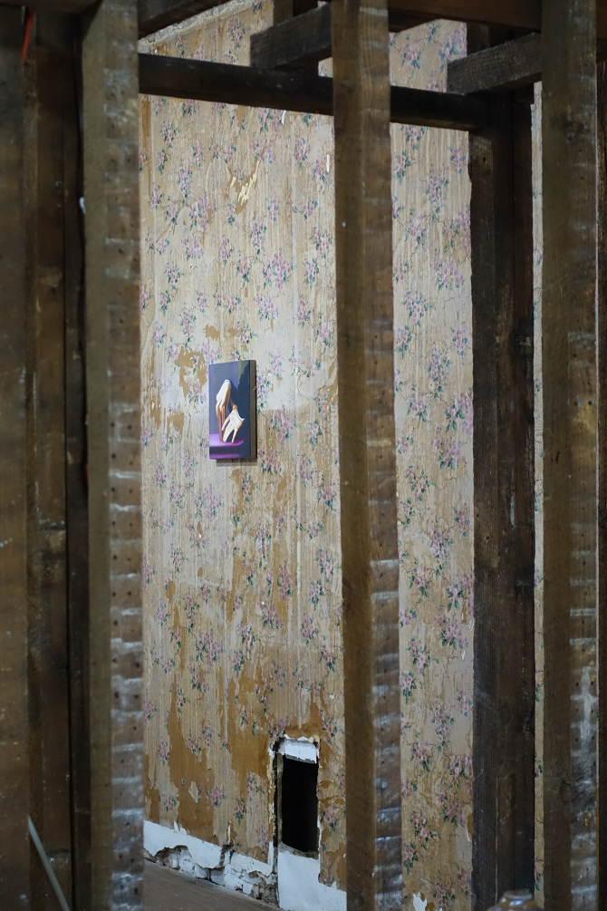
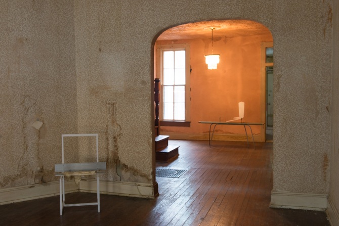
In the context of that writing, the introduction of Rowhouse Project in Remington has good comic timing, as if in malicious compliance to Guy’s critique. Operated between Summer 2014 and Spring 2016, Rowhouse Project embodied a model that was both more domestic than the galleries that Guy references and more clearly dedicated to the presentation of art. As site, the space was charged in its specificity as rowhouse, as a residence in Remington, as a home that was built in layers; it not only heavily affected the objects placed inside of it, but seemed to physically create those objects in their entirety.2 The house itself perhaps found a lineage in other domestic interrogations—Judy Chicago and Miriam Schapiro’s Womanhouse, David Ireland’s 500 Capp Street, Gregor Schneider’s Haus Ur, or Kurt Schwitters’ Merzbau3—but with its politics situated mostly in the house’s extreme placed-ness, at times to the neighborhood itself; at others, to the history of construction that this house’s architecture embodied.4

Within that question of the project’s locale, the rowhouse’s plural identities—as rowhouse, as Huntingdon Ave., as Remington neighborhood, as Baltimore, as America—become central contextual items. Justin Leiberman addresses the role of “critical” art being shown in non-gentrified places; Josh Tonsfeldt interrogates the architectural history as well as the traces left in the house; Cynthia Daignault’s residency functions as a social project in which the surrounding community was the core subject of the resulting show; for Trevor Shimizu and Van Hanos, reflections on their past relationships with Baltimore City become interwoven with their work; for Ajay Kurian, the site becomes post-9/11 America.

Sam Anderson

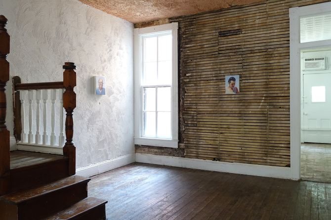
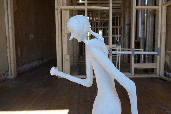
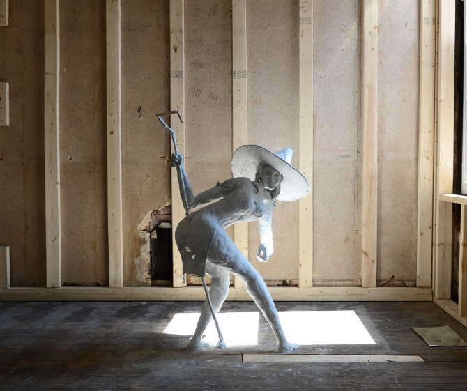
As for the building itself, Rowhouse Project also seemed to have a life of its own. The basic mode of operation in its two year life followed an arc that started with a residential interior that seemed to be falling apart behind stained wallpaper. The structure was slowly stripped down to its skeleton, dramatically shifting between shows. With Ajay Kurian’s exhibition Work Harder Under Water, the plastered walls disappeared and the underlying lath was revealed.5 In a piece in which two sadistic cyborg boys pissed on a third, a plumbing system of water was built into the structure of the house so that the stream from the second floor trickled into a basement that glowed blue with hanging neon Neighborhood Watch eyes. Here, perhaps most explicitly, has the house been reimagined as an affectual and deviant body. The Neighborhood Watch eyes impart the house with vision, and the multilevel fountain doubles as both plumbing and digestion, trapping its participants in an cyclical performance of torture.

Rowhouse Project might be described as an acceleration of the malleability of any built environment. The apparent permanence of built architecture proves to be quite plastic, engaging in a long-term back and forth between tenants. Renovations and alterations “persistently retire or reshape buildings,” Stewart Brand writes in How Buildings Learn. “First we shape our buildings, then they shape us, then we shape them again–ad infinitum.”6 A building itself becomes a kind of indexical archive, capturing both conscious alterations (renovations, expansions) and unconscious ones (wear, desire lines, decay) left by a string of tenants. To see the walls of Rowhouse Project painted, stripped, demolished, and rebuilt in a span of mere months places the domestic space in conversation with the changing seasons; aptly, how its shows have been archived: the leaves fall, flora becomes dormant, new walls are erected.

Sam Anderson

Rowhouse Project was not the house gallery that Guy describes, which would be better rearticulated through Lane Relyea’s terms as “the cash strapped activity at the low end, all the freshly graduated do-it-yourselfers who rehearse in increasingly remote cities and neighborhoods the gentrifying pattern of improvising exhibitions out of bars, hotel rooms, laundromats, whatever venues are at hand.”7 Instead, it was a fairly well-connected exhibition space with a very specific notion of site, a non-commercial intention, and a unique mode of collaboration that intersected with the House Gallery sphere from a distant starting point. At its best, the push and pull between architecture and the gallery’s program developed a collaboration that was more striking than any one artist or curator’s contribution to the whole.

While Rowhouse Project was archived through an online component (along with a sizable printed publication), the triad relationship between the uncovered layers of the house’s history, the haunting of affect, and the house’s site-specificity revealed something of an analog virtuality that existed within the structure itself. Elizabeth Grosz builds on this concept of pre-digital virtuality in her 2001 text Architecture From The Outside: “The invention of electronically generated media does not introduce us for the first time to virtuality but rather renders virtuality more graphic.”8 She expands the notion of the virtual as she points towards letter writing, reading, and painting–the things that evoke constructed, imaginary, and mutable spaces–as key sites of pre-digital virtuality, which opens up a suggestion of the Rowhouse as a virtual entity that simultaneously hosts multiple iterations of itself.

This understanding of virtuality is more effective than the one employed in some post-internet practices that limit this conversation to one of non-space and documentation circulation. Instead, the place becomes “Rowhouse” as thing-in-itself, a false noumenon stitched together through the seams of phenomena, a temporally flattened space. This is a virtuality that does not attempt to remove the gallery’s relationship to locale.9 Further, these threads point towards an understanding of place through hauntings of affect. In her review in this publication of Ajay Kurian’s exhibition, Quintessa Matranga references an observation from Bachelard’s Poetics of Space, “that the structure of the house parodies the human psyche.” Architecture as projected psychic interiority creates an intersection between feeling and place that cultivates virtuality as well, here.

Van Hanos

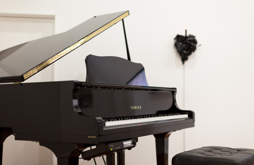
Working within the confines of domestic space is, of course, not a new gesture, and Rowhouse Project continues a trajectory of domestic curating that includes Hans Ulrich Obrist’s 1991 kitchen show, World Soup, and the 1986 multi-venued Chambres d’Amis in Ghent, Belgium.10 In these examples, the alteration or intervention of preexisting architecture is often minimal: how much can the psychology of the space be manipulated with minimum disruption? It is a question that continues to be explored, and though the gesture of transforming domestic space into curatorial venue is hardly a radical one given its long history, it does create space for a more phenomenological experience, one in which no aspect of the environment recedes into neutral background. One recent example of this exploration is The Pond, a multi-room and multi-floor installation by Jordan Loeppky-Kolesnik at the Anderson in Richmond, VA. The Pond occupied four floors of the Anderson, inviting viewers to begin on the top level and make their way down through a back staircase and adjacent rooms. Located within an otherwise traditional white cube, this section of the building had previously been reserved for storage.

Jordan Loeppky-Kolesnik

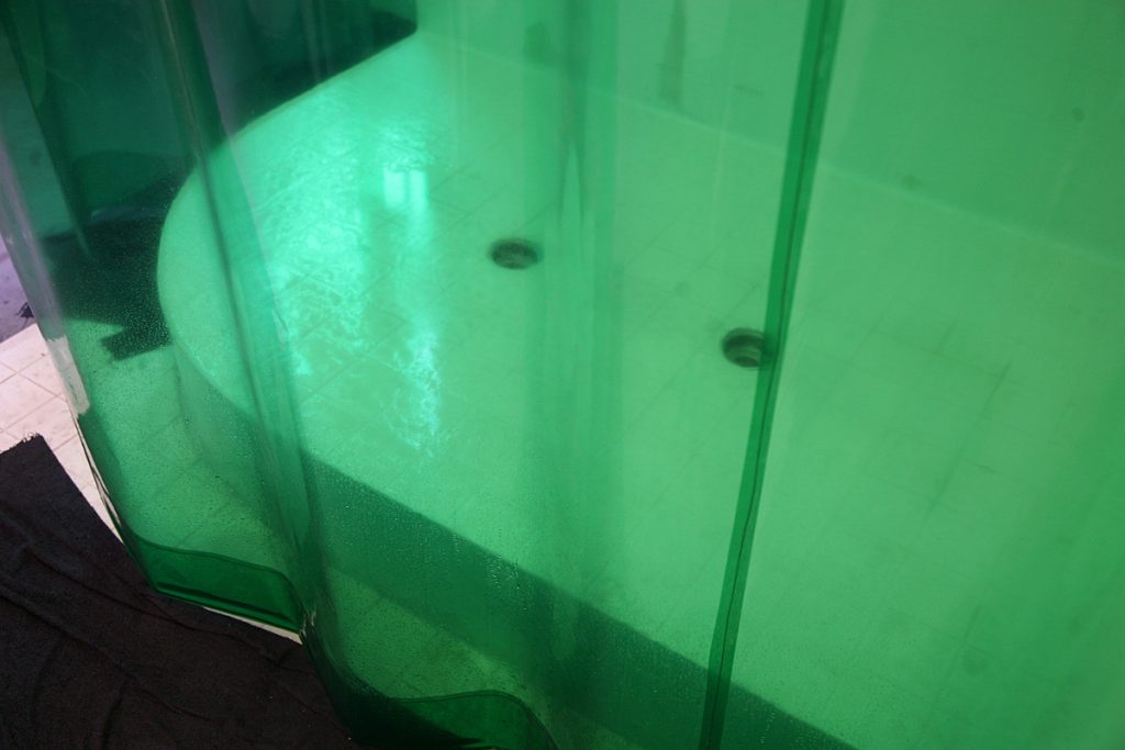
In The Pond, as in much of their work, Loeppky-Kolesnik blurs new constructed realities of a space with existing versions of itself in order to project psychological, virtual space onto the physical. An existing sink blends in with a newly constructed shower complete with dual drains (an absent intimacy), while various video monitors embed narrative into different corners of the space. Newly constructed walls, windows, and HVAC vents blend with existing ones so that the artist’s interventions to the space become nearly invisible. Navigating the labyrinthine rooms imbues the traditionally neglected space with a degree of care and attention: every wasp nest, overgrown creeping vine, and graffiti tag enters the extensive install.

And audience navigation is a crucial part of how The Pond exists. The viewer moves through rooms with changing light and climates, experiencing an increasingly humid, foggy atmosphere from humidifiers and running water on the upper level and the transition of artificial white light to diffused green light to near-darkness in the basement. The spell is eventually broken upon departure, when the viewer is spit out into the harsh bright sunlight of the outdoor world.

Jordan Loeppky-Kolesnik

“It has everything to do with desire and filth,” reads one subtitle against a dark marshy landscape from one of the installed videos. Equally erotic and repulsive, the empty bathrooms, bedrooms, and utility rooms that Loeppky-Kolesnik contrives are markedly vacant but filled with detritus from intimate encounters: an arranged bouquet of stinging nettle, an initialed heart drawn on the wall, a continuously running shower. The building has begun to decay and devour this oft-neglected area, and Loeppky-Kolesnik preserves and reanimates the artifacts left behind. It is a space both deviant and tender, conducive to an intimate encounter on the foam mats or in the shower but disrupted by the horror of a sink filled with tadpoles. Its histories compress into a surreal collection of relics and poems, providing just a peek into the activities that may have previously taken place inside.

Between both Rowhouse Project and these other adjacent projects, hauntings are experienced when a latent presence intersects with existing environment. Seemingly, however, there is negligible distinction between how different virtual spaces (past, psychological present, future) overlap with real space. Their shared virtual status blurs the origins of these affectual, real, and temporal spaces. As a collaborative endeavor, Rowhouse Project approaches place and virtuality in a way that opens up a useful poetics and addresses a larger question of locale. The ways that this platform facilitates spatial intervention, both in subtlety and in scale, become points of reference for how to deal with real space, something which will always contend with the presences of affect, past, and future.


Note: A special thanks to Corin Hewitt and Meggie Kelley for their additions to this research. Images courtesy of Rowhouse Project and Jordan Loeppky-Kolesnik. Additional line edits added November 14, 2022.

No Words, All Smiles: The Emoji Movie is a Mirror on Our Own World

Nicky Smith

“No Words, All Smiles: The Emoji Movie is a mirror on our own world” is the fifth publication as part of THESE ESSAYS, a series selected by editors-in-residence Suzanne Doogan and E. Saffronia Downing.

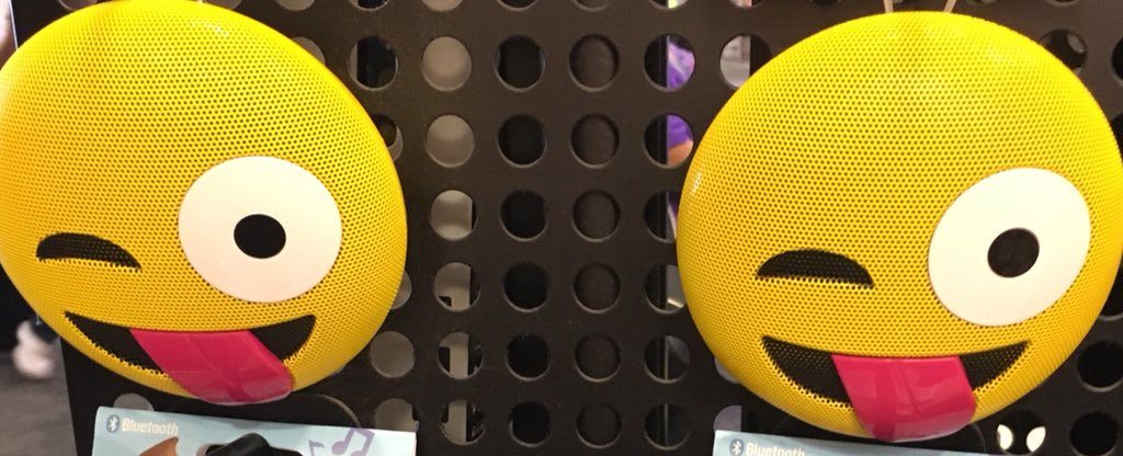
In the year since its release, The Emoji Movie has been completely forgotten, relegated to the Razzies and 7/11 bargain bins along with The Angry Birds Movie and failed sequels and reboots like The Mummy and Daddy’s Home 2. I haven’t seen it since it came out, although several moments still come to mind periodically, particularly one scene in front of a frozen fountain in Paris. Numerous allegations of domestic abuse and sexual assault against T.J. Miller that came out earlier this year have only sunk The Emoji Movie deeper into our abyss of cultural detritus. But the integration of emojis into daily discourse and conversation has only increased, and their full compatibility with Unicode has ensured that they will continue to spread. In 2015, the Oxford English Dictionary named “” as their “word of the year,” and I have no doubt that more emojis and glyphs will be awarded and given the same kind of acknowledgment as we move into the 2020’s.

This is not the end. The Emoji Movie is not a sign of how far we’ve strayed from God’s light. But it got trashed: it’s currently sitting at eight percent on Rotten Tomatoes, and the “Critics Consensus” simply reads “.” It’s not a well-constructed, well-written, or even engaging movie most of the time, but the extreme loathing of The Emoji Movie is not a reaction to these faults. People are disgusted and embarrassed by the concept; that it exists as a product in the world that we share. But the premise is endlessly fascinating and rich—the antipathy towards The Emoji Movie stems from the fact that it’s the opposite of an escapist summer blockbuster.

This is a movie about smartphones and apps and emojis: things that most of us use and interact with every day. Watching The Emoji Movie is an 86-minute look in the mirror for a civilian in the 21st-century capitalist West. Wonder Woman is escapism—The Emoji Movie is reality, and it’s overwhelming and often horrifying. No wonder people hate it so much.

So many of us complain about social media and compare it to be imprisoned or shackled somehow, and here too, the emojis are imprisoned in “Textopolis,” a Philip K. Dick nightmare city where everyone is assigned an emotion at birth and must never deviate or risk erasure (“Face With Tears of Joy” is shown being carted away on a stretcher with a broken leg; “Crying Face” must continue to be sad even after he’s won the lottery).

All working emojis report to a giant Cube, where they’re put into square slots and forced to wait hours, days, even years before they’re selected by the user, in this case a high schooler named Alex. T.J. Miller stars (unfortunately) as Gene, a “Meh” emoji who can’t contain himself from expressing a range of emotions, and when his big day at the Cube comes, he chokes, can’t stop cycling through different emojis, and when he’s “scanned,” the resulting emoji that shows up on Alex’s phone is grotesque and obnoxious. Of course it’s sent to Alex’s crush, and he’s embarrassed—the rest of the movie, we follow Gene, Hi-5 (James Corden—again, unfortunately), and Jailbreak (a princess disguised as a hacker) as they leave Textopolis and wander through the limbo between apps on Alex’s phone, peeking in on YouTube, Facebook, Dropbox, and Spotify along the way.

This movie poses so many philosophical and social questions that are mostly squandered by writers too old and uninterested in getting really heady. I mean, this is a kid’s movie, and it’s clearly modeled on Pixar’s wildly popular Inside Out. But The Emoji Movie isn’t about personifying and legitimizing teenage emotions—it explores the relativity of time, multiple parallel universes, and our own condition as smartphone and social media users. About two-thirds of the way through the movie, we see Gene’s parents, two “Meh” emojis, wander through limbo and end up in Instagram. They had an argument earlier, and Mom Meh walks into a photo of Alex and his parents standing in front of the Eiffel Tower. She walks in frozen time, eventually finding her husband, and they reconcile as they flip through Alex’s photo roll and kiss in a fountain, water suspended in the air. The little girl behind me said exactly what I was thinking: “That was beautiful.”

There are bizarre and offensive moments, like the “abandoned luggage” emoji being black for some reason (there are other black emojis and characters, but “abandoned luggage” sounds like Katt Williams, says “oh HELL naw,” etc.). Trying to make sense of the physics and universal laws of this world is pointless, but it’s not as glaring as something like Cars, where the cars race… but also sit in the stands? I don’t care that “Poop” somehow has a son and they both have to use the bathroom. Every scene is a road not taken: music is shown architecturally when Gene and Jailbreak enter Spotify, and they surf the sound waves of songs; the elderly of Textopolis are text-based emoticons that ride in wheelchairs and fall down and hurt themselves; the elite of Textopolis are just as petty and clueless as our own world leaders, and their insignificance when faced with complete annihilation (i.e. an appointment at an ersatz Genius Bar) mirrors our own helplessness and hopelessness staring down climate change in the years to come.

Members of Generation Z will outpace Millennials and enrage Baby Boomers as they begin communicating exclusively in emojis. We may know what “eggplant + peach” means now, but in ten years there will be phrases consisting of a dozen or more emojis strung together to communicate messages more complicated than sex jokes. Embrace it and enjoy your tech savviness while you can.

The histrionic responses to this movie even existing show how resistant people are to change and the evolution of language, and the perceived “dumbing down” of our culture. Oh, please! It is not a pox on our society — emojis are no different than slang, colloquialisms, or code within insular groups and communities. Most people refused to engage with The Emoji Movie at all, and in doing so they missed out on a surprisingly trenchant take on our widespread feeling of imprisonment and being shackled by smartphones. This isn’t product placement, it’s a satire smuggled in and out of multiplexes. Buy it for a quarter next time you go to get a hot dog or a Slurpee.


These Essays is a periodical mini-series of non-fiction writing curated for the promotion of joy and inquiry by E. Saffronia Downing and Suzanne Doogan. For the duration of the project, one essay will be posted each Sunday here on Post-Office Arts Journal. Writing is not restricted by theme, and ranges from pop culture criticism to personal essay and material analysis. For more information or to contribute an original piece, please contact theseessays@gmail.com.

The Holy Ghost Goes to Bed at Midnight @ School 33 (James Bouché)

Allie Linn

“The architecture has to be an object of your memory,” Louise Bourgeois asserted in a 1999 interview with her longtime studio assistant Jerry Gorovoy. “When you summon, when you conjure the memory, in order to make it clearer, you pile up the associations the way you pile up bricks to build an edifice. Memory itself is a form of architecture.”1 In translating the domestic interiors of her youth into built sculptural spaces, Bourgeois materialized (and created space to reflect on) the narratives she had carried with her for decades. Architecture functions as both medium and metaphor in her work, so that the processes of building and remembering become synonymous.

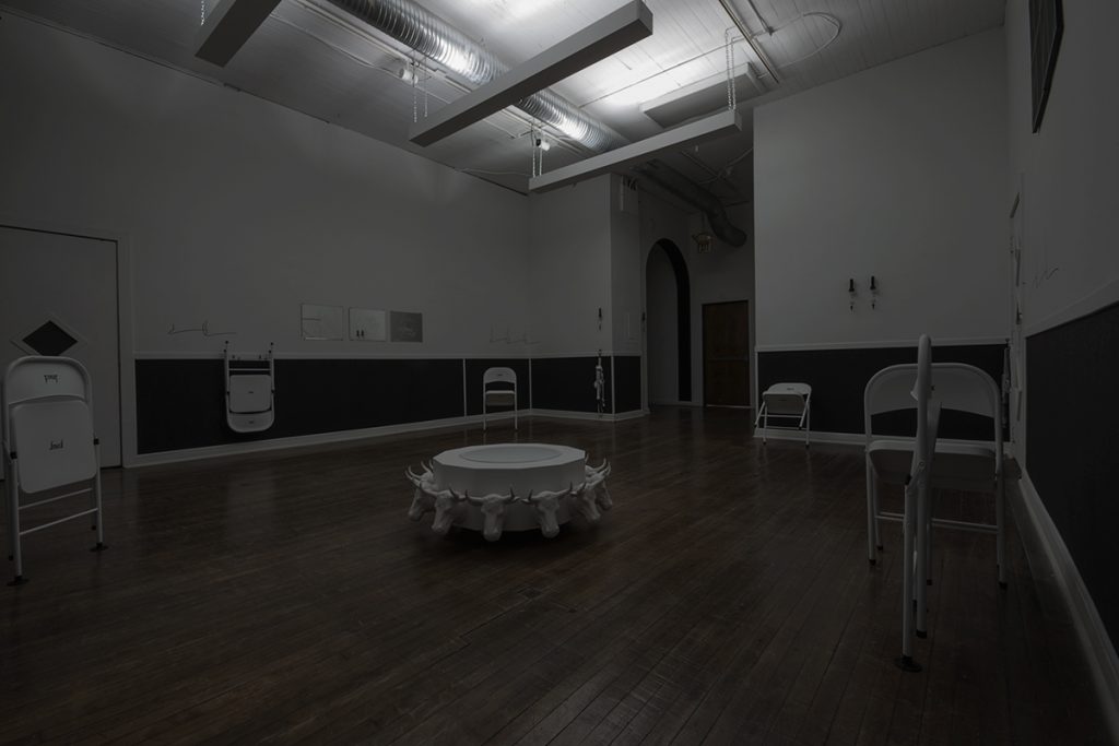
Bourgeois’s words still felt timely while walking through The Holy Ghost Goes To Bed At Midnight, James Bouché’s recent solo exhibition at School 33. Described in the gallery text as a “reconsidering of truths and values…once easily accepted” but ultimately “dismissed in adulthood,” The Holy Ghost reimagines the gallery as a stripped down, achromatic version of the Mormon temple Bouché attended as an adolescent before coming out as gay and leaving the church at sixteen. With hindsight, the remembered iconography of the original space is reimagined into a collection of artificial simulations. Once-revered objects are translated into hollow props, stripped of their function, and, at times, eroticized.

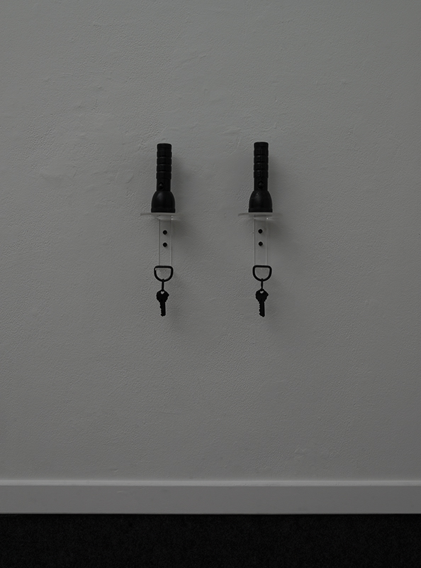
Every element within the space has been meticulously fabricated by Bouché: custom hanging ceiling-facing lights cast only a dim glow in the darkened room, and the lower half of the walls have been upholstered with grey felt. Occasional slits in this upholstery, mended with carefully placed safety pins, act as small wounds, barely discernible, but present. Paul Cowan-esque images of simplified black and white windows line the top of the walls, and vinyl decals of curtains caught in the breeze sit beneath them. Throughout the perimeter of the room are six white folding chairs, numbered one through six, teetering in various states of mid-fall. Multiple black keys hung beneath wall-mounted wax-cast flashlights provide only a suggestion of the labyrinthine expanse of the real temple.

Most captivating, perhaps, is a scaled-down replica of a traditional baptismal font sitting on the floor. True to its Mormon original, the font rests on twelve sculpted oxen, representative of the twelve tribes of Israel. One of the more publicized aspects of the Mormon church is the proxy baptism or the baptism for the dead, a practice in which a living member of the Mormon community can be baptized on behalf of a deceased person, often without their prior agreement. It is a controversial and scrutinized practice, one that can be equated with forced conversion. Importantly, Bouché’s font is empty and far too small to accommodate an adult baptism. All of the objects in the room, in fact, have been stripped of their function and rendered useless: the wax flashlights cannot illuminate, the keys indicate no accompanying locks, the windows and curtains are merely two-dimensional cartoons on a wall. These objects collectively construct an elaborate facade, aesthetically enticing but functionally frustrating.

Clipped to the lower walls are also fabricated harnesses, referencing both the bondage of imposed religion and the sexual potential of the space. In his book Queer Space: Architecture and Same-Sex Desire, Aaron Betsky defines queer space as “a misuse or deformation of a place, an appropriation of the buildings and codes of the city for perverse purposes.”2 While Betsky’s 1997 work has been justifiably criticized for its rather narrow, male-centric perspective, Queer Space does provide one lens for understanding how a space of repression and condemnation might be reappropriated and reimagined as an empowering space for sexual liberation. The visual language of the remembered temple in The Holy Ghost has been adjusted only slightly, and yet the space is nevertheless radically reclaimed.

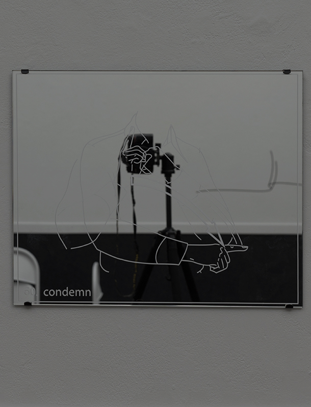
The eroticism of the room is initially subtle. Three mirrors depicting diagrams of different hand gestures, captioned “60. condemn,” “118. fornication (‘sleep around’),” and “36. bondage,” most explicitly point to sex, but even these graphics dissolve into the mirrored reflections behind them until confronted by a body. Betsky names the mirror space as “free and open, shifting and ephemeral, and yet constrained by its lack of reality,” simultaneously functioning as true reflection and intangible projection.3 Stripped of their source information, the diagrams reference both the handshakes and gestures of various Mormon ceremonies (i.e. the marriage sealing) and the body language of cruising culture. Betsky finally notes that queer space “becomes an invisible network, a code of behavior or ritualized language of gestures that traces the activities and places of everyday life,” a framework illustrated by Bouché’s co-opted and reclaimed nonverbal communications.4

The meticulous attention paid to detail in The Holy Ghost Goes to Bed At Midnight is characteristic of Bouché’s ever-thoughtful and detail-oriented practice, but the sharing of personal narrative represents a significant departure from the artist’s generally tight-lipped practice. Many of the elements of the installation are still shrouded in mystery, as the Mormon temple generally remains closed to non-practitioners, but the reflection on imposed childhood ideologies and practices is nonetheless universally understood. In the surreal, colorless mirror-world of the pseudo-temple, Bouché intertwines memory with architecture to create an immersive space for rumination and reflection.


Bzz Bzz Bzz – Deep Listening @ First Continent (Ramaya Tegegne)

Reece Cox


Deep Listening borrows its title from the practice of Deep Listening developed by American composer, Pauline Oliveros. Oliveros coined the term after a particularly formative experience playing and recording in a cistern 14 feet underground wherein as she and her collaborators played in the the echoic space it became clear they weren’t just playing their instruments, but that they were playing the room as well. Oliveros describes deep listening as “an aesthetic based upon principles of improvisation, electronic music, ritual, teaching and meditation. This aesthetic is designed to inspire both trained and untrained performers to practice the art of listening and responding to environmental conditions in solo and ensemble situations.” With Oliveros’ practice of deep listening in mind, I approached the show expecting some reverberation trail – literally or otherwise – may be of particular importance. 1

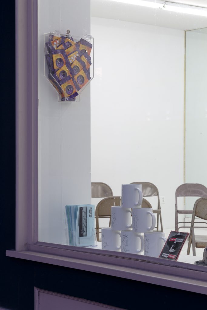
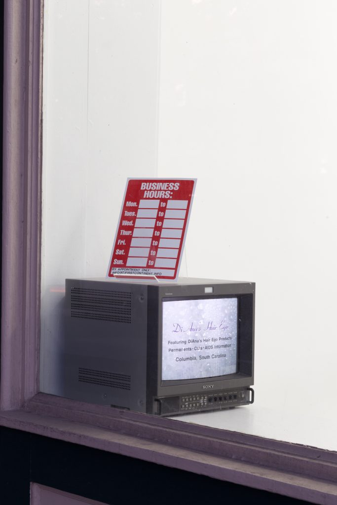
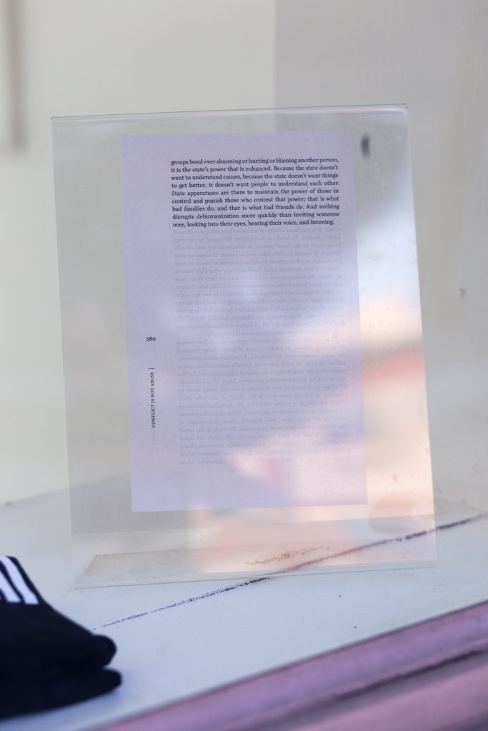
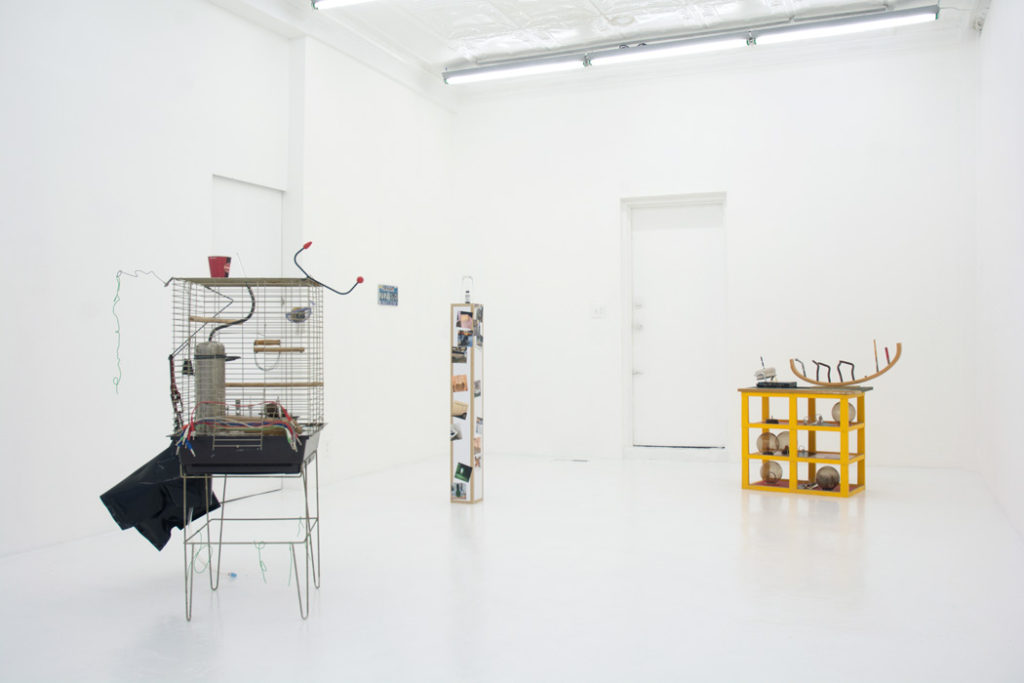
Upon entering the gallery, I immediately noticed a rather sparse arrangement, existing primarily in collections of objects on display along the window sills. Objects including a stack of mugs featuring a comic of ‘Superwoman’ fighting off a male aggressor, a stack of Barbara Kruger postcards (Your Comfort is My Silence), stuffed animal seals, Silence = Death t-shirts, a clear plexiglas dispenser of female condoms, a business hours sign with no open hours written in, a cathode ray television with footage of interviews, and various publications. All are arranged in a manner which presents as promotional or informational – like accoutrements to some local shop or doctor’s office and expressly not-so-precious as an object intended to be viewed as art. Most of these items face out of the window towards the sidewalk, a subtle yet clear gesture acknowledging the gallery’s nonexistent open hours while revealing themselves instead to an audience of passersby.

As a person who came for an opening, I began to feel there was nothing here for me aside from fellow art going acquaintances whom I can only assume were beginning to feel a similar tinge of alienation – perhaps a similar alienation felt by those walking past busy Franklin Street openings on a Saturday night knowing nothing of the elite looking gatherings in unlabeled, mostly empty storefronts.

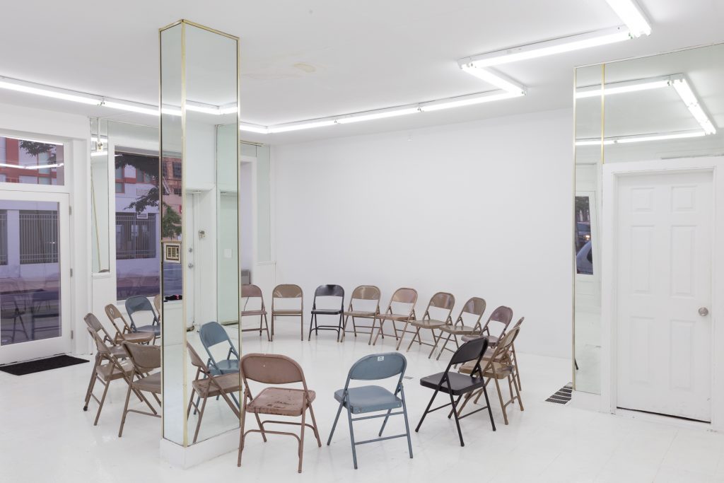
Free food and drink, always a welcoming gesture, were provided to sooth any weariness. The concessions included the art-opening standard plastic container of ice and beer, only in this case the amount of alcoholic beverages was equally matched by a generic flavored and unflavored seltzer option, as well as a freshly cooked vegetable stew and rice served from a crockpot. The non-assumptive quality of the free non-alcoholic drinks and vegan meal added to the sense that this space is not solely designated for such a targeted audience, but modeled to facilitate a broader, family-friendly kind of gathering. The final arrangement of objects in the room was a circle of a dozen or more folding chairs – an irksomely well accommodating amount as every seat became occupied with very few left standing once the performance begins. Once the audience was seated, looking across the circle at each other under the bright florescent lighting, I get another feeling that we, the gallery audience, are on display to one another and again I remind myself – listen Deeply.

Tegegne began reading from a booklet while standing on the perimeter of the circle behind the backs of the listeners, occasionally changing her position, moving counter clockwise and then clockwise around the audience. The presentation was impersonal and matter-of-fact. She read into a microphone, amplified just loud enough to mask sound of her speaking voice and most other ambient sound, edging on a confrontational volume but falling short at just reasonable. Over the course of approximately half an hour, the monologue crisscrosses into a web composed of interview excerpts with people involved with the space as a gallery, a rental property, and a piece of the neighborhood. The landlord, the former tenant, the curators, a client of the former business, Ben Fredrick (the realtor who is currently involved in the sale of the building), Noah Barker (the first artist to have a show at First Continent), and others all form a narrative of the buildings, past and present, as understood and experienced by each character. We learned from the landlord that the storefront is a particularly attractive space for a business because of how it sits at the corner of the intersection. We also learn that this very position which gives the space this appeal for potential buyers (the block, largely occupied by artist-run galleries, is for sale) is also at high risk of cars driving into the storefront. In a subsequent interview we learn the previous tenant who ran a hair salon in the space had to leave after the third car crashed into the building while the salon was open, making it clear the risk to herself, customers, and business was too great to remain in the location. The interviews with Abbey Campbell (artist and co-director of First Continent) reveal a tenuous relationship to the space wherein the necessary labor to bring the space up to art gallery standards conveniently serves to make the space (and surrounding spaces on the block) attractive to potential buyers. They renovated the interior with their personal finances and labor, ultimately providing a more attractive, culturally relevant, and seemingly highbrow commercial space. It is clear that no one has permanent plans. The landlord and curators share a silent and mutual understanding that this is not a permanent situation for anyone but a mutually beneficial intersection of specific interests.

I think of the audience. On view to each other in the circle, I think how many of us live in the neighborhood, some even within buildings owned by the same landlord quoted in the monologue. To most of us, none of the information we hear is exactly new, yet having it arranged and delivered in such an organized and oddly sterile manner reveals a general voyeurism that is often overlooked (or perhaps assumed) in contemporary art contexts existing within developing urban areas. The sensitivity to acknowledge an audience beyond the transient and educated art viewer places the venue and exhibition at odds with itself; yet not because it is shamed by didactic witticisms about gentrification, but because the collected data is as much for no one as it is anyone. The narrative effectively illuminates an ambiguous triangulation of neighborhood, tenant and landlord but ceases before announcing something be done or suggesting some sort of misguided solution. Equally inconclusive is the exhibition and performance and its relationship to us, the audience in attendance: it is all too specific to be art in any other context, yet it remains ultimately inaccessible to the neighborhood beyond the few attendees. It is within this ambiguity where one may begin to hear a particularly long reverb trail if listening closely enough.

A day or two after the opening I walked by First Content to take some photographs through the windows. As I take pictures a man walks by and asks what’s going on in there? Before I can form a complete thought about how this could possibly makes sense as a nuanced exhibition directly related to this specific location and even this very interaction we’re having, he asks if people have meetings inside and if it’s some sort of art gallery. I think that’s it I reply as he wishes me a good day and continues down the sidewalk.

Bzzz Bzzz Bzzz, A performance by Ramaya Tegegne at the opening of her exhibition Deep Listening at First Continent

Deep Listening runs May 20 – June 24, 2017

Ramaya Tegegne is an artist based in Geneva, Switzerland.
This exhibition was made possible with generous support from the State of Geneva.

Photos are courtesy of First Continent. 

Erased (F)e-male Body: Processing Adolescent Female Trauma through a Surrogate in the work of Amanda Horowitz, Bunny Rogers, and Jacky Connolly

Allie Linn

Estimated read time: 24 minutes.

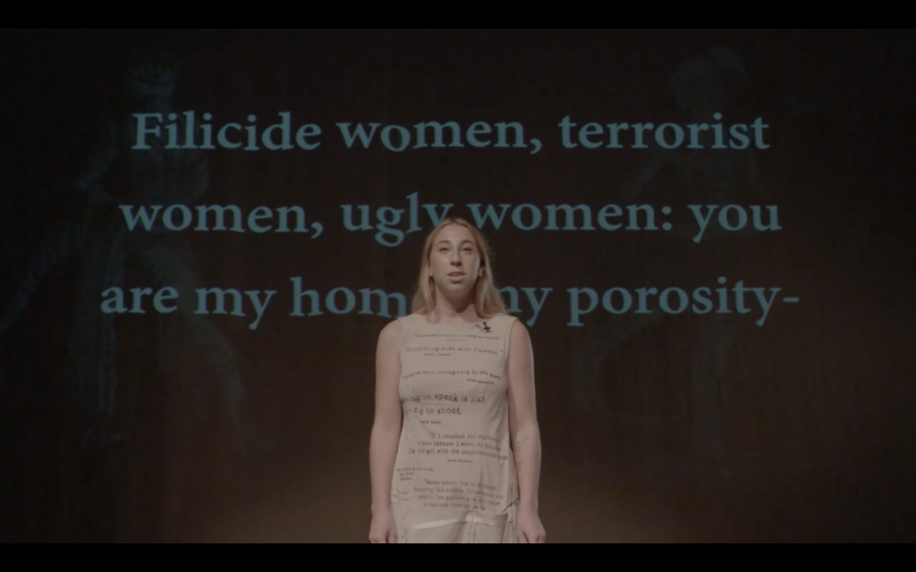
Revenge Poem (Theory of the LoFi Female), a thirteen-minute-long ballad attempting to understand the motivations for producing revenge porn and reconcile with its effects, opens with the artist, Amanda Horowitz, under a spotlight in a dark room. She describes the next steps that a target of the abuse can take, reciting instructions that are simultaneously projected on the wall behind her: “Feeling trapped? Become a porn star. Go on a killing spree. Never regret the feeling of your first kill. Embrace a journey laden in cum.” Her tone is conversational and inviting, despite the crude violence of her advice, and her deliberate lack of grief is strangely empowering. The volume of the percussive synthesizers in the background steadily rises as her message becomes increasingly urgent. “Filicide women, terrorist women, ugly women: you are my home, my porosity. Traveling through cell walls, you can escape.” Here, Horowitz first introduces the prospect of transcending the body as the ultimate means of release from a system that has birthed such a breach of trust, such a gross disregard for psychological repercussions. The target’s body has been publicized, reproduced, and manipulated to induce shame and humiliation, but the artist is not interested in the word victim.

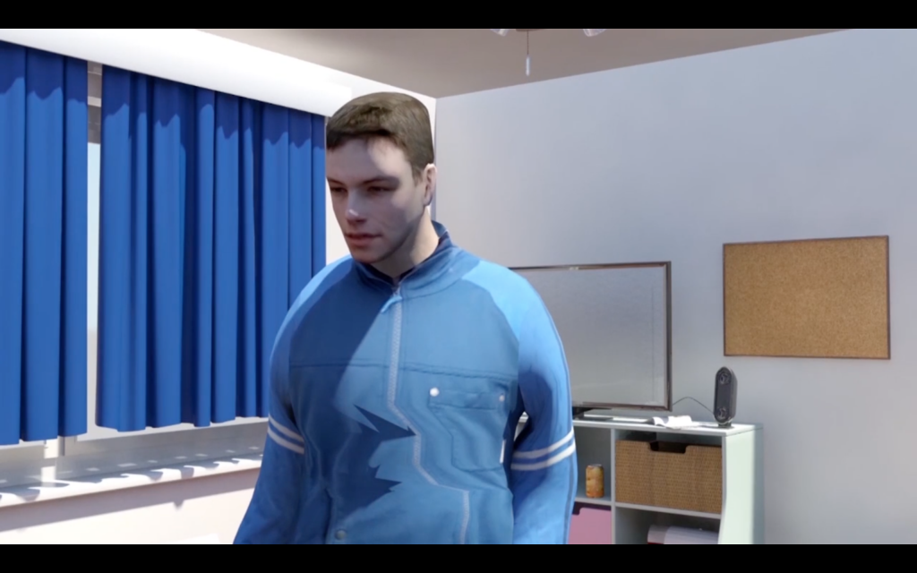
The scene changes to display an avatar of an adolescent male in a tracksuit entering the digitally rendered bedroom of a young girl. Horowitz observes the scene unfold via a projection on the wall of the room she occupies so that the view of the virtual bedroom is televised to both the artist and the audience. Like Horowitz, the male delivers a monologue, speaking aggressively but nonetheless gathering some twisted sympathy with lines like, “Flashing clothes, I’m a dashing boy/ Trapped here.” One can attempt to mine the subtle wordplay of his verses in real-time, searching for motivations for the vengeful act in lines like, “I feel anonymous when I look at it, like America chose me to make this and then I put you in a dress.” It is not completely clear who is in charge of the situation; the male seems confined to the room, monitored under surveillance, but the female can only watch his diatribe remotely and passively. It seems unsettling that this violent character would be inside of a young girl’s room for any reason, but it is understood that he exists inside of a separate, constructed world. As a digitally rendered, sometimes glitching, avatar, he seems less dangerous and more pet-like, ultimately controlled and manipulated by the artist.

Horowitz has described this project as “a perverted feminism, one that is searching for a humanity outside of sexual morals and current economic and political structures.”1 Using revenge porn as a catalyst for a broader inquiry into gendered power dynamics, Horowitz searches for a nuanced understanding of the impact of trauma inflicted on the female body. She uses performance, language, and drag to fluidly transition between omniscient motivational speaker, abuser, and target of the attack. It seems that even revenge porn, the quintessential gesture of misogyny, should be investigated from many different perspectives, its motives scrutinized. Horowitz has said that Revenge Poem is a “defiant slaughter of the very idea that there is a female victim,” and she explores the nebulous space between target and predator poetically and powerfully, reserving empathy for both parties.2

Horowitz’s decision to eschew victimization and incite empathy, at times resulting in work that feels profane or, as she describes it, perverted, is echoed in the work of contemporaries Bunny Rogers and Jacky Connolly. Like Horowitz, Rogers and Connolly navigate the complicated implications of trauma through the inhabitation of avatars or surrogates, both physical and digital, within constructed worlds. Animated videos generated from computer graphics constitute the majority of Connolly’s practice, while Rogers and Horowitz incorporate animated avatars into larger installations that integrate craft practices traditionally characterized as feminine. The artists deviate from, and build upon, the body-centric work of Yoko Ono, Hannah Wilke, Carolee Schneeman, and other feminist artists of the 1960s and 70s in order to extend the physical body into the infinitely pliable digital space of the screen. Speaking and acting through the guise of avatars, both original and appropriated, Horowitz, Rogers, and Connolly are able to translate trauma, often remembered in a fragmented manner, into a narrative structure. Whether reflecting on revenge porn, the Columbine High School massacre, or the September 11 terrorist attacks, the work investigates individual memories of universally experienced emergencies and their subsequent social and political ramifications. Recounted through a female narrator, the collective work also reflects on a broader experience of girlhood and adolescence in the dawn of the internet, identifying moments that have functioned as catalysts for premature entrance into adulthood.

N. Katherine Hayles writes that “trauma overwhelms the ability of a human to process it” and “traumatic events are experienced and remembered in a qualitatively different way from ordinary experience… Dissociated from language, trauma resists narrative.”3 She continues,

Experienced consciously but remembered non-linguistically, trauma has structural affinities with code. Like code, it is linked with narrative without itself being narrative. Like code, it is somewhere other than on the linguistic surface, while having power to influence that surface. Like code, it is intimately related to somatic states below the level of consciousness. These similarities suggest that code can become a conduit through which to understand, represent, and intervene in trauma.4

If “conscious is to the unconscious” what “language is to code,” as Hayles argues, then the digital realm can provide an appropriate platform for processing trauma, filtering language through the virtual body of an avatar. 5 An avatar “is generally conceived of as a passive puppet providing unmediated agency within the virtual world,” and Hayles explains the benefit of operating through this form:6

The contrast between the body’s limitations and cyberspace’s power highlights the advantages of pattern over presence… As long as the pattern endures, one has attained a kind of immortality…In a world despoiled by overdevelopment, overpopulation, and time-release environmental poisons, it is comforting to think that physical forms can recover their pristine purity by being reconstituted as informational patterns in a multidimensional computer space. A cyberspace body, like a cyberspace landscape, is immune to blight and corruption.7

Invincible, immortal, and immune to pain, the cyberspace body provides an ideal, neutral space for processing emotion, and because the physical body is so frequently a site of past trauma, its erasure in an artwork can represent transcendence from a psychological burden. The use of an avatar provides mediated distance for reflection on a traumatic event and further enhances the surreal and uncanny atmosphere of its aftermath. Horowitz utilizes the avatar to shift roles between male perpetrator and female victim in Revenge Poem, by way of occupying each character’s voice, while Rogers and Connolly insert themselves into cartoons and computer games, finding correlations with fictitious childhood characters.
In the writing that accompanies Revenge Poem, Horowitz describes the contemporary female as synonymous with a compressed digital image, prone to manipulation and distortion. “Like a JPEG, she has become pure data traveling through cyberspace, losing sharpness and becoming a lo-fi, genderless image.”8 assertion reiterates the integration of the virtual and corporeal that has been suggested by media theorists and cyberfeminists for decades, most notably by Donna Haraway in her 1985 seminal work, “A Cyborg Manifesto.” “By the late twentieth century, our time, mythic time, we are all chimeras, theorized and fabricated hybrids of machine and organism. In short, we are cyborgs,” Haraway declares.9

 “Why should our bodies end at the skin, or include at best other beings encapsulated by the skin?”10 This merger between human and machine is not meant to eradicate the body but rather explore its limitations through a synthesis with the digital realm. Maria Fernandez explains that participation in the digital world actually heightens awareness of the physical body, writing, “We need to strengthen our presence in that greatly contested [digital] realm, but with a consciousness of our bodies and embodiment. In the celebration of our union with machines, it is critical to keep in mind that technology has been an integral part of the construction and sociohistorical positioning of identities.”11

Erasure of the physical representation of the body is an inherently radical gesture for an artist making work within a patriarchal structure. Artist and theorist Hannah Black has written, “The abolition of the body, [the] idea that if we were to abolish gender—if that could even be a serious political horizon—it would involve a complete re-imagining of the conceptual train of the body, an unthinking or de-creating of this idea of having a body.”12 This rather abstract way of thinking reimagines the potential of treating gender fluidly and, in regards to processing trauma, blurs traditionally defined feminine and masculine coping mechanisms.

For Horowitz, one of the most important reasons for utilizing an avatar in Revenge Poem is the ability to acquire “the perspective of the male cyber rapist, occupying his voice as a form of drag.”13 As the character delivers his monologue in the second act of the video, it quickly becomes clear that he has an extremely limited range of movement; after initially walking into the room, he stands completely frozen and unblinking, able only to jerk his neck mechanically. An inset occasionally appears to depict the artist watching the scene projected on the wall behind her. She seems to patiently wait for him to finish, wading through the hostility of his words in search of a logical reason for his violent and violating act. His words express a juvenile frustration towards being told no, and his final lines seem to depict him as a nursery school villain, simultaneously dangerous and naive.
Horowitz returns to her soapbox, now reciting her coded poem from a booklet in her hands. Occasionally, her words are interrupted by recorded protest chants and barely decipherable news and videogame clips. As she reaches the conclusion of her monologue, her sentences deviate from abstract poetry and become a more direct and confessional soliloquy:

Looking at the stolen images on revenge porn feeds, I feel a mixture of skin crawling disgust and confusion. I want to empathize with this boy, wrap my head around his motivation, turning his abuse into something substantial and greater than the senseless act, raising up its importance not as victim or perpetrator but as the forces that cast us in this technological projection. Using his attire, I want to be that girl and turn her into my bio-warrior.…

Horowitz “wants to empathize,” but she still cannot fathom the male character’s actions. In dawning his character to search for motives, she is now confronted with the possibility of also being guilty of an act of violation. The digital avatar of the male has provided space for cyberdrag and a pursuit of empathy, but it has also created discomfort and agitation. “Am I the cyber rapist?” Horowitz asks, momentarily pausing from her script, seemingly lost in the question. The video closes with a kind of duet; the male calls out the phrase, “Because my girl knows how to feel,” and Horowitz echoes, “Because I know how to feel.”

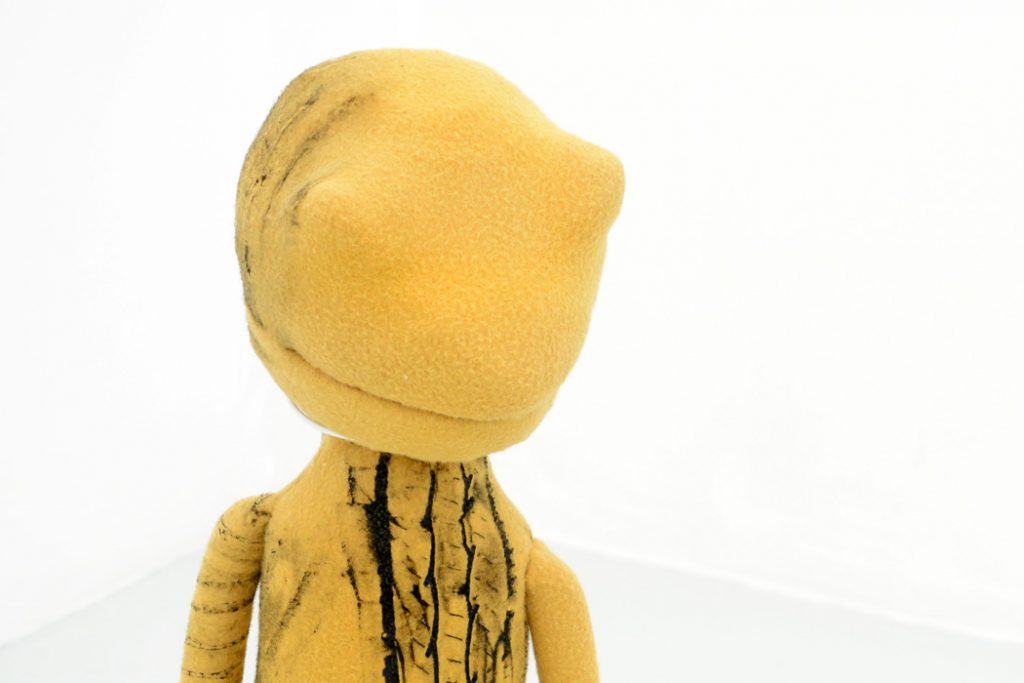
Revenge Poem was shown in Baltimore in December 2015 as part of i <3 my emergency, a two-person exhibition at Springsteen Gallery showcasing the work of Horowitz and Nandi Loaf. A group of sculptural objects by Horowitz accompanying the video are collectively titled Cloak of Earthly Objects. Three puppet-like sculptures sit on the ground, and vinyl text on the walls behind the figures display various poems by the artist: “A war is waged on/ Your pockmarks/ Your puberty/ Your butterflies in history,” and “You are a hysterical monster/ We shall never have to move,” and “Tidy up 9-1-1/ Look at the nice girl/ Standing by the airport/ Pantomiming typhoons.” The gallery text describes these works as a collective “multifaceted hyperobject of [the artist’s] experiences of 9/11.”14

In a subtle nod to Revenge Poem, Cloak of Earthly Objects also uses surrogate bodies to act as exterior vessels for processing trauma. However, the surrogates have now been realized as objects and brought into the physical world. Importantly, each puppet is fully functional and can be entered; they are shells of a collective memory waiting to be manipulated by the user. The exhibition seems to reflect less on the actual events of September 11 and more on the implications of a post-9/11 world, fraught with anxiety, suspicion, and the subsequent increase of discrimination towards non-Americans and immigrants. Brian Massumi explains:

The immediate shock gave way to lingering fear, relaying the danger into a remainder of surplus threat. 9/11 was an excess-threat generating actual event, which has perhaps done more than any other threat-o-genic source to legitimate pre-emptive politics… An event where threat materializes as a clear and present danger extrudes a surplus-remainder of threat-potential, which can contaminate new objects, persons, and contexts through the joint mechanisms of the double conditional and the objective imprecision of the specificity of threat. Threat’s self-causing proliferates.15

The first puppet, or “threat-potential” object, Rubble Rock, is constructed from yellow-orange foam and is covered in tire tread marks, indexical patterns of a traumatic, and possibly lethal, event. Rubble Rock resembles a frog and even potentially references the recently newsworthy meme character Pepe the Frog. The character has been listed as a hate symbol and banned by the Anti-Defamation League, following its cooption by various alt-right and white supremacist groups.16 Though the artist could not have foreseen how these events would play out, the allusion to a meme reinforces the fact that Rubble Rock is a character waiting to be manipulated and changed. The artist has imbued the figure with her own memory of the psychological aftermath of 9/11 and invites the viewer to do the same. The puppet is an empty vessel waiting to be directed, but the fate of the once-innocent Pepe the Frog serves as a reminder of the dark potential such a vessel possesses. Fear and anxiety can breed hatred and bigotry, and Cloak of Earthly Objects seems to document the artist coming to this realization at the young age of nine. She explains: “I think about my experience of 9/11 as still occurring, becoming a hyperobject that consumes an entire political climate of fear and hysteria.”17

On the other side of the gallery is A Buff Rose, a puppet with soft, purple felt skin, a lacy white dress, and human hair. Its eyes, eyebrows, nostrils, and mouth are beaded with hundreds of white, pink, and gold microbeads, a sock is stuffed in its mouth. Like Rubble Rock, there are signs of foul play; it seems that the puppet has asphyxiated. Horowitz’s play with language once again reemerges in the title of this character; “buff” might refer to nudity, strength of the character (despite its current frail state), or it might imply that the doll will be used to mop up the floors, presumably becoming as soiled as Rubble Rock over time. It feels appropriate that these puppets tread the line between toy and portent, as they represent an account of 9/11 through the eyes of a nine-year-old.

The third figure is less of a puppet and more of a sandwich board; a flat, cut-out female figure, hinged at the top of the head, wears a forest green cloak over a body covered in images of war, maps, the desert, Hummers, butterflies, and military planes. The title, Eracer Girl, similarly lends itself to various interpretations. The E-Racer is a homebuilt, single occupancy aircraft, loosely relating to September 11, but the name is also a play on email, e-waste, eBay Inc. Alternatively, the word might be a play on “eraser,” and Horowitz may be alluding to an erased childhood or loss of innocence. Whereas Rubble Rock and A Buff Rose encapsulate an indescribable feeling for Horowitz, operating more like her poetry, Eracer Girl attempts to illustrate, functioning more like a diagram; Eracer Girl is an aggregate of the media she experiences.

As self-defined hyperobjects, a term coined by Timothy Morton to describe entities “that are massively distributed in time and space relative to humans…[and involve] profoundly different temporalities than the human-scale ones we are used to,” Horowitz’s marionettes attempt to encompass a wide spectrum of anxieties induced by the aftermath of 9/11.18 Morton would probably argue that these art objects alone hardly constitute a hyperobject, but it is interesting to begin to try to understand what the hyperobject at play might be.19 More so than the actual event, Horowitz is attempting to reconcile with the development of a Homeland Security Advisory System, perpetually lingering at a nervous yellow, and the surge in xenophobic and Islamophobic hate crimes. The hyperobject, maybe, is a subsequent racism that, indeed, this election season has proven to be quite rampant. “I’ve thought about those sculptures as representations that embody an abstract power network, one that spans back and forth between time,” Horowitz has said. “The puppets… can be entered and possessed, which was very important to me in thinking about them as almost voodoo objects.”20

The conversation becomes gendered when we begin to consider the shared grieving within a post-9/11 landscape and the traditionally feminine characteristics this grieving is usually assigned. “When I was making those objects,” Horowitz writes, “I was thinking about an effeminized country, the use of paranoiac foreign policy as a type of domestic hysteria—a symptom once put on housewives who were trapped and repressed and now embraced as an entire national subjectivity.”21

Now an obsolete medical term, hysteria came to prominence as a medical diagnosis in the Victorian era to explain a variety of symptoms ranging from anxiety to irritability to fainting spells in women.22 The creation of the condition, and its continued acceptance for centuries, “illustrates how Western society pathologized women’s sexuality both as a mystery and as a problem.”23 For many years, hysteria justified the classification of women as frail, weak, dramatic, and volatile, and, though now outdated, it is curious to see similar feelings of paranoia and anxiety regarded as heroic or patriotic through a masculine, militaristic lens. Freud later linked the condition to sexual abuse and other childhood traumas, stating that, “the subject has retained an unconscious memory of a precocious experience of… sexual abuse committed by another person; and the period of life at which this fatal event takes place is earliest youth—the years up to the age of eight to ten.”24 Again, the age of “eight to ten” is emphasized as an important time of transition and development during childhood, specifically girlhood; that these vital years of Horowitz’s are marred by a national crisis represents something of a twisted rite of passage. The “fatal event” that Freud describes on an individual scale is not unlike the broader “fatal event” faced on a national scale, and the two carry mirroring ramifications.

Both Revenge Poem and Cloak of Earthly Objects seek to address trauma in rather abstract terms; the artist’s writing is often deliberately cryptic and her props enigmatic. The sculptural objects, especially, seem to develop intuitively, materializing first before being completely understood by even the artist. Possessing the capacity to be entered and controlled, Horowitz’s puppets become tangible surrogates for both the artist and the viewer to impregnate with memory and emotion. They are vessels for emotional labor, concurrently laden with a universally shared experience and infinitely vacant. The puppets anthropomorphize suspicion and anxiety and surveillance, but they also ask to be played with, comforted, held. The avatar in Revenge Poem, similarly, seeks some kind of empathy, and Horowitz enters this shell, too, to search for it, but ultimately comes up empty handed.   

*   *   *
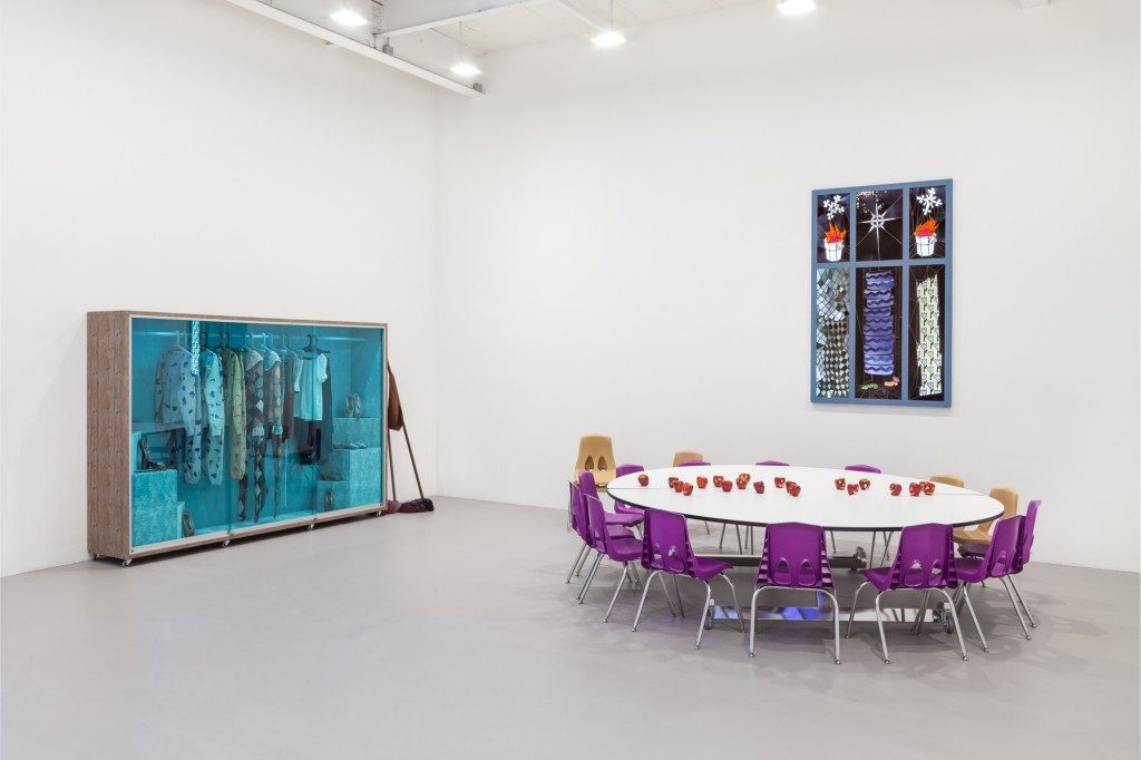
Grappling with collective trauma through physical and digital surrogates similarly centers the work of New York-based artist Bunny Rogers. Often, Rogers masks trauma within seemingly innocuous, utilitarian objects, and she integrates her poetry into installation-based work via animated characters. Her recent installation at Greenspon Gallery in New York, Columbine Cafeteria, transforms the space into a modified representation of the cafeteria of Columbine High School, the site of the 1999 school shooting by students Dylan Klebold and Eric Harris. The exhibition, a sequel to Rogers’ earlier work on the subject, Columbine Library, is multifarious and immersive, and it feels much more fully-realized than the previous iteration. Rogers researched the event extensively and obsessively in preparation for both installations, poring over police reports, news articles, and online forums. The accompanying gallery text explains, however, that Rogers is not interested in a purely objective and straightforward translation: “The artist likewise melds fantasy and fiction with forensic data, suggesting that our experiences reside in the flux between the two.”25 The cafeteria tables and chairs have been painstakingly re-fabricated, while fictitious characters are implanted in the scene, generating a surreal amalgam of reality and fantasy.

Coincidentally, Rogers was also nine years old at the time of the Columbine massacre, the same age as Horowitz at the time of the September 11 attacks. Like Cloak of Earthly Objects, Columbine Cafeteria reflects on the larger implications of a nationally experienced crisis, seeking to visualize an experience that is difficult to articulate but has undoubtedly influenced the collective childhood of a generation. “Research into social absorption of the Columbine Massacre registered as a complex puzzle necessitating subjective assembly,” Rogers explains in an interview with Mousse magazine.26

Nearly eighteen years later, the Columbine shootings are still regarded as a pivotal turning point in the history of school violence, forever changing the ways in which bullying, mental health, and gun violence are addressed in school. Columbine Cafeteria is an ode to a tragedy and its victims, as well as a reflection on the dawn of a new age of anxiety and fear. Like Horowitz, Rogers is interested in searching for a motivation for the horrific event, unsatisfied with the blanket accusation of mental instability. She proposes the irreverent idea that the depression and anger and loneliness experienced by Klebold and Harris are emotions experienced by all young adults.
The individual works in the exhibition demand slow interaction, and, as in much of Rogers’ work, some of the most poignant moments are found within the details, betraying the artist’s hand. Rogers has written that furniture holds the potential to become “vessels for extreme events and extremes of emotion,” noting that they, too, can become worn down and distressed.27 “When I look at old pieces of furniture, I kind of see a silent scream.”28 In the case of Columbine Cafeteria, many of these memories of “extreme events” are buried under sumptuous materials, and the objects require careful visual excavation. Their emptiness is significant.

The front room of Greenspon contains a large velvet-lined vitrine displaying outfits and ballet shoes. A standard circular cafeteria table is surrounded by fourteen purple and beige chairs and covered with apples, carved to resemble jack-o-lanterns. Various stained glass windows, framed portraits, and a cafeteria tray slide (poetically referred to as a ballet barre on the image list) adorn the walls. In the adjacent room, a tableau of an overflowing trashcan and a mop and bucket, seemingly soaked in wine, rests in a corner. An animation is projected on the wall.

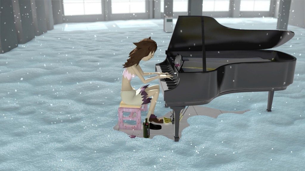
The animation, Mandy’s Piano Solo in Columbine Cafeteria, portrays a 3D avatar based on the character of Mandy Moore from Clone High, a short-lived animated series centering on a high school populated by clones of historical figures.29

 Moore sits at a piano inside of a rendering of the school, while snow falls from the ceiling and covers the ground. The virtual space is both interior and exterior; the structure has failed to protect its lone resident, and a scantily clad Moore is exposed to the cold. There are no footsteps in the snow or other signs of life, and the chronology of the scene is ambiguous. Does she perform in the present, or has the viewer been transported back to 1999? Moore plays three Elliot Smith songs on the piano, despondent odes to adolescence, pausing only to drink from her bottle of wine.
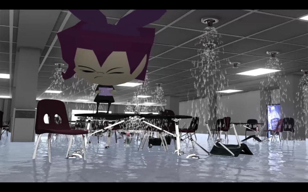
The viewing space for the video closely replicates the animated scene; the bench in the gallery is a physical reproduction of the animated one that Moore sits on, and artificial snow also falls from the gallery ceiling, covering the floor. More carved apples, holding candles, are scattered around the floor. Moore’s world mirrors our own, and the boundary between virtual space and real space is temporarily lifted, allowing the viewer to virtually enter Columbine High School. The physical room, and specifically the piano bench, provides space for processing the tragedy while listening to Moore’s memorial performance.

Rogers seems to acknowledge the potential irreverence of inserting her own body into a tragedy she did not experience firsthand. Her decision to use a surrogate, one that can be recognized by the audience, creates a separate space for processing the Columbine massacre. Rogers can only investigate the event a decade later through online forums; her fabricated character, however, can travel to the virtual site to mourn and fill the space with music. Moore’s character seems to embody innocence and purity; she is referred to as angel in Clone High, and, in the adjacent room, she is depicted wearing a halo.

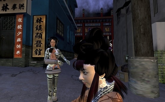
Other characters function more literally as autobiographical surrogates for Rogers. Poetry Reading with Gazlene Membrane, a video from Columbine Library, features an avatar of Gaz, the younger sister of the protagonist from the animated television series Invader Zim. Gaz is described as “the other primary, and most powerful, character… cruel, strong, and brilliant” and notably has an absentee mother, harboring childhood distress of her own.30 In a panel discussion at Yarat Contemporary Art Space in Azerbaijan with Suad Garayeva and Michael Connor, Rogers explains the kinship she feels with both Gaz and Joan of Arc, another character from Clone High that frequently appears in her work, including a stained glass piece in Columbine Cafeteria,

“I related to both of these characters because… they were really outwardly angry and didn’t hold back about expressing cynicism or their sarcastic senses of humor or desires to get vengeance. I think it started with realizing that the two of them seemed like sisters. Gaz is eleven, Joan is seventeen, so I saw them as sisters but also as myself at different ages.”31

In Poetry Reading with Gazlene Membrane, an animated Gaz, whose head and purple pigtails are many times larger than the rest of her body, walks into a rendered depiction of the school’s cafeteria and climbs up onto a table. As in Mandy’s Piano Solo in Columbine Cafeteria, the depiction of Columbine High School is mimicked exactly, down to the measurements of the room and the positioning of the furniture. The sprinklers are running and the chairs, which have been knocked over, are submerged in water. Gaz reads from a book, Cunny Poem 1. Cunny Poem 1 is Rogers’ published anthology of poetry from 2012 to 2014, and, performed in the somber setting, lines that would otherwise seem angst-filled and melodramatic achieve more poignancy and power: “I look at you and I have no idea who you are.” “With art, feelings are clear.” “Remember this crushing day.” Rogers has successfully infiltrated a character that she has admired for some time, and it is surreal to hear her monotone voice emanate from the small cartoon mouth of Gaz. Time is compressed, fusing the Columbine massacre with childhood memories of watching Invader Zim and Rogers’ own current writing.
*   *   *

The use of digital avatars and constructed virtual spaces to process trauma is arguably most prominent in the work of New York-based artist Jacky Connolly. Connolly constructs characters and sets within the computer game The Sims 3 and then records real-time computer graphics to develop animated videos, a technique referred to as machinima.32 The films explore childhood memories through reconstructed, virtual spaces in which fact and fiction can be interwoven. On her similar and pioneering work using Second Life, Chinese artist Cao Fei has reflected that her virtual city is “not a city of magical mirror, it doesn’t restore the full present, not does it recall our reminiscence of the past. It’s a mirror that partially reflects.”33 Connolly operates with a similar philosophy, selectively editing and altering her childhood memories. Like Second Life, The Sims provides access to an entire virtual universe, and the user can direct his or her characters to carry out a wide variety of tasks. Connolly directs and captures in-game scenes in order to create enigmatic narratives containing little to no dialogue. Initially, playing the computer game as a child provided an escape for Connolly, and it proposed the possibility of a fluid identity within a fictitious utopia, completely under her control:

The Sims was my window onto an inaccessible realm, a fantasy theater for enacting my imagined late teen years and early adulthood—a world without school where you could drive, sleep at a man’s house, or try out his heart-shaped hot tub. I would frequently roleplay as older women that I wanted to emulate, an amalgamation of various movie and book characters and cool teens that I would see at high school. I envisioned adulthood as a world of intrigue and possibility, a release from the ensnarement of a middle school nightmare. Real life could only disappoint these optimistic projections.34

The Sims remains “a fantasy theater” for Connolly, and she has explained that her work using the game “no longer enact[s] an imagined future, but reenact[s] the traumas of earlier life stages.”35 Her work Tales from the Borscht Belt, produced in 2016, follows a group of adolescent girls and women in and around a suburban house surrounded by rolling hills and trees. Unlike the work of Rogers or Horowitz, Borscht Belt does not point to a recognizable or historical moment as a singular catalyst for entering adulthood. Instead, the video attempts to illustrate the shared teenage experience of persistent angst and loneliness.

A female voice, presumably Connolly’s, narrates the video, reciting a poem later attributed to LiveJournal user “katythestrange.” Following the link to the user’s online diary reveals a website that has remained untouched since 2005; like so many web diaries of the early 2000s, katythestrange’s is preserved indefinitely online, capturing the sentimental and mawkish writing of her teenage years. Spoken overtop Connolly’s video, the words sound melodramatic but, at times, perplexing. “Once upon a time, long before clocks made sense, a little girl talked to rabbits,” Connolly recites, “Her worst fear was dying alone and in pain/ She built a shelter from the rain/ But one day it fell apart/ She couldn’t sing/ She’d lost her heart.” Katythestrange’s memories are interwoven with Connolly’s to create a shared experience.

Logistically, the game is an invaluable tool for Connolly, providing her with limitless access to actors, sets, and props that can be directed and transformed endlessly. The enormous expenses required for the production of a movie are wholly erased. However, beyond the pragmatism of the decision, the visual language of Connolly’s videos is extremely important to her narratives. The graphics are nostalgic, harkening to early computer games, and the repeated, algorithmically determined movements of a character’s breath or the swaying of the trees outside function as surreal temporal devices in the uncanny worlds. Connolly can seamlessly incorporate fact with fiction, retelling a narrative but allowing the story to evolve and change on its own. The rendered architectural spaces within her videos are filled with strange and dreamlike objects so that “signifiers of the domestic and of childhood (specifically girlhood) are redeployed as markers of personal identity and cultural affiliation.”36 This world very much belongs to Connolly, and the viewer is merely a passerby peering in.

The characters in Borscht Belt are never identified for the viewer. Most of the film depicts only small and mundane actions shared between them, though Connolly incorporates brief moments of violent or sexual acts to hint at an unseen underbelly masked beneath suburban banality. Observed from the point of view of a single character, these moments are often obscured and fleeting so that even the viewer is unable to pin down exactly what has transpired. These accumulated memories ultimately create architectural spaces that are filled with secrets and distrust. Like Rogers, Connolly is interested in the psychology of a room and its belongings:

In my scenes, the nightmares of childhood and the traumas of adolescence serve as an anteroom to hell. Anxious and foreboding nights spent in a suburban bedroom have shifted from being the context in which I was playing (as a preteen) to the subject of my film scenes. As an adult, I can now use this world for my own private film production. This is how the intrigue and possibility of the game lives on, in the sandbox world’s potential for mastery through reenactment.37

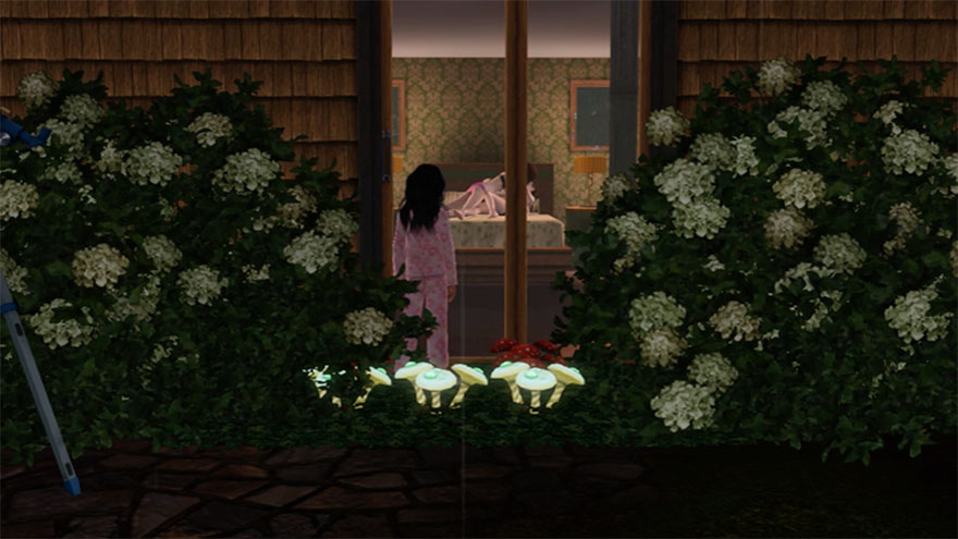
Heavy rain and a foreboding, howling wind can be heard throughout most of Borscht Belt, and the ominous weather keeps the characters trapped inside of the house for the majority of the film. All of the characters are mute, and it is difficult to discern the sincerity of the relationships they share because of the avatars’ standard, vacant expressions. During one moment of clear skies, two of the young female characters relax by the pool, while a third, the youngest, slides through a slip-and-slide on an endless loop, playing alone and keeping herself occupied. Connolly’s mise-en-scénes emphasize isolation and separation, and when the same young girl later witnesses two of the female characters undressed and in bed, she is alone, observing the scene through a closed glass door. The rain falls both inside and outside of the house, as seen in Mandy’s Piano Solo in Columbine Cafeteria; once again, the architecture has failed to protect its occupants, and the young girl is witness to a mature and confusing event, rushing her maturation to adulthood.
For Connolly, working with machinima seems to provide a sense of closure. After dedicating hundreds of hours to recreating architectural spaces and settings from her childhood, she can virtually wander through these landscapes, confronting the rooms that still hold potent memories. Notably, all of the characters in Borscht Belt are female. Connolly’s characters may be unnamed family members or peers or even many different versions of the artist at various ages. The narratives reflect on girlhood and imagined matriarchy, though Connolly is ambiguous in defining the space as utopian or dystopian.

For each of these artists, the inclusion of both digital and physical surrogates provides empty vessels for processing trauma and past memories outside of the body. Horowitz uses the digital avatar as a platform for cyberdrag, finding power in occupying the virtual male body, while Rogers and Connolly infiltrate computer games and television shows from their childhoods, subverting nostalgic pastimes into an interactive stage through which adolescent anxieties can be reevaluated. The code-based language of the digital screen becomes a conduit for translating trauma into narrative, while physical props echo the role of object as vessel, imbued with poignant memories and distressing emotions. Erotic and violent narratives are explored through tender artifacts of girlhood, as in Rogers’ ribboned mops, Horowitz’s smothered puppets, and the forgotten verses of poetry from an online diary discovered by Connolly. By entering into constructed, and at times virtual, worlds, these artists explore potent, distressing memories in order to process past traumas, either personal or universal, and explore the construction of contemporary girlhood and adolescent female identity.

Images and screenshots courtesy of Amanda Horowitz, Springsteen Gallery, Greenspon Gallery, and Jacky Connolly.
Encoach @ Springsteen Gallery (Dickie/Varadi)

Kodi Fabricant

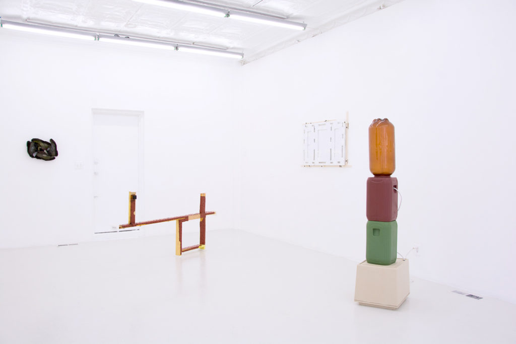
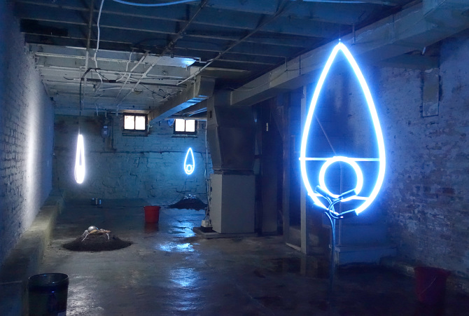
Install view

“Art is a terrible risk, and no one would do it if they didn’t believe in themselves. I’m not sure if I buy it, but the idea has been floated that we, who do this shit, hope that through this work we can maybe escape. Even if you have to hand in your meatsack at some point, your work will stand in for you later. It’s the deposit you put down. Pay the meat price and get in the art tube.” In Steve Kado’s short story accompanying Encoach, a two-person show featuring works by Keith J. Varadi and Georgia Dickie, he skeptically addresses motives for art making. Specifically, escapism and self-preservation become central themes.

A bird’s “hand” in the work, even hypothetically, is critical in creating meaningful dialogue around motive. The presence of bird labor displaces motive from self-aware artist to non-self-aware animal performing the same work. I am using this information to decode the significance of color-sorted pellets by canary and I think it’s safe to use the canary as a stand in for any bird or non-self-aware animal. Male bowerbirds build complex structures of various found objects and sticks, usually grouping disparate objects of like colors together in an effort to attract a mate.

Birds preserve their identity through population, while artists preserve identity through objectified perception (i.e. art). This interpretation poses new questions surrounding an artist’s motives, like “Who/What are they trying to attract through their work?” making attractiveness a key component on the path to self-preservation. For me, this is a much more interesting read than plain old bricolage. The canary is the strongest component of Dickie’s work, and I wish it were more explicit.

Steve Kado’s writing contains clues for decoding the work as well and clearly states his intentions for writing in the last couple lines, “Believe it or not, this piece started out as a reflection on the way primary accumulation and risk were interrelated. It was based very strongly on some ideas detected in the work. JSYK.” Just so you know: A casual way of presenting integral information.

Keith Varadi
Keith Varadi

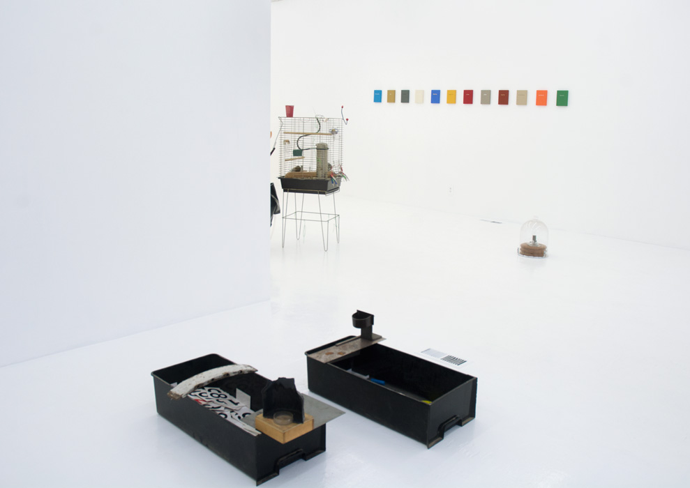
Oh, Hell; Past Gone; Grim Ripper; First Sight of Water; Regal Funk; Steal Those Cuts; Menagerie, PST; Foie Gras; World Truth; Live Like This; Maiden Man; Self-Help Writ Wrong. These phrases decorate 5×7 cloth panels by Varadi. An insider told me they are all titles of his poems, a detail that is not explicit, although it may be assumed or known by the artist’s friends. I almost expected full poems to be shown, considering Varadi’s reputation as a poet. The pieces mimic hardbound book covers, and are of varying cloth and ink color combinations. The colors are similarly rich, vibrant, and seductive, willing a longer pause from the viewer. The selection of this swatch of colors reminds me of Jenny Holzer’s Inflammatory Essays (1979-82) in which Holzer uses backgrounds of varying colors with black text, creating a visually stimulating support system for her provocative content. Varadi’s titles range from provocative (Self-Help Writ Wrong) to dramatized romantic (First Sight of Water), to absurd (World Truth).

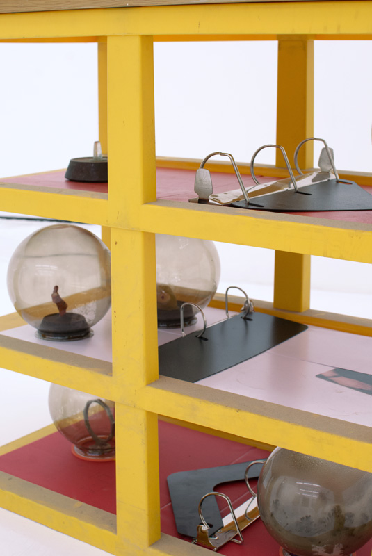
Dickie’s work is less literal. Near the back wall of the gallery, Pisetions (binders) stands displaying storage unit, metal, coral, wax, binders, rubber, and various found objects including some sort of midi splitter and chair parts. Not birdbrain bricolage, but regular. Objects are spatially redefined, perhaps for therapeutic purposes, but definitely not for attractiveness. Liminality exists between binder spiral spine and what looks like the molted shell of a 7 in. plasma ball. This piece did not captivate me in the same way as others by Dickie. The placement of the objects is too normalized, on display and restricted to even-numbered shelves. I over think the term “binder” in effort to read the piece. The shelving unit becomes a binder of objects, hollow glass balls become binders of air, electronic equipment becomes binder of signals, rubber becomes binder of tension, so on and so forth.

Georgia Dickie
Georgia Dickie

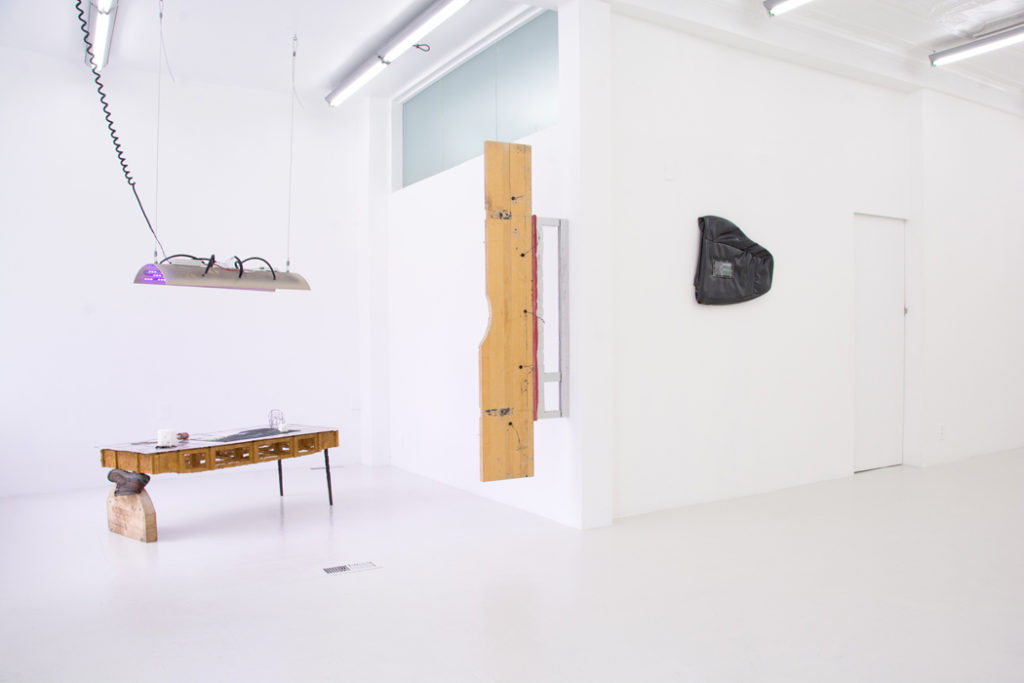
Adjacent is Declaration, a piece by Varadi, consisting of a narrow plinth covered in adhesive vinyl photographs, with a small bottle of crude oil placed on top, enclosed within an overturned pint glass. The photographs adhered to the plinth are snapshots reminiscent of nostalgic point-and-shoot collections. Most notably for me is an image of the word “PIG” with an X through it against a yellow wall. This type of image seems familiar, like I’ve seen this wall before or one like it, which I’m sure there are hundreds. The images seem to capture pauses in daily routine, and contain the motion found in street photography. There is an element of humor specific to the photographer, something that made them pause to chuckle to themselves. I read this as “Moments of Amusement decorate the sides of the structural support to the Eternal Rose of Industry.” Escapist antics are called out simply due to the fact that cars require gasoline to move. To get in your car and just go still requires a trip to Sunoco.

Turning to the wall we see Oasis, a Nevada license plate in a holder with state promotional text “I’d Rather Be Gambling In Las Vegas.” Through the lens of contemporary social media culture, this is a passé bottom-text meme. Again, escapism is on display.

A recurring vibe in both Varadi and Dickie’s work is a sentimental recognition of a fragmented object or place. This is clear in the centrally placed work Today Was a Rare Day (Many Minutes of Fun) by Dickie. Materials include metal birdcage perches, swing, blood, auxiliary cables, photographs, discarded canary feathers, doorknob, resurrection plant, and a disposable coffee cup. I research “resurrection plant” and find it resembles a brittle bird’s nest when dehydrated, but comes to life as a green fern when placed in water. Work that requires research creates an aura of depth both captivating and alienating. It attracts a type of viewer who is eager and has access to resources outside the gallery. The other kind of viewer dismisses the work as difficult or not of their taste.

Keith Varadi
Keith Varadi

After the opening, an artist friend of mine revealed her momentary panic when she thought she had absentmindedly rested her own coffee cup on top of the sculpture. I’m unsure how to appropriately define that sensation, but I believe it’s related to what Kado approaches when he writes, “So we aren’t changing individual identities in different contexts, but those contexts themselves define sets of behaviors and attitudes that are exchanged within, and all of those relationships are trans-individual.” Whose coffee cup is resting on the artwork? Is it the artworks? Does it belong to the artist who made the work? Or does it belong to the artist who left her studio to attend an art opening? Is it the gallerist’s? Did someone leave it there during the install, and it just stuck? Once again, Dickie makes us question possession.

springsteen-install-encoach

Investigating self-preservation and escapism as motives for making art leads to some tricky conclusions. One idea is that artists preserve their identities post-mortem through work that is attractive enough to be cared for long term, that is, work attractive on multiple dimensions (visually, conceptually, socially, etc.) But being able to escape the normalities of daily routine enough to feel inspired involves an element of risk taking, which is contrary to self-preservation. Is it possible for an artist to create work that does not require an ounce of risk-taking, although the creation of art in itself is a risk?

Encoach is a great show for a viewer who likes to dig. The work can speak for itself, but it speaks tangentially. It lingers and leaves you asking questions with no discernible answers. One question I can’t seem to shake is “What happened to the canary?”
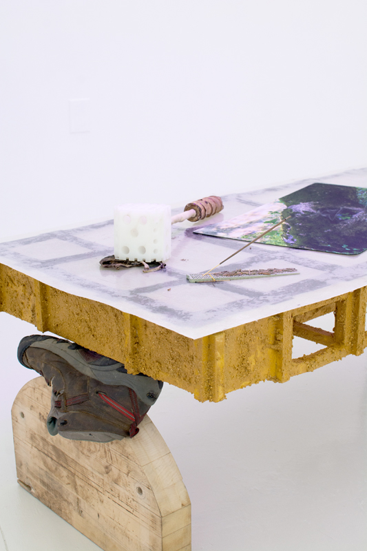
Encoach ran from September 10 through October 8, 2016 at Springsteen Gallery, 502 W. Franklin Street, Baltimore, MD. Images courtesy of Springsteen.

Pinpointing Metaphor: The Squinter’s Watch @ Springsteen Gallery

Bailey Sheehan

To point is to leap from one thing to an unrelated other.

In Modern Athens, the vehicles of mass transportation are called metaphorai. To go to work or come home, one takes a “metaphor”— a bus or a train.

The gesture of “pointing,” similar to the metaphor, is manipulative; a tool used most by memesters who post captioned/captionless imagery (that I am supposed to ‘get’). The highlighting of the rift between thing and expectation is, for some, a method to be utilized for subversion—a simultaneous appeal to and embarrassing of a mass-subjectivity we often confuse as ‘the personal’. The contemporary artist points in a similar way. Or, in the exact same way (Puppies Puppies, Scariest Bug Ever, Goth Shakira).

Colin Foster presents a body of work at Springsteen Gallery on West Franklin Street; the exhibition attempts to point toward some thing as well. The objects, however, exhibit surreality because of the ignorance they express toward their own trajectories as affect-producing things. With this, while the work exhibits interesting manipulation of materials and showcases Foster’s mastery as a maker, I am going to focus on the conceptual backing of the exhibition and some of its possible shortcomings.

The “point” is a formula for art showing where its efficacy is evident, though still holed—work that is supposedly visceral, or based in the presence of a conceptual spectre that is somehow inarticulable though is cogent enough to be modularly not only understood but praised by a group of likeminded people. Take for example, a piece entitled “The Self-Aware Slug” consisting of a linux computer, custom software (a computer repeatedly beating solitaire), and vinyl: there I experience a rift between what has been denoted as “the idea” and what the object is actually doing (or the acknowledged awareness that the object will do something). Here the artwork is first a conceptual poem, and second an object.

THE SELF AWARE SLUG, COLIN FOSTER

The “point” becomes worrisome when, within the rift between the expected and the actual, a recognition of something that would otherwise compromise the idea is displaced by that same idea. Perhaps it is a matter of not being given enough information, however, when I say that this exhibition is about a ‘thing,’ it is because, for me to go ahead and then guess or assume what this thing may be would further regulate that which I am suggesting this exhibition is abusing. And that is something a viewer may need to question more, to which role am I fulfilling? Am I a decider or a regulator?

Adrian Piper in “The Logic of Modernism” wrote about the malleability of the “aberration” that was Greenbergian formalism similarly.
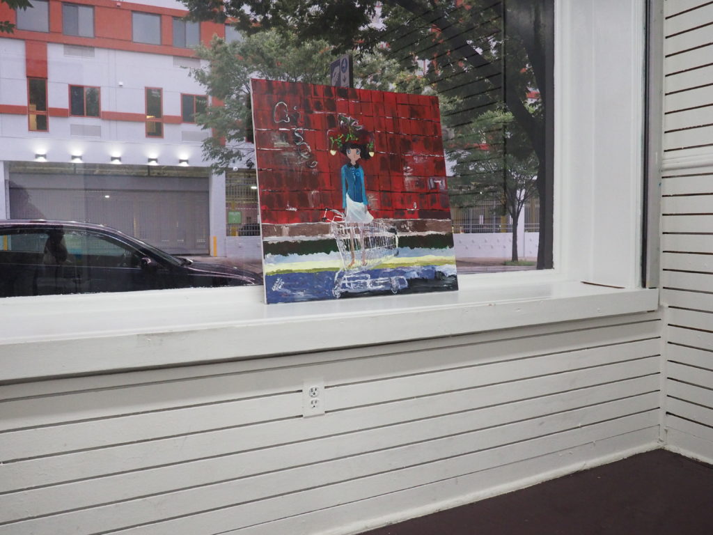
Relative to these lines of continuity, the peculiarly American variety of modernism known as Greenbergian formalism is an aberration. Characterized by its repudiation of content in general and explicitly political subject matter in particular, Greenbergian formalism gained currency as an opportunistic ideological evasion of the threat of cold war McCarthyite censorship and red-baiting in the fifties.

This work is manipulative and can be manipulated because it is evading the responsibility of being a producer and is instead reliant on a conceptual spectre of sorts. It is evasive in its withholding of information that would otherwise allow a viewer to discern if the work is engaging in responsible production. Responsible production is a method of art showing or viewing that is aware, though not in full knowing, of an object’s trajectory as a producer. As the object is shown and seen it is multiplied and reproduced the same as a meme, each time altered, each recreation with its own condition of existence. The responsibly produced artwork does not have to be explicitly based in and around political subject matter, rather, there is a certain political action that accompanies this responsibility taken by both artist and viewer.

The sensual object and I cannot meet inside of me. Instead, our encounter occurs on the interior of the relation between me and the real tree (which must be indirect, but there is no need to complicate things here). When the tree and I somehow form a link, we become a new object; every relation forms a new real object. (Graham Harman)

With the initial object’s relational reproduction alongside a conversation being had by Graham Harman or even Tristan Garcia, it would not be so bizarre to talk about these sculptures similar to the way someone like Hito Steyerl or Steven Shaviro would discuss media or film. Film and music videos, like other media works, are also machines for generating affect, and for capitalising upon, or extracting value from, this affect. Would it follow if we take a text such as Steyerl’s In Defense of the Poor Image and switch out “poor image” with “sculpture featured on art viewer?”

The sculpture featured on art viewer is no longer about the real thing—the originary original. Instead, it is about its own real conditions of existence: about swarm circulation, digital dispersion, fractured and flexible temporalities. It is about defiance and appropriation just as it is about conformism and exploitation.

I bring this all up, because at The Squinter’s Watch, it is clear that the work is about this one thing, a notion that is ideally inarticulable, though still maintains a modular registration transpersonally, defended only by a few encapsulating words I wish not name but will (hiking, gaming, solemnity). The work may in actuality be evasive; the work may in fact be displacing some other thing behind a screen of familiarities, (modular hanging of wall-based works, an interesting manipulation of material, depictions of a feeling or lifestyle). This is most likely not an intention of the work, however, it evidences the fragility, or weak integrity of a bridge (or “point”). A lack of any supplemental artist statement and or formal press release only helps to create a conceptual shroud. The work may then be mutated somewhere in the process of reproduction and dissemination (being featured on art viewer, being posted to instagram, a promotion on facebook, a rearticulation of the exhibition with a friend over coffee, maybe possibly even seeing the work in situ), which in turn would, in a worst case scenario allow, the possible continued fetishization of blue-collar aesthetics or, say a weird strain of heteronormativity at the fault of the originary original. Even though the work may not be necessarily about that, that same fetishization then is further co-opted into a contemporary arts canon.

Daniel Penny in a New Inquiry essay entitled The Irrelevant and the Contemporary: Why is Poetry #Trending in Contemporary Art penned: To go the way of the Bernadette Corporation and attempt to make poetry more commodified, more in line with contemporary art’s market logic and formalist preoccupations is a mistake. Poetry’s slowness, difficulty, irrelevance — these qualities must be made into virtues. If we circle back to Agamben, poets who are out of step with the time are the most contemporary of all.

I feel almost as though Penny’s accusation and rightful assertion that the Bernadette Corporation’s poetry is “more in line with contemporary art’s market logic,” is somehow skewed by the same idealism that conceptually sponsors this show. The dichotomization between the work and that which may compromise it is clear in art that decides it would rather discuss things supposedly beyond the cusp of any articulation (viscerality, the spectre, etc), or beyond the commensurability of an economic sphere. Although ‘‘the essence of culture is discrimination,’’ as Igor Kopytoff has put it, the market turns art into a homogeneous commodity whose value is in no sense unique. (Olav Velthuis “The Symbolic Meaning of Prices Constructing the Value of Contemporary Art in Amsterdam and New York Galleries”.) The work in this show seems to be instituting this same dichotomization, or at the very least it is trying to sweep some of the contextual parameters that may compromise the work, under the rug. The term post-object (seemingly endorsed by Penny) here only sounds to me as an evasive maneuver as to avoid responsibility for any ‘negative production’ of the sculpture as object. Or, it is to convince me that that aspect of the work simply does not matter.

Maybe the work needs to be contaminated in order to allow for the safer dispersing and fracturing of the art. The Bernadette Corporation, Christopher Ho, Nandi Loaf, or even Puppies Puppies are all great examples of artists who allow the contamination of their own work. Further, if the work allows itself to be contaminated or compromised, it will also gift a viewer with the ability to place more trust in the hands of the artist himself. With this in mind, if, while the work is dispersing (not only digitally, but through the subsequent reproduction of relation), the work is manipulated to be a propagator of something bad, it is not the responsibility of the author himself.

Images courtesy of Springsteen Gallery. The Squinter’s Watch is on view from July 9 through August 13, 2016.
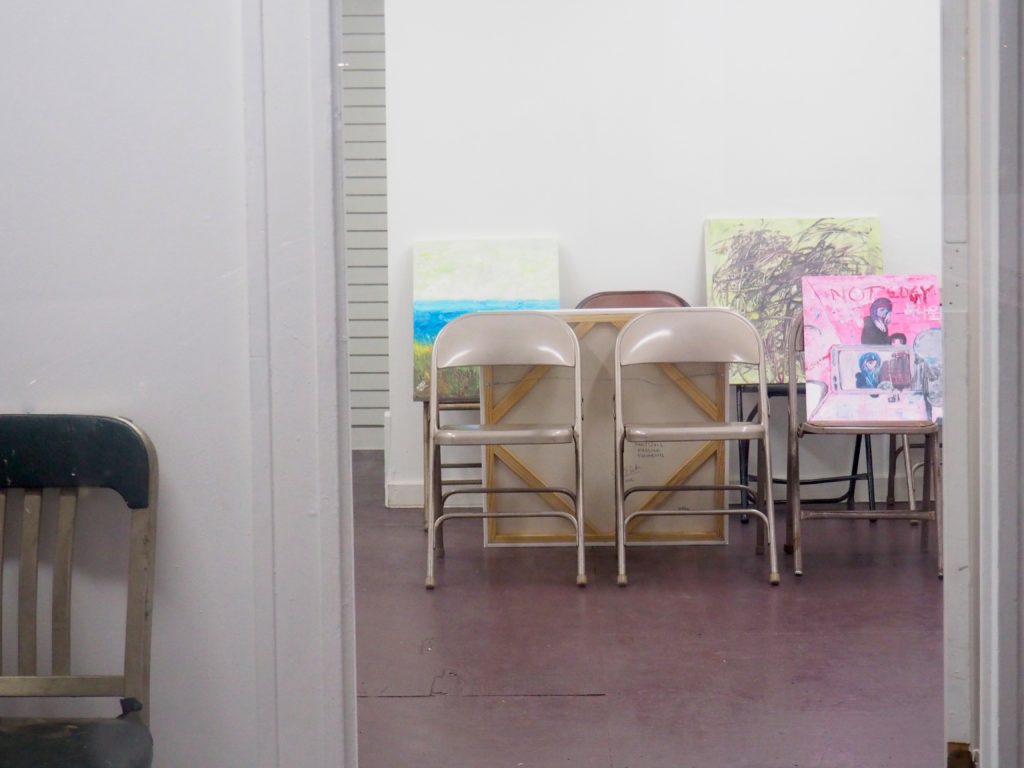
 

Persona As Readymade, Self As Religious Artifact: The Group Show @ Rope

C. Klockner

The Group Show features new paintings by Sarah Hai Edwards operating under the guise of three personas, each of which maintains independent studio practices. The work is displayed mostly on the floor and other surfaces of Rope, leaned against an arrangement of chairs with varying amounts of room for viewing. The arrangement is casual and awkward, and I imagine a Free School setting up for a workshop with a similar level of care.

Edwards’ personas cover three semi-distinct fields of work: Nooks Sez operates in the language of traditionalist abstract-expressionist mark making, Sarah Edwards works in a casual “Sunday painter” observational landscape style, and Sarah Hai mainly works in anime-style cartooning. This information was received verbally in a friendly setting — at the opening, the gallery directors maintained a continuous conversation over casual air, according to co-director Seán Boylan, “speaking about the show and Edwards’ work to people who attended and wanted to engage in discussion.” According to Boylan, the gallery originally received submission from one of Edwards’ personas, and later discovered another persona independently. After connecting all three projects, the directors proposed the opportunity of showing each body of work together in one show.

It’s a strange and exciting arrangement of work, but there are two aspects to this show that I want to address specifically because of those aspects’ failure to reconcile with each other: the show’s efforts as an exhibition of deskilled painting and the show’s efforts to showcase a conceptual curatorial project.

In the former, the topic of deskilled art practice has been worked to death. When reading about the aspect of Manet and Courbet being “castigated for what was taken to be their formal inchoateness, and lack of technique or facilite,” there’s a haunted aura in the air; we can point to where these histories take us, who is remembered, etc. 1 The topic in contemporary art 1970—> has primarily covered post-studio, hands-off, and appropriation based practices, but more recently has returned to the topic of casual-handedness.

I mention this because the paintings are bad and are similar to work I see produced in high school art programs: frantic, ambitious, direct, angsty. Deskilled in every sense, though not so much in the way I identify other hands-on provisionalist, folk, or outsider practices, where value might be found in material integrity, rawness of form, discipline of labor/conviction, or innovative use of obvious/accessible materials. Studio work that might be considered more elegantly handled in comparison brings to mind Judith Bernstein, Trevor Shimizu, Basquiat, Quintessa Matranga [who has contributed to this journal], and Rafael Delacruz — explicitly non-virtuosic line work but, rather, hard-headed practices that manage to evoke a sense of resolution.

Historically, a push towards deskilling (and valuing the deskilled) came paired with political implications, as it pushed the artist’s identification with the laborer by demoting the artist’s perceived agency and by including the laborer in the artist’s methods. 2 This is worth noting at a time when the field seems to have twisted that ideal of deskilling by developing a combination of hands-off deskilled practice, outsourced (skilled) labor, and, somehow, the promoted agency of the artist. In the field of practices in the above mentioned artists, both canonized and contemporary work might find potency in the development of the non-professionalized object, something that seems integral at time when deskilling seems to have lost much of its embedded politics. I do, however, want to acknowledge that those mentioned hard-headed practices appear to contain complexities within them that are absent in Sarah Edwards’ practice. The line between deskilled practice and amateur practice is almost too blurry to mention, but it seems to play a role here.
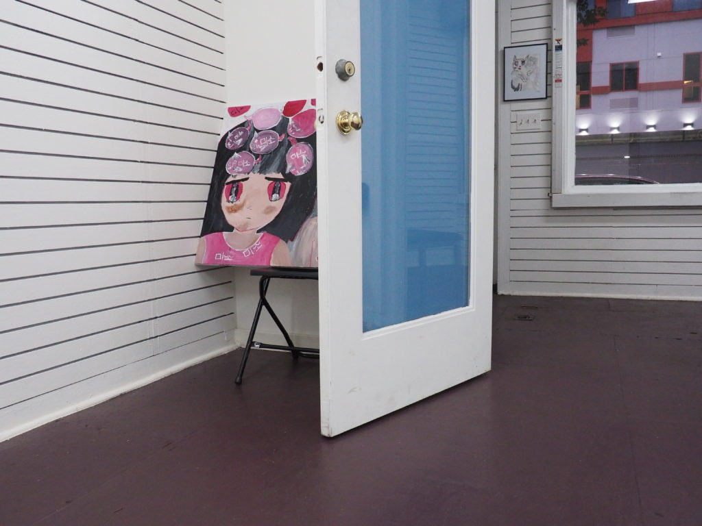
The impulse to make medium-specific pieces with heavy hand and clumsy representation is at odds with the solutions some post-studio or post-net practices settle on: the hands-off fabrication of fetishized value object. 3 This method seems to be employed, at times, in order to subsidize a more complex, immaterial practice. At other times, it appears to be for the sake of trend research and accumulating various forms of capital. And while a hands-on deskilling impulse might combat issues that arise in both of those production schemes, it could reveal something else entirely: who is able to leverage a half-assed practice into gallery space, critical coverage, and audience? Perhaps the practice becomes the hustle and the social circle in that scenario. I’m reminded of one myth for the name origins of “Dada:” a simple Romanian translation from “yes, yes.” That would be reciprocal positive feedback loops within an avant garde social circle, but I’m curious: who is saying “yes, yes,” now? This brings us back to that question of deskilled vs. amateur practice: deskilled artists have agency to select context, while amateur artists have to rely on the grace of curatorial interest.

The quality of work in these paintings is an important starting point before discussing the curatorial aspect simply because of its nature as a foundation to the show. Within the curation, the audience is presented a group show between three constructed personas that each umbrella a separate body of work. This functions so that the audience is presented with a balance between bad, sincere painting and a conceptual curatorial project about split identities. The solution of displaying work and chairs in the gallery feels satisfying, but the agendas conflict, each operating at odds with the other in a way that denies coexistence.

Placing the malleability of identity at the forefront of a practice has a long history — Duchamp as Rrose Selavy, Stephen Kaltenbach as Clyde Dillon, Adrian Piper as Mythic Being, Amalia Ulman as Amalia Ulman — and I can’t overstate the important potential of this tactic in understanding “self” as the contemporary subject and its conditions shift. Here, however, it feels forced and partially flattened through the immediate display of such personas as pinned down butterflies to observe. The curators place the burden of that content onto an artist who is, possibly, using personas as trial and error to unearth a practice she can believe in. That weight hedges the bets placed on both ideas; the paintings feel like placeholders for ideas, and the curation feels like an afterthought.

This may partially be due to the utilitarian function of the split identity and the relationship between the curators and those personas (or selves?) being displayed as “art objects.” In Boris Groys’ “Curator as Iconoclast,” he describes the historical relationship between curators and religious artifacts in early museums at the turn of the 19th century, “All kinds of ‘beautiful’ functional objects, which had previously been employed for various religious rituals, dressing the rooms of power, or manifesting private wealth were collected and put on display as works of art—that is, as defunctionalized, autonomous objects of pure contemplation. The curators administering these museums ‘created’ art through iconoclastic acts directed against traditional icons of religion or power, by reducing these icons to mere artworks. Art was originally ‘just’ art.” 4

Groys goes on to claim that the difference between the artist and the curator is that the artist doesn’t devalue sacred objects as the curator might, but rather promotes mass-produced objects. “Sacred objects were once devalued [by curators] to produce art; today, in contrast, profane objects are valorized [by artists] to become art.” 5

How do Edwards’ split personas operate within this proposal? Are the practices reflecting “self” or “persona” here? As identities, those two facets might function with a relationship similar to the one shared between religious objects and profane, manufactured objects as Groys describes, where religious/functional objects (that is, utilitarian and iconographic instances of communion and ornamentation) are defunctionalized for contemplation, demoted to “just art” by curators, and profane objects (that is, non-spiritual, manufactured commodities) are promoted to the level of “Art” by artists. By presenting the personas as identity brands, the curators might be promoting the profane to the level of “Art” and, in turn, playing the role of the artist. On the other hand, if the personas act for Edwards as personal tools for self-realization (or, operating in religious terms, “communion” with self), the curators perform the iconoclastic act of demoting the once-charged object. There is conflict in both scenarios.

A malleable/split identity practice holds water, perhaps paradoxically, when it is still functioning and maintaining ambiguity. By placing the works into a single show that relies on “the reveal,” the project is flattened just in time for the audience to see it. Because of this situation, the question of whether or not the paintings are “good” seems besides the point; they could operate within a history of avant-garde deskilling or within a history of “selected” amateur work, and are placed in a situation where they can’t fully vie for either position.

Edited: March 18, 2018

Not Now @ Gallery 4 (Hermonie Only Williams)

Molly Young

In her current show at Gallery Four entitled “Not Now,” Hermonie Williams uses an interplay of minimalistic sculpture, graphite drawings, and shadows to explore facets of mental health as anxiety and depression. At first glance, her pieces feel understated, but within the dimmed lighting of the gallery, they succeed in carrying an introverted weight that stems directly from Williams’s simple, piercing manipulations of detail.

Near the entrance, a sculpture comprised of two twisted cylinders made of charred wooden spikes, sits on a pair of white tables in the first room of the gallery. Its title, “Suttee, ” refers to the obsolete Hindu ritual that required a widow to throw herself onto her husband’s funeral pyre or suicide via other methods soon after his death. The piece evokes the look of a pyre with its pointed, bunched wood, but its curvature adds a bodily element to it. That implied presence not only alludes to the human suffering its name signals, but also relates to the larger themes Williams grapples with in her text: the weight of internal anguish and finding a means to express it. In this and similar works, Williams uses fresh methods to challenge the materiality of the wood. Usually far from malleable, the wood appears able to twist and move in ways that it ultimately cannot. The sharpened, charred clusters sit spotlighted on an altar of sorts, like relics of suffering ingrained in memory through their preservation.

NotNow_Install0007

Williams’s polycarbonate sculptures are scattered throughout the second room of the gallery, which uses less theatrical lighting than the first. There is a subtle shift from the heaviest weight of the previous work towards something more delicately fragmented, even introverted, in nature. Curved polycarbonate beams protrude from the sparsely arranged wall and floor like distinct tendrils of anxiety quietly making their presence known and felt. One of them seems to emerge downwards from some unknown source within the wall itself. It comes to a fine point, hanging just far enough from the surface to cast a shadow.

Another piece arcs directly from the wall into the ground, echoed several feet away by a small arch rooted in the hardwood floor, entitled “After and Before.” Elsewhere, a beam hanging horizontally across two adjacent walls to create a zig-zag shaped shadow that emphasizes the absence of structure, of something more tangible and even pliable. When taken together, these works feel like manifestations of mental affliction in real time. The darkness and visual weight of the medium in conjunction with its simple, smooth forms moves the viewer to their own state of disquiet in such measured divisions of negative space.

Whatever dark levels of meditation and medium pervade the first two rooms give way to a naturally lit sort of acceptance in the third. The shades are open in both windows at the farthest end of the gallery, washing the minimal overhead spotlighting with pale sunlight. Four graphite drawings hang from the walls, and the only sculptures in the room sit comfortably on pedestals and on the ground. These pieces read as whole expressions of self, rather than pained fragments.

While another set of dark, minimalistic sculptures might have felt tired and out of place at this point in the show, Williams shows sensitivity in the dynamic range of work completed in this last room. Fifteen small, sharp pyramids are organized tightly into a rectangle on the ground, menacing in nature but pushed against the wall, quietly prevented from causing real harm. Its repeated pattern and firm attachment to the ground embodies an inner threat that is ever-present and, as the title “Might As Well Get Used To It” suggests, demands adaptation rather than avoidance. The fullness of a polished enamel square disc with a slightly convex surface, brings closure.

NotNow_Install0009

The crux of the show lies in this ability to depict a multiplicity of selves — both the deconstructed mind and the meditative whole — in a cohesive manner. Something new emerges in viewing pieces that are more complete, that rest between resignation and closure: a nuanced coexistence with internal struggle that has been accepted into the overarching being, but not wholly surrendered to. Such maintenance of depth is lost only in the graphite drawings, some of which almost fill the frame with swimming chaos while others are small, gridded confines with wide margins. These works feel too much like patterned representations of a disturbed mind — either “wild” and unrestrained or restricted to the point of near-emptiness — to be as impactful and varied as their sculptural counterparts.

Williams’s pieces have a dark, industrial materiality. Their curved, smooth forms are distinctly feminine, and call to mind Zachary Rawe’s description of Leslie Hewitt’s sculptural works: “Although the pieces are thin, somewhat fragile in appearance, they also occupy and control the environment through the creation of negative space.” By forcing the viewer to reconcile such pieces with their blank, expansive environments, Williams joins Hewitt in the representation of black femininity in Minimalist art as something with equal parts visual strength and structural delicacy, a sharp infusion of dark configurations into an oppressive excess of whiteness. She effectively portrays a mind seeking to be at peace with its many selves, all of which are housed within the black female body as it exists in a constant flux of contentiously white spaces. Moreover, her pieces give an authentic form to each facet of self in a manner that feels balanced; no one room or combination of works fully upstages another. Rather, the pieces gradually build off of one another to account for these emotional nuances, and their latent interconnectedness. In this way, Williams’s work embodies a psychological spectrum with compelling meditations on acute fragments of internal complexity and vulnerability.

Into the Blue @ Terrault Contemporary (Travis Levasseur)


Bailey Sheehan

PianoSconce_IntoTheBlue

The characteristically surreal is off-putting, that is, we already inhabit a certain amount of surreality in what we would posit as the building blocks of our day-to-days. I have my cup of coffee and that coffee is too hot, but maybe that coffee is only hot because, you know, I got my coffee yesterday and it was fine. Maybe it has more to do with the coldness of the air, that is possibly felt the most the moment I leave my home. That same coffee lights my hallway and I buy what I buy. Self-stranding. There is a landscape that I burn through, and that is all part of a larger picture I know. And that larger picture is shuffling, still I never change.

Into the Blue is a stranded show. It’s an effective embarrassment, and a big ‘Fuck You’ to and from everyone left behind. A party, gassed by what was left behind, ensues as we are stranded, as we ourselves say we are better off without this pop machine. We then turn to our babe I Love You I Do–and my “what I want” is “what I want.” Sia sounds more like poetry with piano accompaniment, without a present voice to form, some character. What I find empowering is that this set of work never leans one way.

Installation photo of Travis Levasseur's Into the Blue show at Terrault Contemporary in Baltimore, MD.

A miniature set on the floor in front of a baby grand, with a familiar landscape. A candle burns a line and a black tar-type substance puddles around it. Not too far away, some of the wine I drank last week; it isn’t in me (I don’t have it) and it powers my fan–it keeps me here. And with language there is a precondition of separation–its subsequent doubling through pop proves too fast to follow. I just came to watch / I don’t know all that much. I lay dispersed humming a song that I don’t remember ever liking.

I get a sense that there is something missing or that the main act has yet to arrive. There does, however, seem to be a consistent reassurance that it was somewhere. (Maybe in the ocean (a piano playing the greatest hits of our generation), it sinking just as I am though a lot faster, I would assume.)

Chandelier02_IntoTheBlue

Further, some of the moves in this exhibition are telling me that this machine remains better off sunken or stranded. It builds a pottery barn chandelier, it operates in private despite our handling of it as if it does not. And what are we celebrating? 

This is an ironic turn the work takes, as if the individual could ever enact a divorce from their idealized consumerist selves… and that that divorce would include piano accompaniment from Evanescence, Sia, etc. Though even if I find the song Wake Me Up Inside rather trite, I still know all the words. The consumer may be the missing figure that this show is circling.

Travis Levasseur

By incorporating an understanding that the consumer and the individual were never/could never be one and the same, a presence could be felt, as if the exhibition is attempting to summon the consumer and their dogmatic purchasing. As if when the pop machine is stranded, this encompassing figure will be as well.

And in the inconsequential nature of the work’s physical manifestation, there lies an indifference to whether the work was purchased or fabricated. Through that indifference, I am able to enact a reduction that, as a supposed consumer, I am familiar with. This reduction is a .jpg compression that shares an idea in spite of how much is lost through the quickness of its load. A supposed universality, and an overdue goodbye.

Images courtesy of Terrault Contemporary. Photo credit: Duncan M. Hill. Travis Levasseur‘s project Into the Blue is on view through March 26, 2016 at 1515 Guilford Ave., Baltimore, MD